S
sixten
Guest
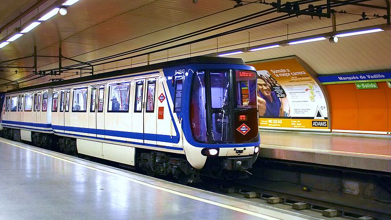
Hi Archboston guys and gals. I'm embarking on a pet project to redesign the red line trains, with the goal of sharing modular body assemblies between lines. I'd like to complete 3-4 separate designs in the search for the most practical, space-efficient design. The last month of mechanically-derived cold weather delays, their resulting overcrowding, and the generally unpleasant station accommodations & appearances have led me to this. It will be an extensive redesign of the trains, human traffic patterns, and stations themselves. Each train will take into consideration space maximization, safety, comfort, power efficiency, cost efficiency, and cross-line modular part utilization, among other things. Each day on the Boston T brings new ideas, and each will be incorporated in some form during the coming months.
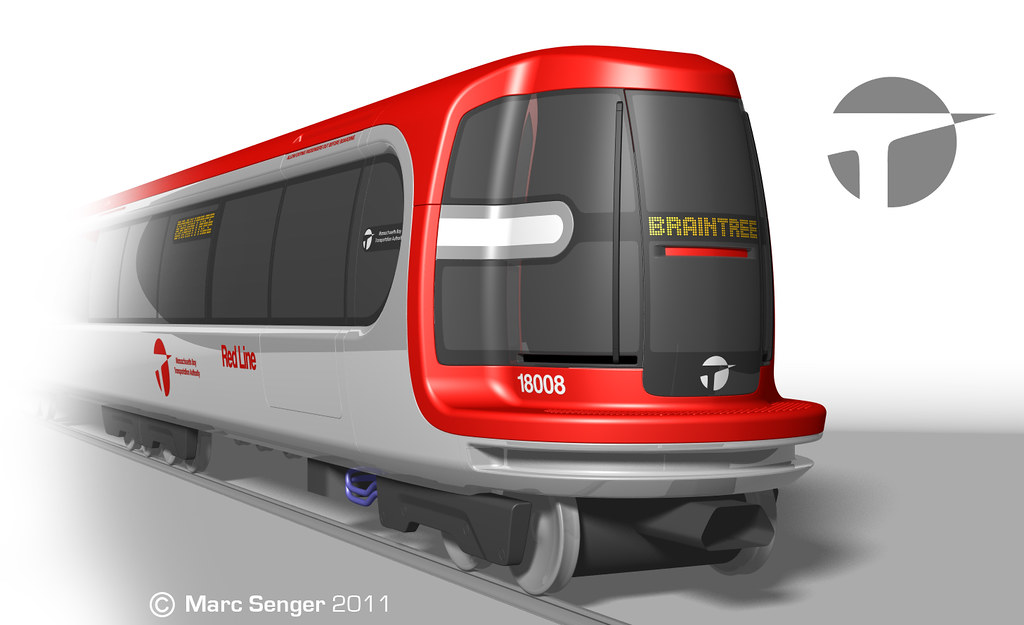
In the above version, the front "lip" provides a stepping surface, and is circular in profile to minimize car contact during tight turns. The front step surface will also push a series of retrofitted "blinds" away, which will cover the rail pit when the train is not present in the station. These blinds will prevent waiting passengers from falling into the pit. The goal of this circular design language is to create an iconic and geometrically-robust appearance. A frosted sunroof allows natural light throughout the cars. Conductor visibility is maximized with liberal use of wraparound glass. This is an ongoing project, so these still require much thought and packaging consideration. Open to any feedback. Thanks!
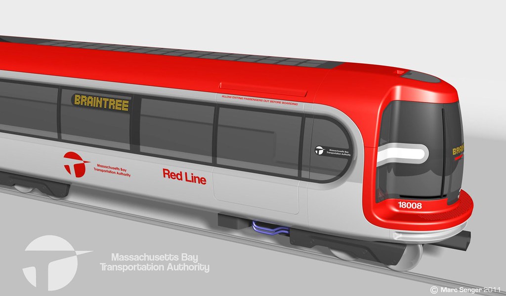
In the above version, the front "lip" provides a stepping surface, and is circular in profile to minimize car contact during tight turns. The front step surface will also push a series of retrofitted "blinds" away, which will cover the rail pit when the train is not present in the station. These blinds will prevent waiting passengers from falling into the pit. The goal of this circular design language is to create an iconic and geometrically-robust appearance. A frosted sunroof allows natural light throughout the cars. Conductor visibility is maximized with liberal use of wraparound glass. This is an ongoing project, so these still require much thought and packaging consideration. Open to any feedback. Thanks!

")