Metropolitan Storage Warehouse Redevelopment/Renovation (MIT) | 134 Mass. Ave | Cambridge

bigpicture7

Senior Member
Joined
May 5, 2016
Messages
3,746
Reaction score
8,606
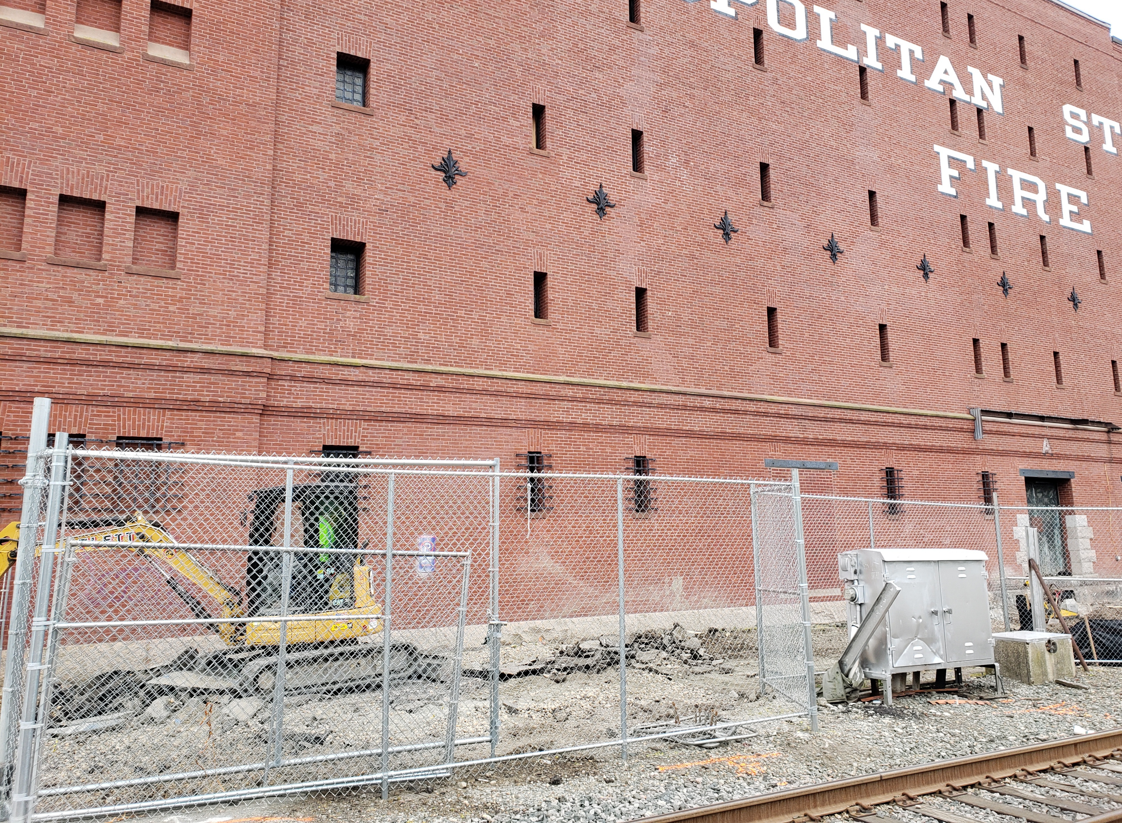
Construction barriers were installed surrounding the Met Storage Warehouse yesterday (6/16) and some site work appears to be beginning
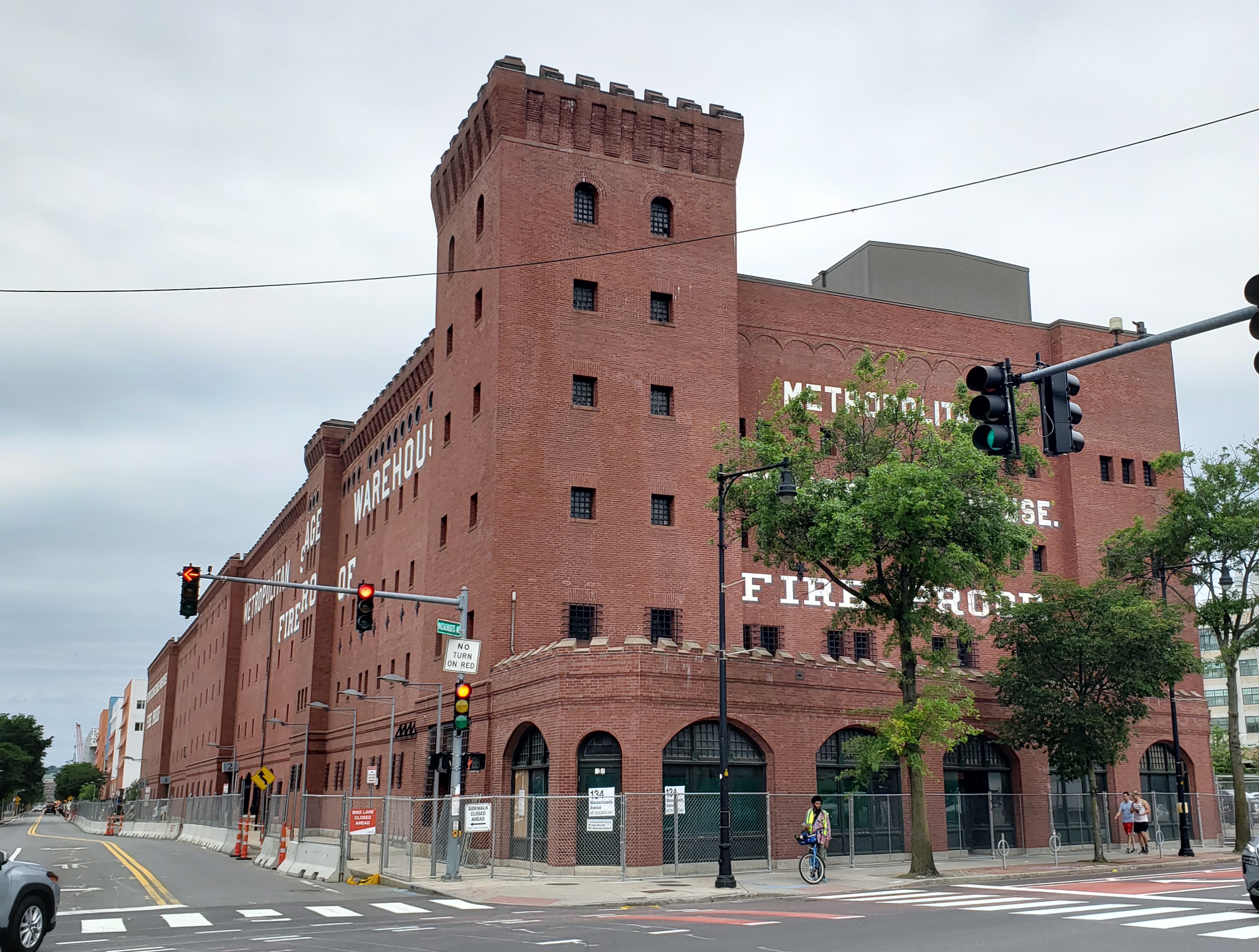
mitmet-1.jpg

mitmet-2.jpg


A recent article in The Tech states that work is indeed starting in June:

Given that this is a substantial project in a fairly prominent location, I figured it now earned its own thread.
Here is some recap from aB about this, as extracted from the infill thread:
Apparently MIT provided new plans to City of Cambridge this month for the Metropolitan Storage Warehouse on Mass Ave. Substantial updates, including partial demos and glass walls. This is scheduled to go before the Historical Commission Thurs (agenda).
The new home of the School of Architecture and Planning. I believe, when MIT's Cambridge campus was originally conceived, SA+P was located in a prime location adjacent to major departments that interacted with architecture, reflective of their conception of architecture bringing in new ideas from other industries and advancing architecture as a whole. I'm weary of this move to push architecture off the main quad and into its own, separate building across the street.
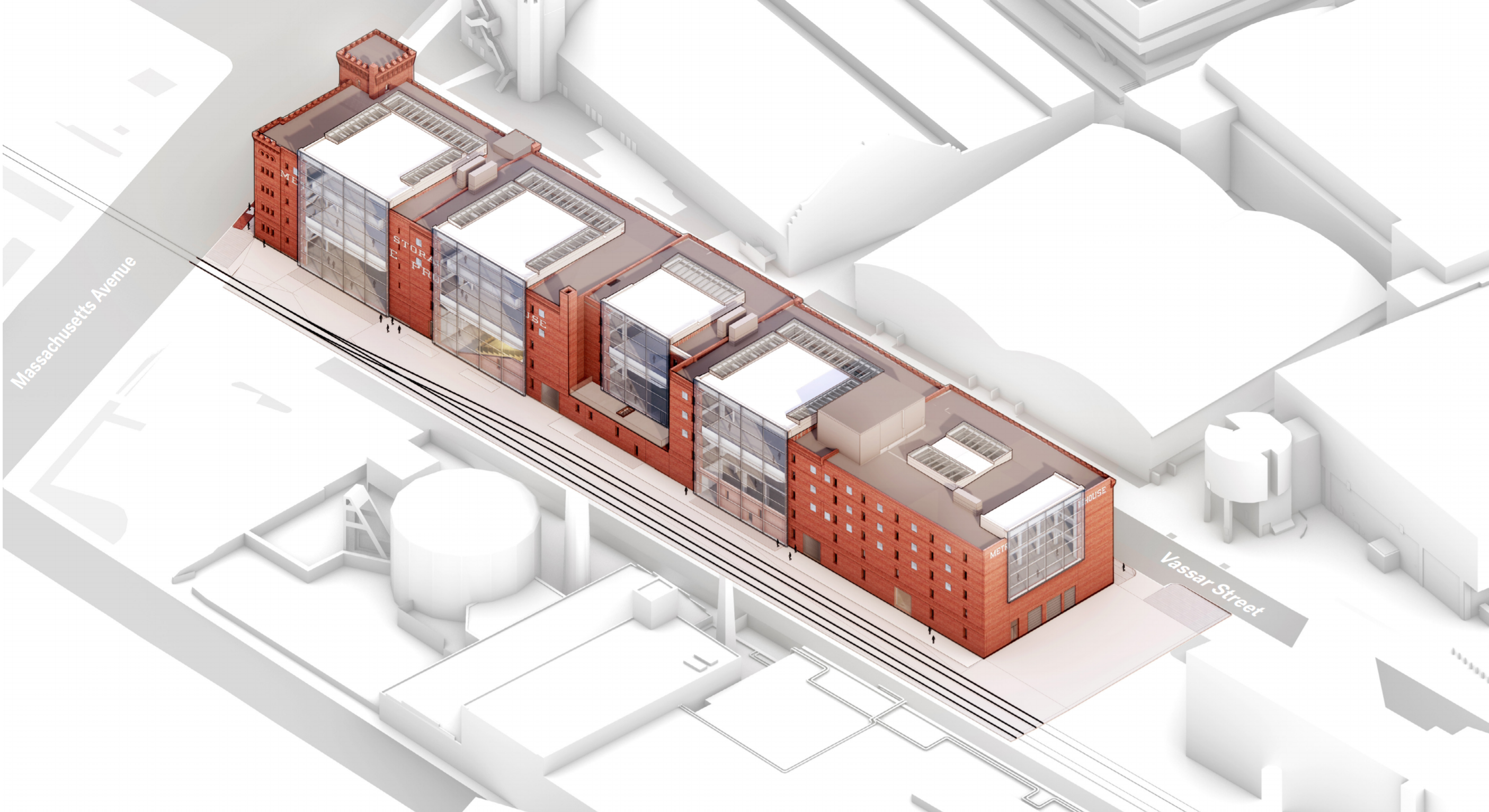
Regardless, it looks like it will be quite an extensive and expensive re-use:
View attachment 16110
...
According to this post, a new render book was just released for the Met Warehouse project (see the Issuu digital magazine linked therein):

Seems to be corroborated via a recent update here, though fewer renders shown:

In any case, they seem to be taking this in a bolder direction with these latest revisions. It's not clear to me from these materials, but I suspect that they are keeping one side of the building more traditional, while going quite bold with the other

In sum (from Stefal's post #150 above):
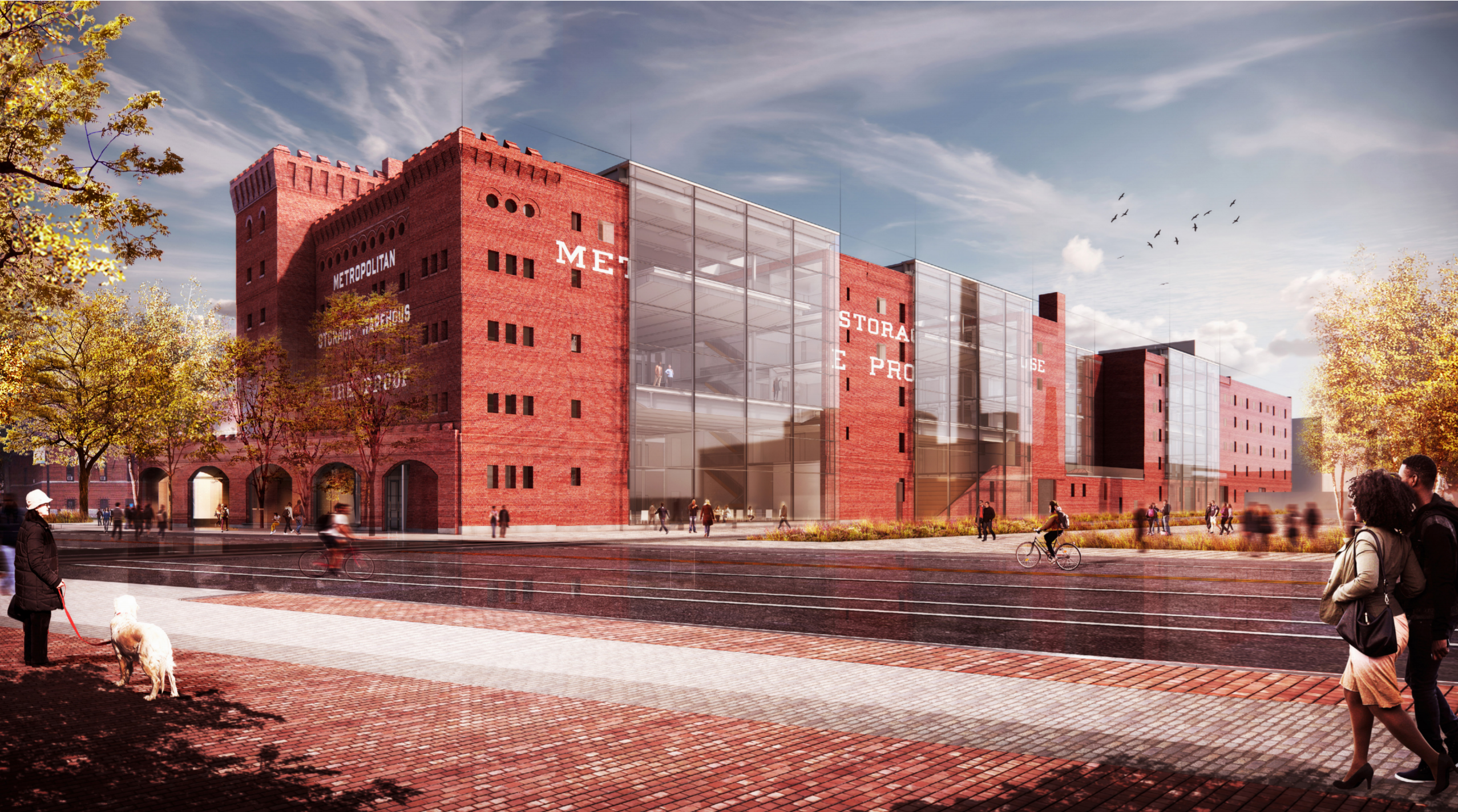
1630335982649-png.16117

1630333815208-png.16110
 
Are they really partially leaving the sign up, while adding glass right in the middle of it? It looks ridiculous. I can't believe this solution got approved, what a sloppy mess.

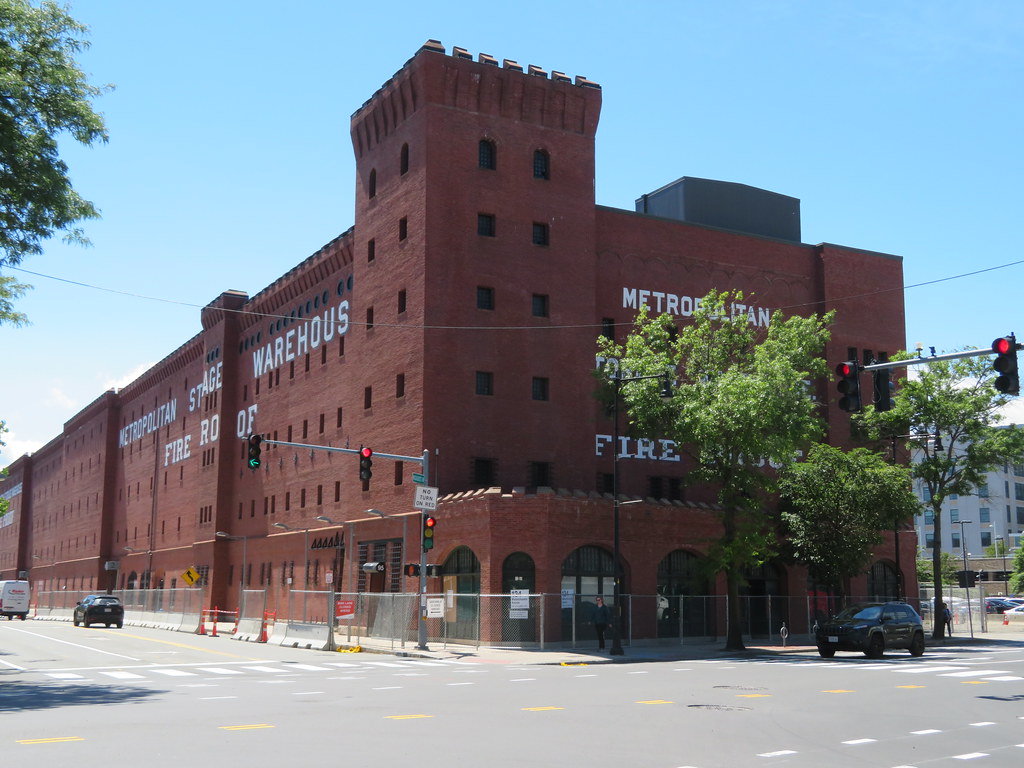
They are leaving the building much more traditional-looking, with sign intact, on the Vassar St.-facing side of the building (from the design presentation):
met_whouse_33.png


There's likely no way re-use of this building would be possible without providing a means for dramatically more natural light (which the Historical Commission agreed with, IIRC).
 
Are they really partially leaving the sign up, while adding glass right in the middle of it? It looks ridiculous. I can't believe this solution got approved, what a sloppy mess.
...given the choice to dramatically alter the railroad-facing side, while honoring the historic view of the street-facing side, it makes me wonder if they have eventual plans for that parking lot on Mass Ave. that would effectively block full view of the railroad-side of this building from public view anyway
 
They are leaving the building much more traditional-looking, with sign intact, on the Vassar St.-facing side of the building....

Ahhh ok good, thanks. The Vassar side is the one that actually matters.
 
They could at least print the signage on to the glazing!

I agree that could be quite cool. Actually, though, this conversation got me looking back through the design materials, and this presentation shows the lettering removed on the railroad-facing side:
met_whouse_44.png


I have no idea if this is more or less accurate than the other presentation (and to confirm, this presentation does still show the full lettering intact on the opposite side on Vassar), but, to me, no lettering seems to work better than partial lettering on the railroad side.
 
Last edited:
I agree that could be quite cool. Actually, though, this conversation got me looking back through the design materials, and this presentation shows the lettering removed on the railroad-facing side:
View attachment 25541

I have no idea if this is more or less accurate than the other presentation (and to confirm, this presentation does still show the full lettering intact on the opposite side on Vassar), but, to me, no lettering seems to work better than partial lettering on the railroad side.
I'm fairly certain this version you have here is the more recent design that got approved. It's likely there's no lettering on the RR side.
 
...given the choice to dramatically alter the railroad-facing side, while honoring the historic view of the street-facing side, it makes me wonder if they have eventual plans for that parking lot on Mass Ave. that would effectively block full view of the railroad-side of this building from public view anyway

There has to be plans. Currently these renovations almost present as a paradox where from a rational point of view of course the Vassar side is the one worth preserving, and yet the vast majority of us are probably recoiling seeing the railroad side--the one that has much higher visibility--get cut up with such massive glass gashes. Surely that parking lot will soon be developed and these alterations won't seem so stark.
 
There has to be plans. Currently these renovations almost present as a paradox where from a rational point of view of course the Vassar side is the one worth preserving, and yet the vast majority of us are probably recoiling seeing the railroad side--the one that has much higher visibility--get cut up with such massive glass gashes. Surely that parking lot will soon be developed and these alterations won't seem so stark.

I mean, they had to cut it up somehow. If you don't need a fireproof warehouse anymore, that structure needs major alterations to survive. Its form doesn't permit many other uses.
 
I mean, they had to cut it up somehow. If you don't need a fireproof warehouse anymore, that structure needs major alterations to survive. Its form doesn't permit many other uses.

Equilibria, are you secretly the Director of the Cambridge Historical Commission? (jk, though your perspectives on this are quite similar ;) ) To quote the latter (emphasis mine):
...[the project] meets significant preservation goals in adapting an uncompromisingly difficult structure for continuing use.

It seems the philosophy here is: better to preserve a big chunk of the legacy of what it once was for hundred(s) more years, than to keep it 100% as-it-was yet functionally not useful and therefore left decaying. To be sure, some historic buildings are not "uncompromisingly difficult...for continuing use"; this one, on the other hand, probably is.
 
Last edited:
I agree that could be quite cool. Actually, though, this conversation got me looking back through the design materials, and this presentation shows the lettering removed on the railroad-facing side:
View attachment 25541

I have no idea if this is more or less accurate than the other presentation (and to confirm, this presentation does still show the full lettering intact on the opposite side on Vassar), but, to me, no lettering seems to work better than partial lettering on the railroad side.
I really like this version. Just think of the view from the GL line on it's way to West Station. Also one can only take so much red brick.

IMG_6632 by Bos Beeline, on Flickr
IMG_6635 by Bos Beeline, on Flickr
IMG_6636 by Bos Beeline, on Flickr
IMG_6638 by Bos Beeline, on Flickr
 
I'm very interested in how this will ultimately be detailed out. What material is separating the two window systems? How can this be flashed without looking sloppy?
I get why they need the new windows for the program, but this is very odd to me. I'm a bit surprised it was approved by the historic commission.

1680475768302.png
 
I'm very interested in how this will ultimately be detailed out. What material is separating the two window systems? How can this be flashed without looking sloppy?
I get why they need the new windows for the program, but this is very odd to me. I'm a bit surprised it was approved by the historic commission.

View attachment 36061
I’ve thought about this too. I can’t quite piece together the window hardware in my head, but I think that the old and the new windows must be fabricated together as one unit, each one custom.

They’re running a big risk on the Vassar side of the building: they intend to overlay their new window grid over the existing window grid. If the old and new windows are different enough, then I believe this will come through. The new glass will be at a different planes within the depth of the brick, and it seems like it will have a different color and opacity. But if the old and new look too similar, then it’ll just be one huge muddle.
 

Back
Top