You are using an out of date browser. It may not display this or other websites correctly.
You should upgrade or use an alternative browser.
You should upgrade or use an alternative browser.
Midtown Hotel Redevelopment | 220 Huntington Avenue | Back Bay
- Thread starter JSic
- Start date
JeffDowntown
Senior Member
- Joined
- May 28, 2007
- Messages
- 5,007
- Reaction score
- 4,130
Excellent point, this clip from the 1917 Bromley Atlas shows it was basically free standing, not a row house. But row houses have often been cut up into multi-family, and they are still called row houses. This was likely single family when built -- similar size row houses in the area were built as single family. But this, specifically, was built detached.But there is no debate, this is not a brownstone... and certainly not an Irish battleship. And not an actual row house which should be single family not an apartment building
It also shows the the parking lot next to the former school is not a "missing tooth", it was there when the school was there.
TomOfBoston
Senior Member
- Joined
- Mar 29, 2007
- Messages
- 1,268
- Reaction score
- 507
Row house is often generic. It is a "row house" that was not in a row.Excellent point, this clip from the 1917 Bromley Atlas shows it was basically free standing, not a row house. But row houses have often been cut up into multi-family, and they are still called row houses. This was likely single family when built -- similar size row houses in the area were built as single family. But this, specifically, was built detached.
View attachment 11809
It also shows the the parking lot next to the former school is not a "missing tooth", it was there when the school was there.
Great find. One note is that many of these supposedly single family "rowhouses" were multifamily from the beginning. Even their middle-upper class owners couldn't afford them without renting out the basement or the top floor. Others took on boarders.Excellent point, this clip from the 1917 Bromley Atlas shows it was basically free standing, not a row house. But row houses have often been cut up into multi-family, and they are still called row houses. This was likely single family when built -- similar size row houses in the area were built as single family. But this, specifically, was built detached.
View attachment 11809
It also shows the the parking lot next to the former school is not a "missing tooth", it was there when the school was there.
Similar to the Parisian practice of renting out that top floor to the "maid"?Great find. One note is that many of these supposedly single family "rowhouses" were multifamily from the beginning. Even their middle-upper class owners couldn't afford them without renting out the basement or the top floor. Others took on boarders.
Even more so....Back in the day, people who could afford a house could afford live-in help generally; I'm thinking of straight up subletting part of the apartment to tenants or the like.Similar to the Parisian practice of renting out that top floor to the "maid"?
I really like this proposal, especially the quality of the cladding. Per the picture, though, I wish that they chose to make this two buildings, and have one as tall as 118 Huntington right behind this stately building on St Boltoph. It would of provided superior egress for the neighborhood. They could of gone crazy and given a couple parking spaces to 146 Boltoph and made a real swanky little area right here...
Anyway, a guy can dream.
Anyway, a guy can dream.
Attachments
cadetcarl
Active Member
- Joined
- Sep 11, 2012
- Messages
- 432
- Reaction score
- 31
If we might return to the topic of the thread--or a little ways back--I'd like to offer a maybe-controversial opinion:
We stand a better chance of getting a good end product if they refine the massing and materiality a little bit rather than trying to go for that broken-up "pretend it's four buildings" look. To my eye those just never turn out very nice because "hm, make it different, just because" is not the kind of justification for using materials that yields beautiful architecture. Pretty much all of those new towers on the Fens side of lower Boylston suck, except Fenway Health.
I agree that it risks becoming oppressive at this scale, but have you actually walked along Mass Ave by the Church Park apartments? It's actually quite pleasant. The sidewalk is wide with trees providing a nice canopy. And there's the covered portion with lots of street-level retail, which is mostly doing fine. (I happen to not mind the buildings above either, but I get it.) No, the real dangerous precedent for this redev is the adjacent Greenhouse Apartments: nothing going on at the street level, super narrow sidewalk that's basically a rideshare pickup and dropoff zone through which the pedestrian must hurry, which in turn makes the building unwelcoming. Almost any building is fine if you fix the street.
Equilibria
Senior Member
- Joined
- May 6, 2007
- Messages
- 7,219
- Reaction score
- 8,728
BCDC:

 bpda.app.box.com
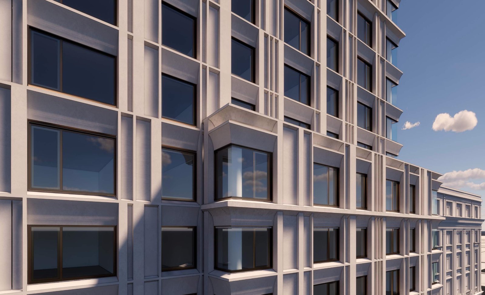
Cellular was better. The verticality here serves only to accentuate the fundamental cheapness of precast facade with the randomness of the vertical lines.
The BCDC: Ruining perfectly good designs with "what we heard" since 1630.


20210427 220 Huntington Ave BCDC Presentation.pdf | Powered by Box
Cellular was better. The verticality here serves only to accentuate the fundamental cheapness of precast facade with the randomness of the vertical lines.
The BCDC: Ruining perfectly good designs with "what we heard" since 1630.
Massachoicetts
Active Member
- Joined
- Jun 4, 2019
- Messages
- 573
- Reaction score
- 714
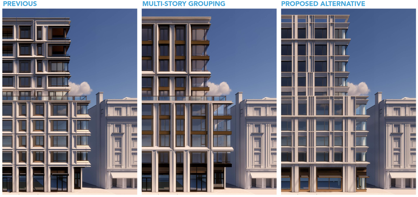
The ground level on the 'proposed alternative' looks the best. The overall strcture is better on MultiStory grouping. 'Previous' looks more engaging from 2 story+.
One thing I do not like about the poposed is they removed the balcony/common area on the 6th floor. It would have looked nicer with people out nd about on floor 6. Don't know why they want to just get rid of that.
One thing I do not like about the poposed is they removed the balcony/common area on the 6th floor. It would have looked nicer with people out nd about on floor 6. Don't know why they want to just get rid of that.
JeffDowntown
Senior Member
- Joined
- May 28, 2007
- Messages
- 5,007
- Reaction score
- 4,130
Now why would anyone want to be out and about on the 6th floor common balcony? It only has gorgeous views of the Christian Science Plaza. Much too nice of a feature to keep.One thing I do not like about the poposed is they removed the balcony/common area on the 6th floor. It would have looked nicer with people out nd about on floor 6. Don't know why they want to just get rid of that.
Massachoicetts
Active Member
- Joined
- Jun 4, 2019
- Messages
- 573
- Reaction score
- 714
Now why would anyone want to be out and about on the 6th floor common balcony? It only has gorgeous views of the Christian Science Plaza. Much too nice of a feature to keep.
Well it looks sterile and brutalist without an area where people can actual go outside. That's a huge amenity lost I feel.. i have a 5th floor open space in my complex now and it is so useful. Its just nice to have. They didn't put the common balcony anywhere else in the building.. which is strange. I dont know, every complex in/around me has some sort of open air space.. its just really odd not to have any here in such a large unit. Especially if younger, people can use it for meeting friends in complex, cooking/bbqing, events, just to sit/read, tan/lounge in summer, have a cup of coffee in the morning if they dont have their own balcony without having to get fully dressed up to go out in public, etc. I even have my own balcony in my apt, but use the common space all the time... so does everyone else. I really couldn't imagine not having a space like that in my complex. (Granted I live in a far less expensive market, luxury is like 1800 for a 2 bed)
Last edited:
BCDC:

20210427 220 Huntington Ave BCDC Presentation.pdf | Powered by Box
bpda.app.box.com
Cellular was better. The verticality here serves only to accentuate the fundamental cheapness of precast facade with the randomness of the vertical lines.
The BCDC: Ruining perfectly good designs with "what we heard" since 1630.
View attachment 12541
None of these make the mark for me. The previous and the proposed seem overly regular and remind me of Government Center. While the middle with the less regular columns and rows, which is a relief, feels a bit dated already.
And the apparent loss of a balcony space adds to the sense that the designs are diminishing.
Massachoicetts
Active Member
- Joined
- Jun 4, 2019
- Messages
- 573
- Reaction score
- 714
Wait a minute, nowhere in the presentation does it say they removed the balcony. It just looks like they replaced the glass partition with what amounts to a parapet

It very much could be.. again, hoping they didnt remove it!

