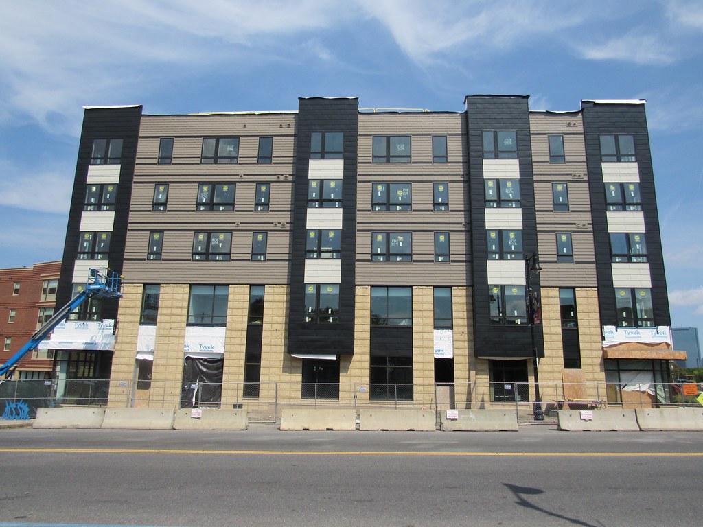
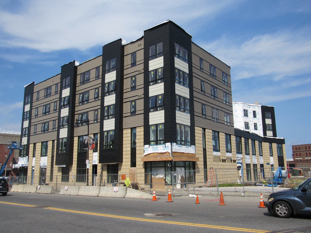
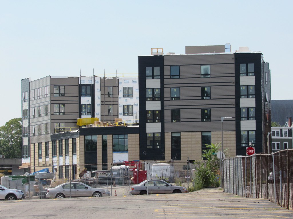
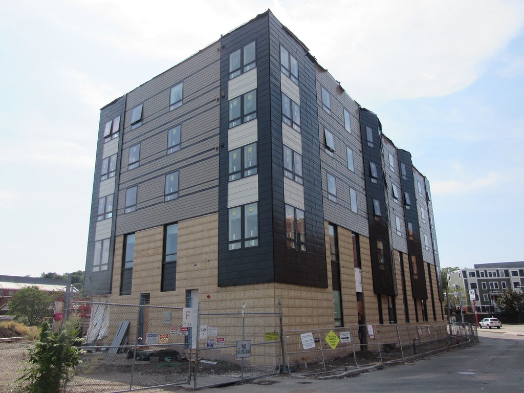
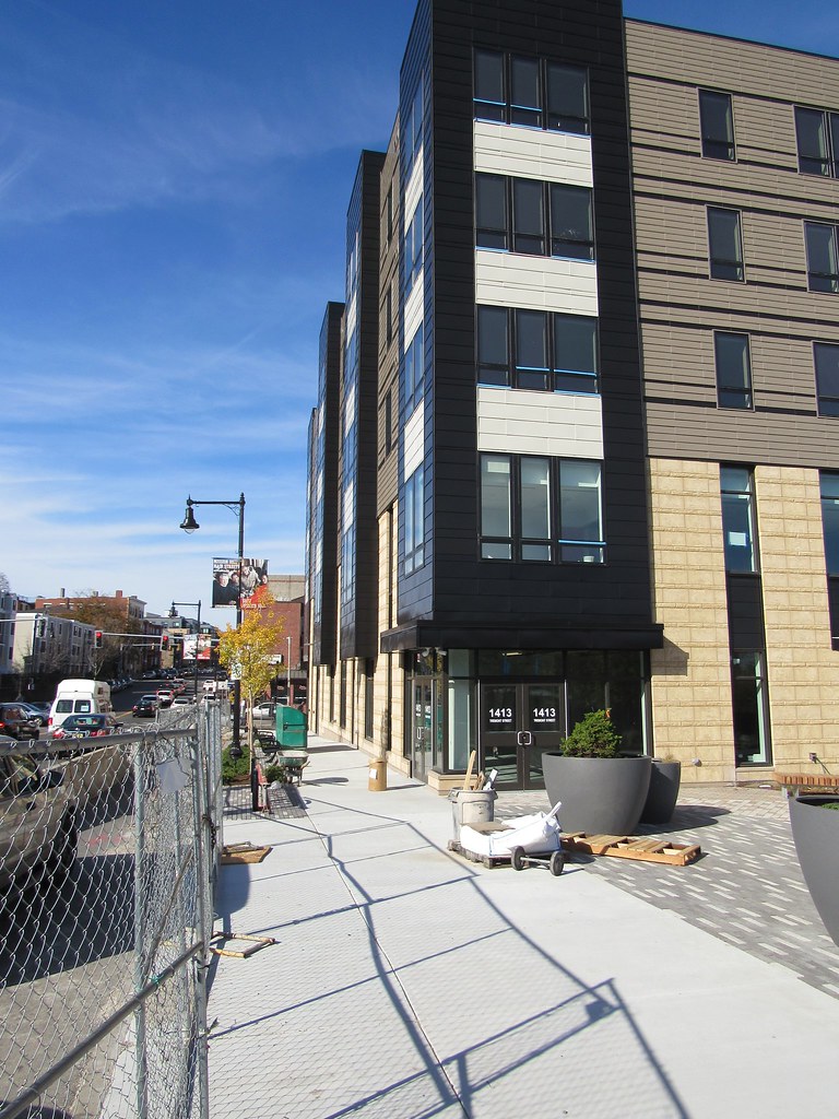
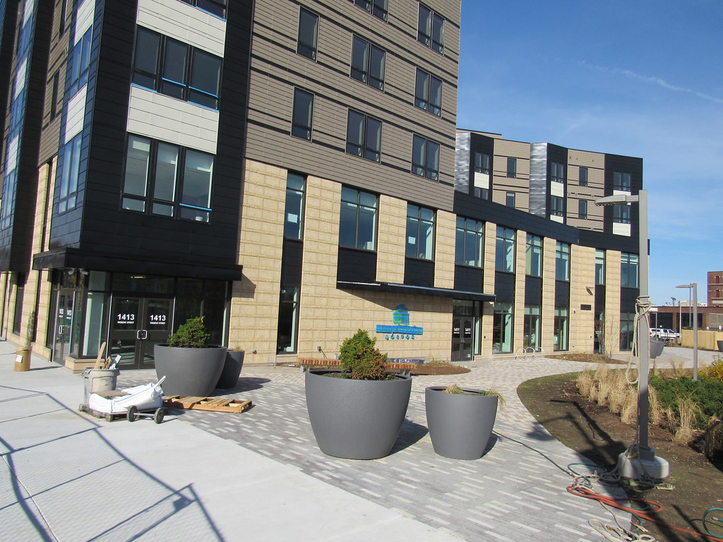
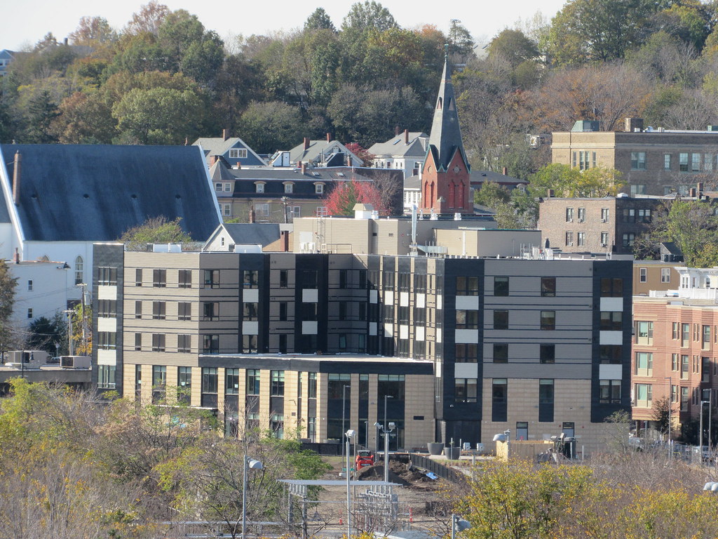
Mission Hill Parcel 25 | Tremont St @ Roxbury Crossing

Nice to see the infill and midrises speeding up.

Looks like about 12 years from concept to people moving in.

btw, i'm a little behind the curve on exactly what these workshops represent, but my gut tells me all this poltiical correctness to make sure no minorities and their communities get exploited by the evil rich developer people and their kind is kinda dull. Not insane or anything so extreme. Just dull.

It's comforting to know they're pushing back gentrification.
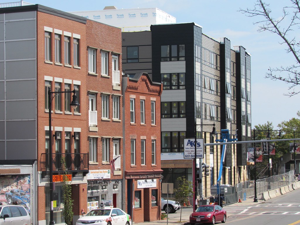
Actually all the community involvement and workshopping has more to do with the really memories of how the BRA behaved back in the aggressive urban renewal period.

Major parts of many minority communities in Boston were bulldozed in the name of progress (and highways). The communities have not forgotten this, and to this day really don't trust the BPDA processes to protect them.
 
Re: Parcel 25- Roxbury Crossing

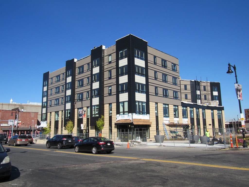
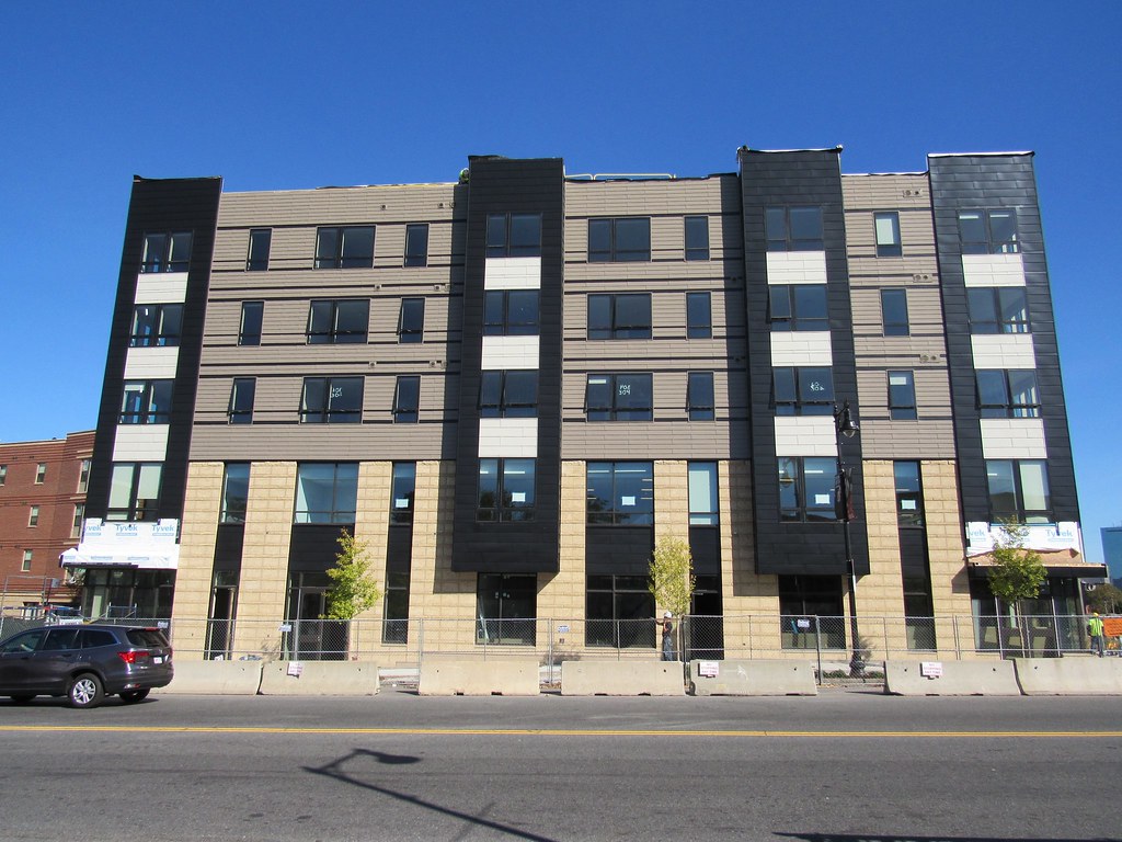
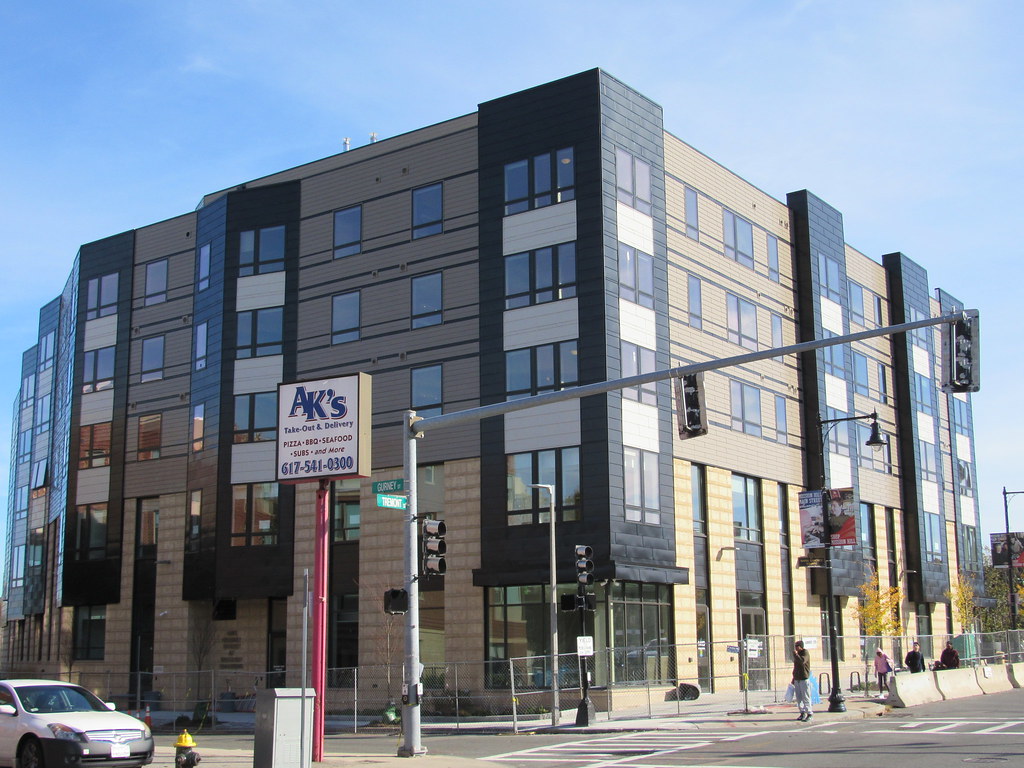
Wow, this thing is hard to look at. Renders were totally passable.

I stumbled across these on Goody Clancy's site accidentally...

"View from T"
MHNS_Pacel-25_View-from-T-Tremont_Goody-Clancy1-900x615.jpg


"Corner of Gurney & Tremont"
MHNS_Parcel-25_Corner-of-Gurney-and-Tremont_Goody-Clancy.jpg


"Parcel 25 Courtyard"
MHNS_Parcel-25_Courtyard_Goody-Clancy.jpg
 
Holy wow.

This is tough to love. What happened?!

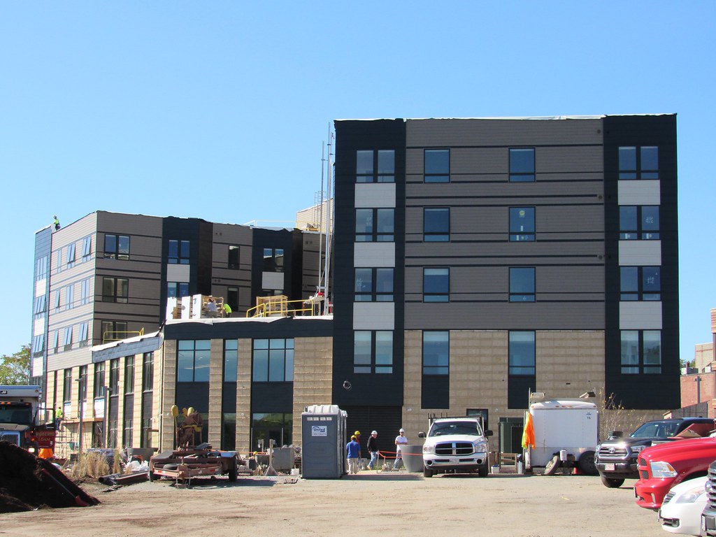
This does not meet Goody Clancey's quality standards. Did they get replaced on the job? This is an amazing lesson on what architectural rigor does for you and what happens when you lose it. In the renders you see that there is a sensitivity to scale (the breakdown of the elements of the base materials), rhythm (the bays are equally spaced), and hierarchy (bay window, versus field materials, versus visual transparency. Any designer worth anything can manage these things. These area things you learn in the first semester of the first year of design school. GCA can do that stuff with their eyes closed. Something went seriously sideways on this project. This is a textbook case of what not to do.

cca
 
Last edited:
It took me a minute to realize the upper floors are not covered in insulation and awaiting the real cladding.

That's really, really, really ugly. I have no idea what the architect was trying to do.
 
Huh, I don't really mind what I see. Definitely a swing and a miss, but I'll take it over the didn't-try-at-all procedure (I'm lookin' at you, The Beverly).
 
This is an ok building ... but a horrible pieces of design. If you don't know the difference I will be happy to have a conversation about it.

cca
 
^ I can tell that it's a turd, but would love to hear you work through the details.

What's the most offensive part?
 
^ I can tell that it's a turd, but would love to hear you work through the details.

What's the most offensive part?

Start with post #128 on this tread.

cca
 
Its just infill that adds housing. It'll blend into the rest of the mediocrity in 2 weeks and be forgotten but the added housing will always be there. Good enough.
 
Its just infill that adds housing. It'll blend into the rest of the mediocrity in 2 weeks and be forgotten but the added housing will always be there. Good enough.

By this logic, the design of infill housing never matters.

I'm all for giving relatively low cost infill housing the benefit of the doubt, but this is truly awful. This project doesn't deserve a pass...
 
Holy shit this thing is awful.

Trying hard and botching it even worse than if you didn't try hard. Maybe they should try less hard next time.
 
Earthmovers on site, excavations underway, and signs up describing the building (47 units of affordable housing and 29 parking spaces iirc). Early sunsets killing my ability to photo
 

Back
Top