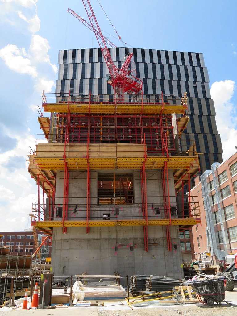
MIT East Campus - Kendall Square Gateway | Cambridge

Thats my bad yea 315’ it was listed wrongly here
https://en.m.wikipedia.org/wiki/List_of_tallest_buildings_and_structures_in_Cambridge,_Massachusetts

Cambridge wicked local has 135 broadway at 350ft
https://www.google.com/amp/s/cambridge.wickedlocal.com/news/20181017/four-new-buildings-coming-to-kendall-including-tallest-in-cambridge%3ftemplate=ampart

So still same point Cambridge gets 2 new tallest towers in a row and then hopefully is capped with something substantial at Volpe. Theres talks of 500’ but well see.

Huh? The 315' is 100% incorrect. That diagram is literally 2 floors shorter than the final project, and it's at least the 342' when you factor in the mech. I remember finding renders where a tip of the mech went all the way to 381'.
EDIT: Here's the 381' figure.
https://oeaaa.faa.gov/oeaaa/external/searchAction.jsp?action=displayOECase&oeCaseID=328902687&row=13

I'm pretty sure 135 Broadway was going about 396'. Isn't there a diagram lying around somewhere?

Also, how could Wiki estimate Eastgate at 270' when it's 30 floors plus a box on top? I think the box tipped that just over 300'. I guess it won't matter since they're smashing it to the ground.

Page 70 on the linked file below has the T.O. Building at 330', which looks like top of screen wall. The inages below show an element of some kind extending above the screen wall. No idea what that is? Or, maybe it's just an architectural element, which doesn't really affect overall height.

The screen wall appears to have grown by 15' between the 2015 & 2016 elevations.

https://kendallsquare.mit.edu/sites/default/files/documents/MIT_PUDPlanBoardSoMa_20160105-1.pdf

Then in November of 2016, it went forward with a total of 30 floors.

https://kendallsquare.mit.edu/sites/default/files/documents/MIT_PUDPlanBoardSoMa_20160105-1.pdf

Which has it back down to 319'.

The FAA page doesn't make much sense with 381' or 391'. Ground level is at 20', not 10'. Unless 381' is being stated as the max buildable, nothing backs up those heights.

30 storeys of dorms is going to be approx. 300 feet. A few extra feet for the podium having slightly taller floors at 5 and 29/30. There's not really a significant mech level for residential buildings. Not building a 60 foot screen wall here I'm pretty sure.

Would love to see 381' here, but don't think you're getting anything near that. It's only slightly taller than number 2 in Cambridge, not blowing it away.
 
Then in November of 2016, it went forward with a total of 30 floors.

https://kendallsquare.mit.edu/sites/default/files/documents/MIT_PUDPlanBoardSoMa_20160105-1.pdf

Which has it back down to 319'.

The FAA page doesn't make much sense with 381' or 391'. Ground level is at 20', not 10'. Unless 381' is being stated as the max buildable, nothing backs up those heights.

Check out that extra little box sticking up on page 9, 72, 74, and 75. Technically, that box counts as part of the official height. Obviously we all want to know how tall this is up to the screen, and then again with the screen, and then finally with that added box on top. A box just like that one is the reason why Minneapolis one day had a "taller" building than Boston, because unbeknownst for decades, it counted!

When I look at the elevations near the end I still question if this is the final version. In particular, in real life the building appears to absolutely tower over Boeing while here it's much closer. I also count 30 floors on the real building whereas here it just has 28 on page 70's diagram.

I'm happy to see we are finally trying to get to the bottom of this! If we can find the most accurate documents we can use them to get these into the diagrams database on skyscraperpage. I think we can agree on 295', 280', and 235' so it's mainly the big one (plus whatever replaces Eastgate which is less interesting/pressing).
 
Nice pictures, BeeLine!

The gradient really falls apart 2/3 the way up. It's like they skipped 3 floors. This last picture is actually a little flattering to what it looks like in person, in my opinion.
 
From 6/21. Dorm tower is behind the ~288' Marriott yet dwarfs it. Could it be 342' is the roof height and the box pushes it further?

IMG_2621 by David Z, on Flickr
 
I agree the gradient was not done well. It's a fairly ugly, bar code-inspired building as is, but that color change is just awful.

To be fair, though, this is better than that hideous Vassar St Res Hall, the perfect Downtown Tulsa Holiday Inn no one ever asked for.
 
Yea they should have just made it one color. It sucks when a brand new building already hits the countdown clock for a reclad.
 
Honestly, it's fine until the final three color changes. I can't help but feel they skipped a few shades. It's very jarring.
 
Honestly, it's fine until the final three color changes. I can't help but feel they skipped a few shades. It's very jarring.
100% with you on this. I can't look at it without feeling uncomfortable! So so close!
 
I prefer the lighter shades at the top. I just wish it hadn't started so dark at the lowest floors. A more gradual gradient would have been better.
 
Although the brown paneling and dark glass scream midtown 1970's Midtown Manhattan infill towers, I kind of like the whole F-U to more glass boxes.
 
It's not even the vertical gradient that's the issue for me. It's the internal horizontal color alternation combined with the offset windows that make this so unsettling to look at.
 
IMO...an ugly duckling that will be loved in ten years.
 
It's not even the vertical gradient that's the issue for me. It's the internal horizontal color alternation combined with the offset windows that make this so unsettling to look at.

I find that a bit interesting, if sometimes unsettling, really the effect of those angled panels is to play with the light and make the building look different shades of gold/white/dark depending on the angle and time of day and weather... Me thinks the inspiration was The dress.

I see white/gold
 
I love it! I think it looks better in person too. It definitely has some better angles than others and the gradient could've been smoother but I think overall its a neat addition. I don't find these offset windows annoying like on most buildings as its much more subtle and doesn't feel like a "look how wacky our building is!" type of situation.
 
How did this gradient goof happen? It should have been an easy calculus to figure out the proper percentage of color fade and fabricate accordingly. On an otherwise fine building it's not some small error that can be easily overlooked. The unfortunate thing about using a design "gimmick" like this is that it comes with a rather significant risk of coming out wrong.
 

Back
Top