stick n move
Superstar
- Joined
- Oct 14, 2009
- Messages
- 13,480
- Reaction score
- 24,524
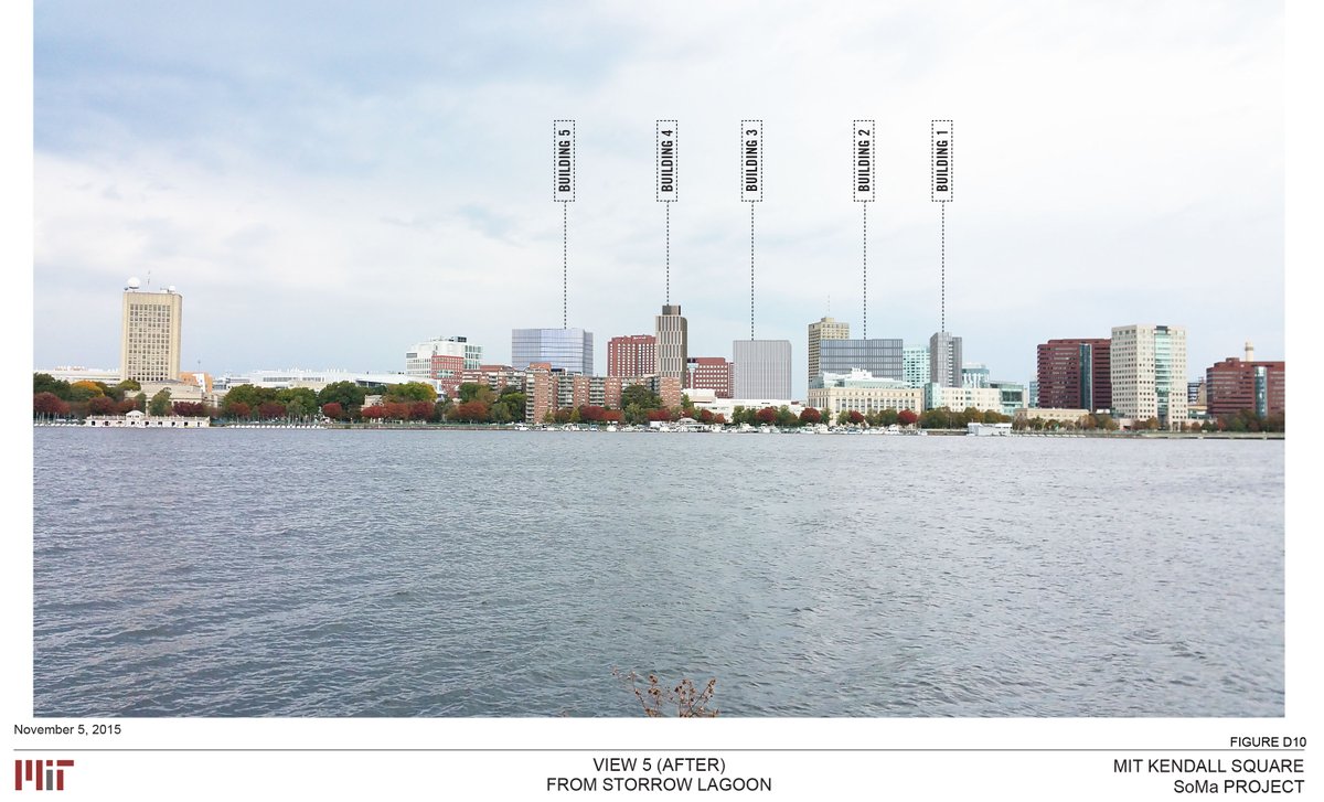
If you look its really groups of 3, so its not wrong though jarring.
As other people have said, this looks better in real life. Pictures aren't real life. I agree that the gradient should have been done better, but it doesn't bother me as much in person.
I love it! I think it looks better in person too. It definitely has some better angles than others and the gradient could've been smoother but I think overall its a neat addition. I don't find these offset windows annoying like on most buildings as its much more subtle and doesn't feel like a "look how wacky our building is!" type of situation.
He is a smart guy, but he is also more interested in ideas than anything else. These kinds of "experiments" are inevitable with artists (not designer) like Mr. Terani.
cca
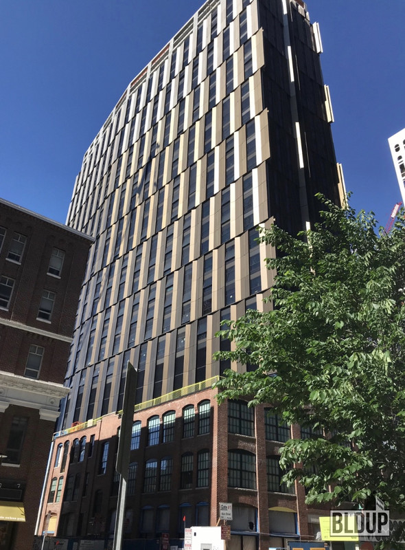
But MIT would say that's what they should be about. This building isn't nearly as offensive as some of their others (Stata, Vassar dorm...). Even with the fugly gradient, this is still better than the Green Building and Eastgate.
I was not criticizing this building at all just explaining that when you hire "idea based" designers ... you will get strong reactions. I am sure they expected that and have bought in to it.
cca
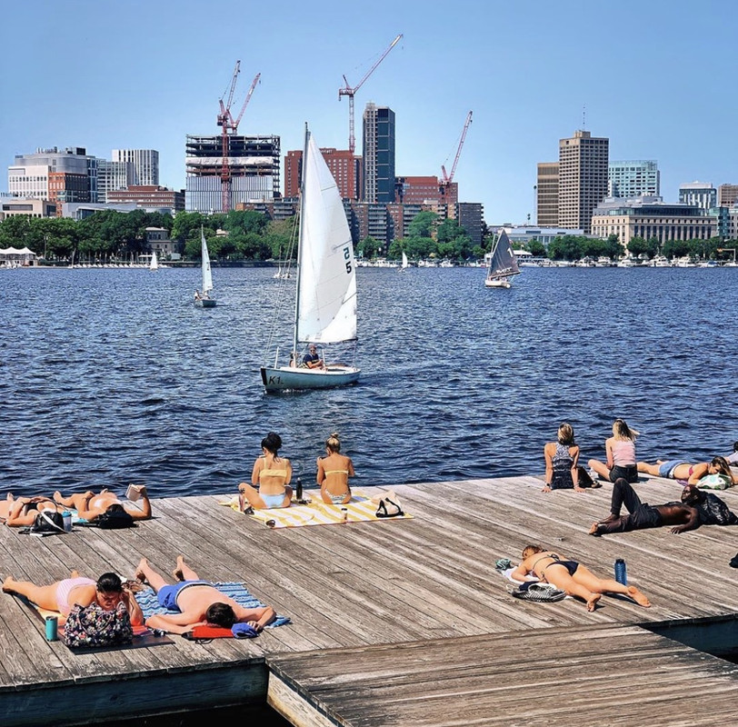
Isn't Eastgate getting replaced by a similar height tower?
Isn't Eastgate getting replaced by a similar height tower?
Isn't Eastgate getting replaced by a similar height tower?