You are using an out of date browser. It may not display this or other websites correctly.
You should upgrade or use an alternative browser.
You should upgrade or use an alternative browser.
MIT East Campus - Kendall Square Gateway | Cambridge
- Thread starter Equilibria
- Start date
Equilibria
Senior Member
- Joined
- May 6, 2007
- Messages
- 7,087
- Reaction score
- 8,325
My issue is that while Building 5 (the MIT Museum one) is a bright spot, the exterior treatments on a lot of these look like throwbacks to 1965. I don't really have a problem with the cantilevered forms, though they're really just an excuse to stack rectangles and be unimaginative with massing, but holy cow, do those buildings look dated out of the box.
I realize that the sketch-style renderings may not do justice to some of the "shimmer" and light play these materials are meant to achieve, but it's kind of the architect's job to know that. C'mon MIT. You're MIT. Do better.
I will give them, though, that this is way better than the Stata Center.
I realize that the sketch-style renderings may not do justice to some of the "shimmer" and light play these materials are meant to achieve, but it's kind of the architect's job to know that. C'mon MIT. You're MIT. Do better.
I will give them, though, that this is way better than the Stata Center.
atlantaden
Senior Member
- Joined
- May 31, 2006
- Messages
- 2,606
- Reaction score
- 2,750
Cantilevered buildings are perfectly safe, it's just a psychological thing.
Well....as long as they do the wind load analysis properly.
Here's another article on the CitiCorp Center's initial design flaw!
http://www.damninteresting.com/a-potentially-disastrous-design-error/
paperless paul
Active Member
- Joined
- Nov 1, 2013
- Messages
- 214
- Reaction score
- 3
Here's another article on the CitiCorp Center's initial design flaw!
http://www.damninteresting.com/a-potentially-disastrous-design-error/
You're better off reading the New Yorker article, helpfully archived here which is a lot clearer (although it still misses some important details). The problem has nothing to do with the cantilever except in as much as that led to the use of multi-level chevron trusses in the exterior walls. The cantilever coupled with this design led to adjacent trusses sharing a corner column as a chord. The real problem came because the contractor chose to use bolts for the truss connections thereby reducing the design strength of the connection. When the connections were designed by the contractor the engineer either did not indicate the most severe design loading, or did not properly review the connection design by the contractor. (I never found a definitive answer to this question).
Beton Brut
Senior Member
- Joined
- May 25, 2006
- Messages
- 4,382
- Reaction score
- 338
When the connections were designed by the contractor the engineer either did not indicate the most severe design loading, or did not properly review the connection design by the contractor.(I never found a definitive answer to this question).
Seems legit:
https://www.youtube.com/watch?v=AOYVaYZvg2Q
Bonus -- Hugh Stubbins interviewed:
https://www.youtube.com/watch?v=TZhgTewKhTQ
Last edited:
whighlander
Senior Member
- Joined
- Aug 14, 2006
- Messages
- 7,812
- Reaction score
- 647
My issue is that while Building 5 (the MIT Museum one) is a bright spot, the exterior treatments on a lot of these look like throwbacks to 1965. I don't really have a problem with the cantilevered forms, though they're really just an excuse to stack rectangles and be unimaginative with massing, but holy cow, do those buildings look dated out of the box.
I realize that the sketch-style renderings may not do justice to some of the "shimmer" and light play these materials are meant to achieve, but it's kind of the architect's job to know that. C'mon MIT. You're MIT. Do better.
I will give them, though, that this is way better than the Stata Center.
Equilib -- did you get a chance to download and review the 3 pdfs sets of slides there are plenty of comments related to the exterior materials and forms, etc.
This has already been through a first review with the Cambridge equivalent of the Civic Design, Zoning, BRA, etc -- the current renders are updates to address issues identified in the first crack
The comments from the Cambridge folks which are quoted in the summary article was to the effect that they appreciate the improvements -- but that some further tweaking is suggested
My guess is that the first building -- the residence on Main St @ 3rd will be started either later this year or early next -- it has to be done before East Gate can be leveled
Equilibria
Senior Member
- Joined
- May 6, 2007
- Messages
- 7,087
- Reaction score
- 8,325
Equilib -- did you get a chance to download and review the 3 pdfs sets of slides there are plenty of comments related to the exterior materials and forms, etc.
That's what I'm referring to. Showing me a picture of the materials doesn't make them look any less archaic.
It's just striking to me how much these buildings look like, well, MIT. I guess I was hoping for better.
whighlander
Senior Member
- Joined
- Aug 14, 2006
- Messages
- 7,812
- Reaction score
- 647
That's what I'm referring to. Showing me a picture of the materials doesn't make them look any less archaic.
It's just striking to me how much these buildings look like, well, MIT. I guess I was hoping for better.
Equilib -- beg to differ
The original "Badger Building" was archaic -- dating from the first Kendall redev era [circa 1970] and like Paul Rudof's State Service Center never finished


this redo of the street level of the building as well as adding the glass tower where there was going to be a "Cement Tower" originally is hardly archaic

tangent
Senior Member
- Joined
- May 11, 2012
- Messages
- 1,789
- Reaction score
- 68
Cantilevered buildings are perfectly safe, it's just a psychological thing.
Yes, even looking at the PDFs makes my stomach queasy.
whighlander
Senior Member
- Joined
- Aug 14, 2006
- Messages
- 7,812
- Reaction score
- 647
MIT Open House Today including information on Kendall Initiative and NANO building projects

http://mit2016.mit.edu/openhouse

http://mit2016.mit.edu/openhouse
bigpicture7
Senior Member
- Joined
- May 5, 2016
- Messages
- 3,906
- Reaction score
- 9,547
Press release today with more renderings:
http://news.mit.edu/2016/new-era-kendall-square-initiative-cambridge-planning-board-0518
This is a massive project.
http://news.mit.edu/2016/new-era-kendall-square-initiative-cambridge-planning-board-0518
This is a massive project.
whighlander
Senior Member
- Joined
- Aug 14, 2006
- Messages
- 7,812
- Reaction score
- 647
Looks like MIT is really trying to stake out Kendall as "their" square, akin to Harvard as Harvard's.
FK4 -- No -- Harvard missed the chance to create their Kendall -- There is very little non-Harvard in Harvard Sq. except for food, drink, banks, and misc shops
Kendall by comparison is a logical extension of MIT's fundamental Mens et Manus motto -- the basic concepts and fundamental practice that were taught in the class room and teaching lab
When MIT arrived in Cambridge 100 years ago -- William Barton Rogers concept for an Institute of Technology [1860] and MIT's logo "Mens et Manus" [mind & hand] was established but limited to the campus. In the first few decades of the 20th C -- MIT joined the Great Universities in creating new knowledge in the academic professorial lab -- the Oxford, Cambridge, Harvard, etc. model
However the Rad Lab during WWII -- changed everything -- focused on transforming fundamental knowledge of electrons, magnetism, EM radiation propagation and scattering into WWII #1 War Winning technology -- microwave Radar
Harvard had a role with their radio research as well -- but after the war was over they went back to each key professor leading his small coterie of associates
MIT -- just in essence changed the name of the Rad Lab to the Research Lab for Electronics -- and the modern multidisciplinary academic research lab was born
The next major step was the extension of the academic research laboratory out to the corporate research lab and on to the practical and productive through consulting and start-ups.
This MIT and to a an extent Stanford and a lesser extent Harvard did during the 60's, 70's and 80's with profs starting up companies focused on commercializing research.
However, what MIT has pioneered and is to a large part responsible for Kendall's boom is the embedding of MIT's research right into the corporate environment through a number of vehicles such as AL Lab, Whitehead, Broad, the Media Lab, ISN, etc.
These multidisciplinary labs with a mix of MIT faculty and research staff and industry people all surrounded and permeated by eager MIT undergraduate and graduate students -- located just off of the campus proper is unique in the US although the UT Austin has tried to emulate some of it.
All that then attracted the pure corporate r&d labs that want to be neighbors in the hood and so you have Novartis, Pfizer, Shire coming from all around the world with the natives just in biotech and pharma. In Information Tech we now have Google, Microsoft, IBM and Amazon plus locals. There are a handful of other major corporate players in Kendall including Schlumberger and I wouldn't be surprised at all if GE didn't set up shop as well.
So -- No this not MIT's Harvard Sq. -- on the contrary Harvard is belatedly trying on western Ave to make a Kendall Sq.
Note - - I apologize to any labs or firms that I should have included -- this is by no means exhaustive
atlantaden
Senior Member
- Joined
- May 31, 2006
- Messages
- 2,606
- Reaction score
- 2,750
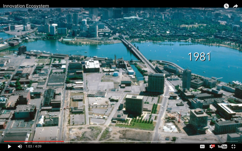
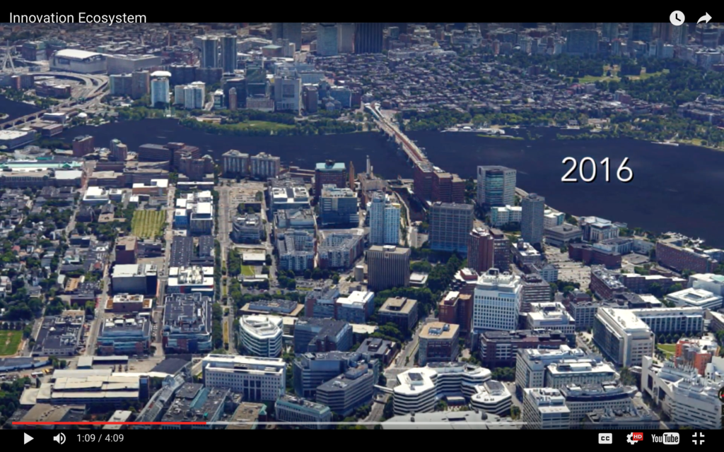
Wow! It seems like MIT is doing for it's campus/Cambridge community what many here on this thread feel BU should be doing for it's campus/Boston community. I for one am blown away by these plans and also by the difference of Kendall Square from 1981 to today! The Seaport is certainly following the same path from open, desolate parking lots similar to Kendall in 1981 to a new community for Boston. Bravo MIT and Cambridge for your collaborative effort to bring this together.
stellarfun
Senior Member
- Joined
- Dec 28, 2006
- Messages
- 5,711
- Reaction score
- 1,544
Globe article.
http://www.bostonglobe.com/business...eighborhood/hIv1mwISI8WuheSfIuA74M/story.html
Next news will be GSA's selection of finalists to develop the Volpe site. The finalists supposedly to be announced this month.
http://www.bostonglobe.com/business...eighborhood/hIv1mwISI8WuheSfIuA74M/story.html
Next news will be GSA's selection of finalists to develop the Volpe site. The finalists supposedly to be announced this month.
- Joined
- May 25, 2006
- Messages
- 7,034
- Reaction score
- 1,875
Man you know things were bad when the Volpe Center was the NICEST thing around.
iamdjmichael
Active Member
- Joined
- Aug 4, 2014
- Messages
- 165
- Reaction score
- 131
Now we just need to utilize HEIGHT for residential in Kendall. Its so walkable to downtown and both the Green and Red lines. No need for excessive parking
Volpe coudve been sexy... there's some good old renders of it in all its 1960s splendor.... nothing like those modernist renders..
https://c.o0bg.com/rf/image_1920w/B...ostonGlobe.com/Business/Images/volpe-4676.jpg
https://c.o0bg.com/rf/image_1920w/B...ostonGlobe.com/Business/Images/volpe-4676.jpg
I mean its one thing for there to be a lot of surface parking / empty lots. But i'm especially surprised by the how poorly defined the edges of some the streets are here. Look at what happens at the near-side edge of the Volpe lawn...I mean what a freaking wasteland. And what a miracle that we are where we are today.


