You've hit it on the head Pierce. A big problem with many of the Brualist buildings (City Hall, Hurley Building, etc) is that the government agencies that own them do not maintain them properly. There is a lot of opportunity to make them really beautiful, with meaningful and well-kept public spaces and plazas. Unfortunately, no one seems to care.
You are using an out of date browser. It may not display this or other websites correctly.
You should upgrade or use an alternative browser.
You should upgrade or use an alternative browser.
Modernist Abominations
- Thread starter ablarc
- Start date
FOUR BUILDINGS

Three pre-modern, one modern.
Three ornamented, one not.
If you asked most folks which one they?d replace if they could replace just one, I bet you know which one they?d pick to replace.
The newest one. The one with the strip windows.
Problem with Modernism in city settings, where buildings have just one fa?ade: ornament not allowed.
So you have to rely on the materials alone. Always the latest thing. Glass today, strip windows a while ago.
When either gets old and dirty, there?s nothing left to admire.
When an ornamented building gets old and dirty, you can admire the ornament.
And after a while, someone makes plans to spruce it up.
Who would want to spruce up the building with the strip windows?
* * *
So OK, we take down the building with the strip windows.
And we replace it with the latest thing: its all slick and new and glassy, and we love it.
When it gets old and dirty?
Why don?t we just build buildings with ornament and style?
Oh ? the historical inevitability police rush in: ?You can?t do that, it?ll look like an old building.?
Is that so bad? All buildings get old.
The style moralists are in a tizzy: ?You can?t do that, it?s dishonest and immoral.?
?Oh yeah, why??
?Coz we say so. We got this theory, see, and it sez ? "
What?s a person to do ? ?
.
Last edited:
I can't argue with a thing you've said. Look at how nicely the building on the left wraps that corner...and then what?
The problem with buildings like the second on the left, is that they don't age. They don't acquire a patina. They just get old. They just get dirty!
The problem with buildings like the second on the left, is that they don't age. They don't acquire a patina. They just get old. They just get dirty!
Ron Newman
Senior Member
- Joined
- May 30, 2006
- Messages
- 8,395
- Reaction score
- 13
Is there a hidden old facade behind that modernist one?

Minato Ku, Wired New York
A modern building that fits so effortlessly into its surroundings that you hardly notice it.
Fits in spite of the large area of glass. The masonry part anchors it into the streetscape by having exactly the same frequency of ornamental detail --an element of scale.
The North End could do with this kind of building, and so could both Harvard/Brattle/Winthrop Square and Davis Square. Delicate scale, small footprint, adequate ornamental detail.
czsz
Senior Member
- Joined
- Jan 12, 2007
- Messages
- 6,043
- Reaction score
- 7
so could ... Harvard/Brattle/Winthrop Square
You might recall there was almost just such a building on Mt. Auburn St. by Hans Hollein, but it was slaughtered in the crib by mothbrained Cambridge philistines. Since that and the Piano fiasco, Harvard has been appallingly timid architecturally.
BTW, I have nothing against the NE School of Photography building per se...I sort of like its industrial chic. What works against it here is the prominent location...like the latter example, it would be better off in a quieter space, doing what the stripped-down simplicity of such buildings do best - providing a more subtle contrast to its surrounds.
The NIMBYs have succeeded in dragging Harvard down to their own level.You might recall there was almost just such a building on Mt. Auburn St. by Hans Hollein, but it was slaughtered in the crib by mothbrained Cambridge philistines. Since that and the Piano fiasco, Harvard has been appallingly timid architecturally.
Allston promises to be a fiasco, a festival of mediocrity.
Try though I did, I couldn't find a decent image of this building bigger than a postage stamp. Does anyone have a bigger image to post?You might recall there was almost just such a building on Mt. Auburn St. by Hans Hollein, but it was slaughtered in the crib by mothbrained Cambridge philistines.
Also, how about some pics of its boring successor? Could you fairly call it a modernist abomination?


^ Well, this is certainly a familiar animal: the generic Harvard Square four-story modernist, foursquare office block. A gaggle of its siblings can be found all together on one block bounded by Brattle Street (Sert's 44 Brattle, Thompson's D/R), Story Street (TAC, Flansburgh) and more recently, Mt. Auburn Street.
This one seems to have wandered off from the pack.
Hollein would have caused heartburn till everyone learned to love it.
This one seems to have wandered off from the pack.
Hollein would have caused heartburn till everyone learned to love it.
I can't argue with a thing you've said. Look at how nicely the building on the left wraps that corner...and then what?
The problem with buildings like the second on the left, is that they don't age. They don't acquire a patina. They just get old. They just get dirty!
Of course you could argue that the modern building provides more life than the one on the corner. That being because the corner building sits empty while the modern one is in active use, having students out in front and a busy salon.
The more I look at this building the more I like it. A good urban background building.
What are all those skylights for (if indeed that's what they are)? What's up there on that floor?
Beton Brut
Senior Member
- Joined
- May 25, 2006
- Messages
- 4,382
- Reaction score
- 338
What are all those skylights for (if indeed that's what they are)? What's up there on that floor?
I believe this building, like the original design from Hollein, is for back office functions of the Harvard Libraries. The metal screen in the shape of an open book was Hollein's clever visual device.
The design as built isn't bad. It owes a bit to Ben Thompson.
Last edited:
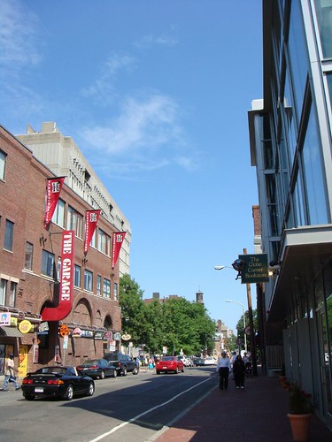
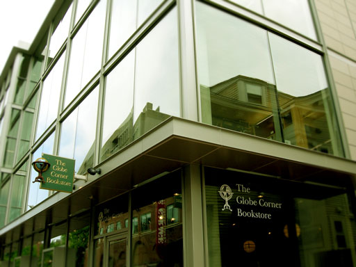
That whole block Design Research is part of is one of Boston's modern urban design triumphs, along with the Globe Bookstore on Mt. Auburn Street and the Borders Building (5c Savings) on Washington Street. Too bad there are so few; Kenmore Square could use buildings similarly open to the street, and so could Boylston Street over its entire length. Compare these with the light-starved shops hidden in the shadowy colonnade of Church Park.
czsz
Senior Member
- Joined
- Jan 12, 2007
- Messages
- 6,043
- Reaction score
- 7
The Apple Store on Boylston arguably achieves this, but with less grace and more cookie-cutter corporate brand ideology.
Unfortunately it requires quite a bit of effort/talent to properly do retail in one of these all-glass spaces, though. I've no idea what's going to fill the ghastly empty space left by Crate & Barrel, but it's going to have to be something with lots of design savvy. In the case of the Globe Travel Bookshop, I think display has actually drained their energies. The old store on Church St. had few windows, but was packed with a lot more product.
Compare these with the light-starved shops hidden in the shadowy colonnade of Church Park.
Unfortunately it requires quite a bit of effort/talent to properly do retail in one of these all-glass spaces, though. I've no idea what's going to fill the ghastly empty space left by Crate & Barrel, but it's going to have to be something with lots of design savvy. In the case of the Globe Travel Bookshop, I think display has actually drained their energies. The old store on Church St. had few windows, but was packed with a lot more product.