New Red and Orange Line Cars

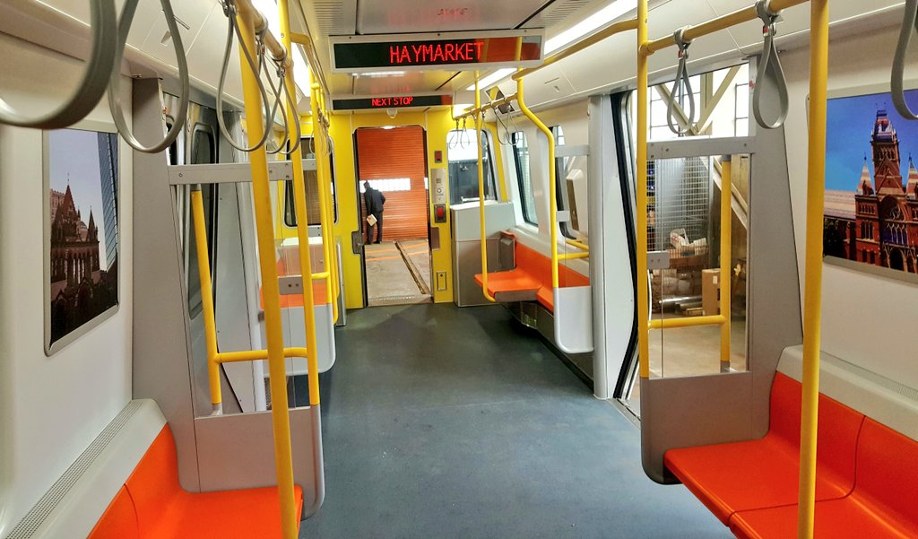
The one thing that I'm really not a fan of at first impression is the destination board....
C7dIbT7VwAAw1qT.jpg:large


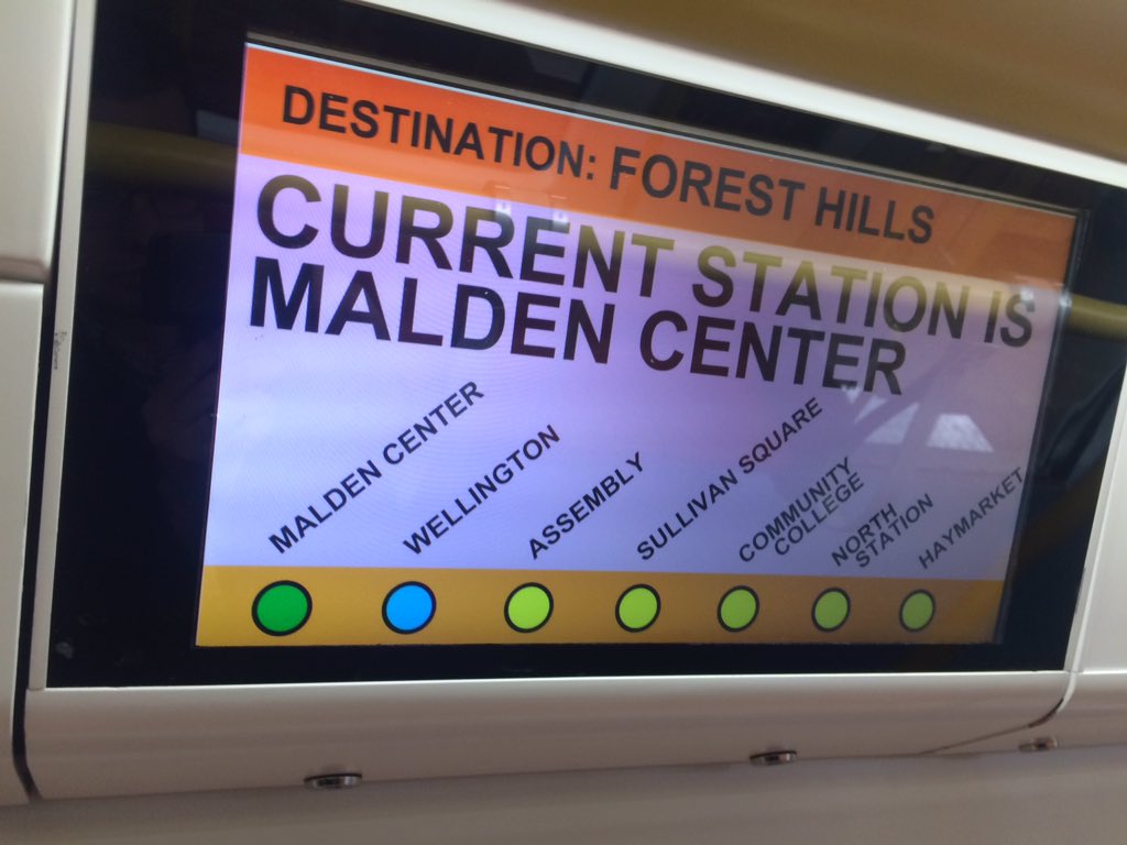
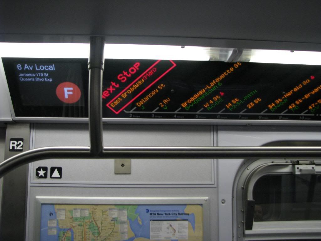
I would have preferred to see something similar to what's on the NYC MTA's newer subway cars...
PartialviewofdigitalstripmaponanR16.jpg

The proposed Orange Line board looks like a standard LCD screen. As such, you can put whatever you want on it with little difficulty, including ads and announcements, and I'd imagine it's just being run by some standard computer hardware. Good for maintaining the thing and means you can update it for style to your heart's content.

While it needs a couple hours from a graphic designer and programmer to look better, I think it's a far better choice than the custom display boards in the NYC trains from that perspective.
 
I think the new cars look so cluttered. Everything inside is so bulky. The windows are much smaller too and the destination displays are gigantic on them.

Remember that this is a 2/3 prototype, so proportions are out of whack.
 
I think the new cars look so cluttered. Everything inside is so bulky. The windows are much smaller too and the destination displays are gigantic on them.

I agree that the destination signs mounted on the windows look absurdly huge. As far as clutter, I think that has to do a lot with the safety yellow railings; I notice the same thing on the brand new buses.

While I like the fold-up seats for wheelchair and strollers, I would really like to see hooks so that bikes can be stored vertically and out of the way of riders. I put my bike on the T maybe once or twice a yar and it always is a drag - I always seem to feel like the bike is in the way of so many people, even if I step out of the car with it at each stop.
 
Are you sure? Look at that picture of our 6'4" governor next to the doors.

Yes. The only dimension that is off is the length. Everything else is to scale. The governor is tall.
 
I think the new cars look so cluttered. Everything inside is so bulky. The windows are much smaller too and the destination displays are gigantic on them.

To me they look very similar to the new Panopticon bus interiors. I haven't yet decided what I think of those, but on the train it does indeed seem needlessly busy.
 
They seem very cold a sterile to me. The need something to warm them up, like wood trim or even some faux wood paneling.
 
C7dIbT7VwAAw1qT.jpg:large


The other issue with these is already cropping up, indoors: glare. In the bright sun you're not going to be able to read them at all.

Hence why NYC (and the Ts on board announcement and exterior destination signs) use LEDs, they are bright enough to cut through most anything.
 
They seem very cold a sterile to me. The need something to warm them up, like wood trim or even some faux wood paneling.

Couldn't agree more - the wood trim and faux wood paneling would be brilliant. It would give a simple, yet retro, elegance to the new cars.
 
I can't decide whether it looks more like a bus or an airport people mover. Either way, it doesn't look quite right. Hopefully it will grow on me, as I'm likely to spend thousands of hours on these things.

Might be the lack of wear and tear... also the lack of ads or any signage.

Aside from the lack of open passage between cars... and the super bright colors, these wouldn't be out of place in Hong Kong, Taipei or Singapore.
 
Might be the lack of wear and tear... also the lack of ads or any signage.

Aside from the lack of open passage between cars... and the super bright colors, these wouldn't be out of place in Hong Kong, Taipei or Singapore.

After looking at them some more, I really dislike the yellow interior car end and the yellow bars. The car would look much better (and feel larger) with them being metal instead.
 
After looking at them some more, I really dislike the yellow interior car end and the yellow bars. The car would look much better (and feel larger) with them being metal instead.

The yellow color is for the visually impaired, no?
 
Media & admin got a tour of the OL mockup:

https://twitter.com/gintautasd/status/844217298844078083

Gintautas Dumcius‏ @gintautasd 22m ago
#mbta New Orange Line car

C7dDJvoXgAY-r1U.jpg:large


https://twitter.com/gintautasd/status/844223106432622593

C7dIbT7VwAAw1qT.jpg:large


https://twitter.com/JoePesaturo/status/844217392297336832

Joe Pesaturo‏ @JoePesaturo 24m ago
Look who's checking out the mock up of new #MBTA #orangeline car!! @gintautasd

C7dC0hgVwAAkzMJ.jpg:large

C7dC3M7V0AAs4Te.jpg:large

C7dDOZMU0AAM7ol.jpg:large


https://twitter.com/JoePesaturo/status/844222270772076545

C7dHqigU0AEpQE6.jpg:large

I like how bright these are. One of the things I don't love about the current orange line is how dim the light is, which is only compounded by the dark finishes.

That said, one of the great things about the new blue line cars is the use of a patterned laminate (kind of a boomarang pattern) Something like that would be a nice was to bring some liveliness to the car with out adding more color.

Well, some of the brightness is design. But part of it is 40 years of improvement in lighting technology (like LEDs).
 

Back
Top