Brattle Loop
Senior Member
- Joined
- Apr 28, 2020
- Messages
- 1,167
- Reaction score
- 2,084
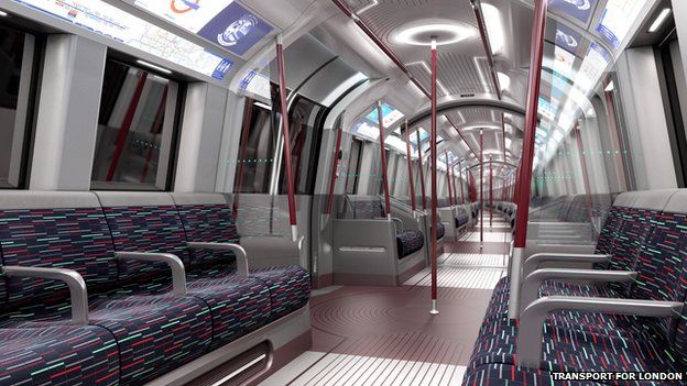
I agree we desperately need new orange line trains but I have to say I sympathize with the aesthetic and comfort complaints. The new seats are considerably less comfortable (I never found the old seats uncomfortable but I do with these) and, while I completely understand not everyone would agree on this, those old trains with the MS paint seats and the faux wood paneling feel like home, the new ones feel extremely sterile by comparison. Worthwhile trade overall but people do notice when those, even somewhat goofy, comforts disappear; a few people I know who also ride regularly have had similar observations.
The #12 cars' seats used to be more comfortable than they are now. At some point in the late 2000s they replaced their black fake-leather seat covers (which had padding) with the current...whatever that color is "bath mat" fabric over what feels like bare, un-padded metal. The old black seats were too-frequently slashed (presumably the current seats were designed to deal with that) but they at least were waterproof (or coffeeproof), unlike the current ones with a bit higher risk of accidentally sitting in a (undetected) puddle of something that hopefully came from a Dunkin. I've had a handful of rides on the oddly-numbered #14 cars, and I can't say that I find the seats themselves to be a particular downgrade, with the exception of the backrests being too short. They are, mercifully, nowhere near as bad as the #5 East Boston Tunnel cars on the Blue Line, which are similarly hard, but so smooth as to be annoyingly slippery, especially when the train is braking heavily.
I generally agree that the aesthetics of the CRRC cars leave something to be desired. I personally find the abundance of yellow unsightly especially given that the seats are orange (I expect a similar clash on the Red Line versions, but have yet to experience those cars in person). To me it fits, though, with the T's somewhat...unpredictable aesthetic decisions. Every new set of passenger equipment lately with the exception of the Rotem coaches on the Commuter Rail (and those are basically clones of older types) has had a new aesthetic design that's essentially come out of nowhere, with a side dish of poorly-executed online polls to choose from a menu of options. There's a distinct lack of consistency (witness the Green Line being back to, yet again, having three different color schemes, this time at least it's on three different vehicle types) across the whole system which is not in and of itself harmful in any way (it's just aesthetics) but which seems to speak to a lack of concern that would be problematic if it spread to other issues. (I personally take significant issue with the current signage standards, which are emphatically not just about aesthetics. Whoever thought "white text in orange bubble on white background" at small sizes was a good idea clearly hasn't tried to read some of the newer Orange Line signs.) It feels distinctly like design by committee, which results in a product which is both perfectly serviceable and utterly unspectacular, probably a pretty good shorthand for the #14 car interiors. Hopefully they can at least keep them clean (that faux-wood paneling doesn't show grime nearly as readily as all that white and yellow in the new cars).

