You are using an out of date browser. It may not display this or other websites correctly.
You should upgrade or use an alternative browser.
You should upgrade or use an alternative browser.
Northeastern eyes dorms
- Thread starter KentXie
- Start date
dshoost88
Senior Member
- Joined
- Apr 14, 2008
- Messages
- 2,167
- Reaction score
- 2,588
I'm checking out NU as a possibility for school...off topic, but does anyone on these boards go there and have a few short words on it?
It is off topic, but I'm the man you're looking for. NU is an awesome time. I moved up here from Florida to go to NU because I was looking for a change. My passion has long been urban redevelopment, so one of the things I was looking for in a college was a place where I wouldn't need a car and could live my dream lifestyle--the urban advantage as NU calls it. The fact that the school has been proactive about improving its academic reputation and physical atmosphere have been the most positive draws for me to be here.
The co-op program here is genius--I don't understand why more colleges don't have this program. I just read that NU has seen their freshman applications increase from 25,000 to 35,000 applications in the past 2 years--and that's just for 2800 spots in the freshman class. According to US News/World Report, we are officially a Top 100 school in the nation (#96 I believe), and we've got the #1 co-op program in the world.
I'm in the College of Engineering and will be the first to tell you--it's f*cking difficult! The coursework has been more difficult than I anticipated, but it has to move quickly to accommodate the co-op schedule. Being walking distance from the Prudential Center, Copley Plaza, Newbury Street, and Fenway Park, as well as having 5 T-stops on/near campus, has proven to make living hear be a truly convenient experience. Unlike BU, Emerson, Berklee, and other urban schools in Boston, you definitely get a sense of place and community here at Northeastern. We have a campus, we have community life, and if you ask me I think this place has been a pretty well kept secret until the past few years.
TheBostonBoy
Active Member
- Joined
- May 8, 2007
- Messages
- 442
- Reaction score
- 0
Ya, I am looking at NU too. I took a tour over April break and I was very impressed. One of my top choices right now.
B
bostoncitywalk
Guest
dshoost88
Senior Member
- Joined
- Apr 14, 2008
- Messages
- 2,167
- Reaction score
- 2,588
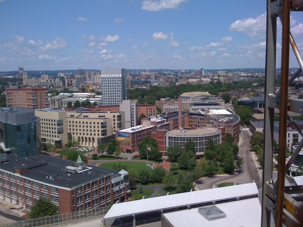
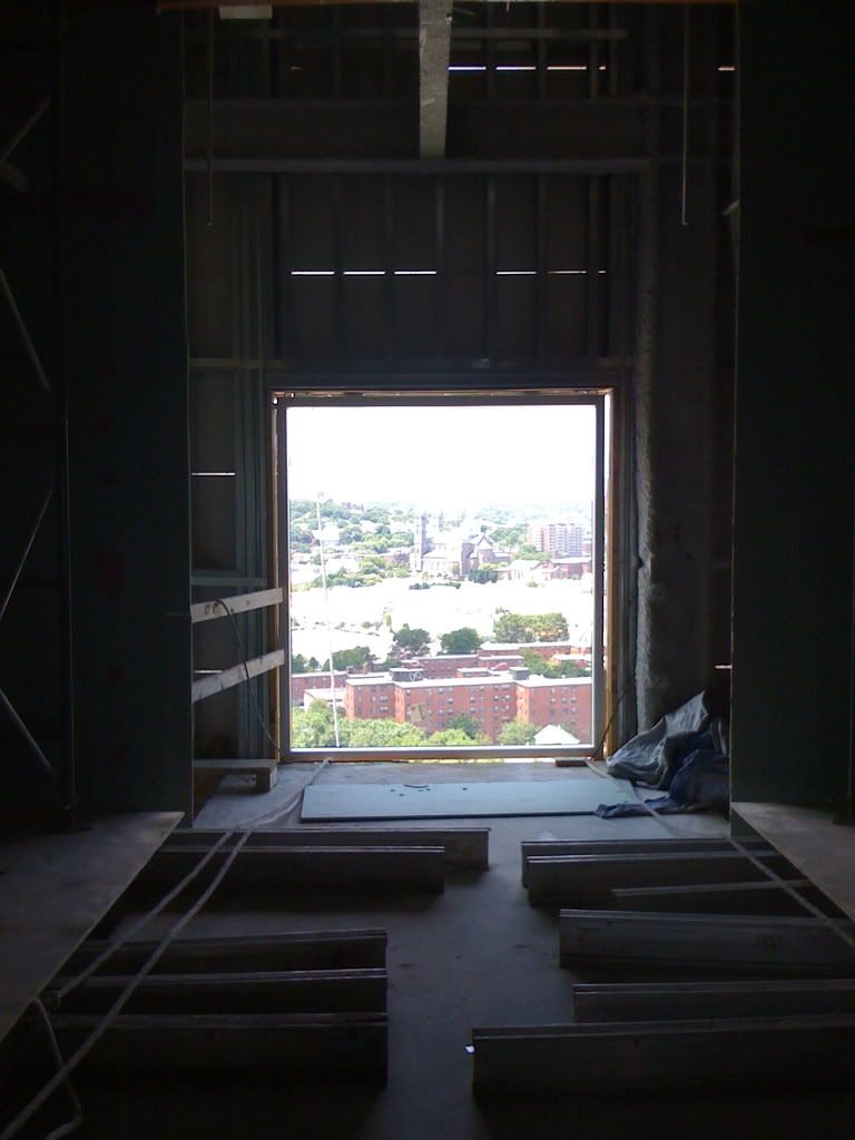
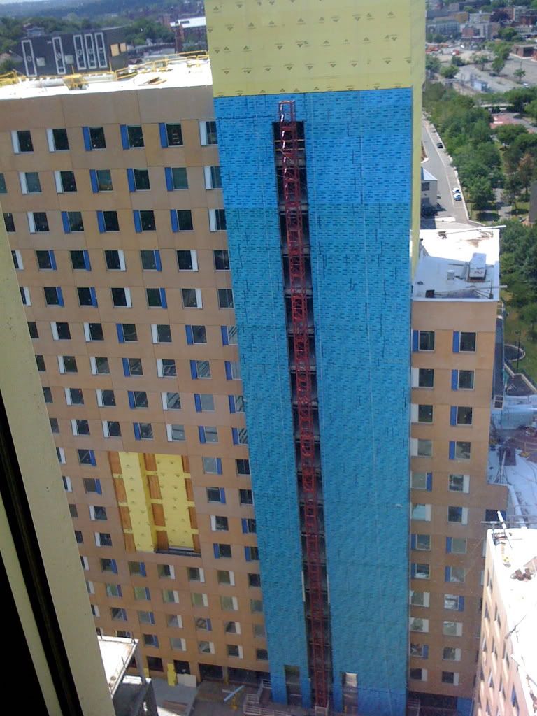
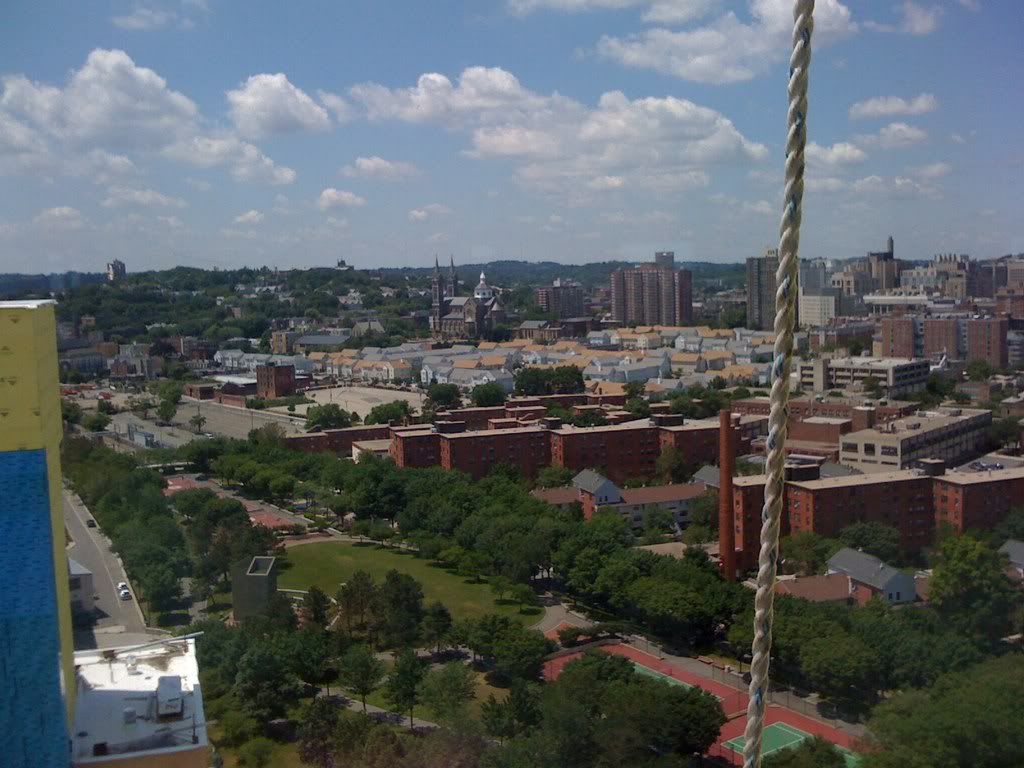
I took a tour today of the interior of Parcel 18, from top to bottom (and then some). I also took about 150 pictures, but at the moment image shack is testing my patience. If I can get it to work later, I'll post those pictures for you.
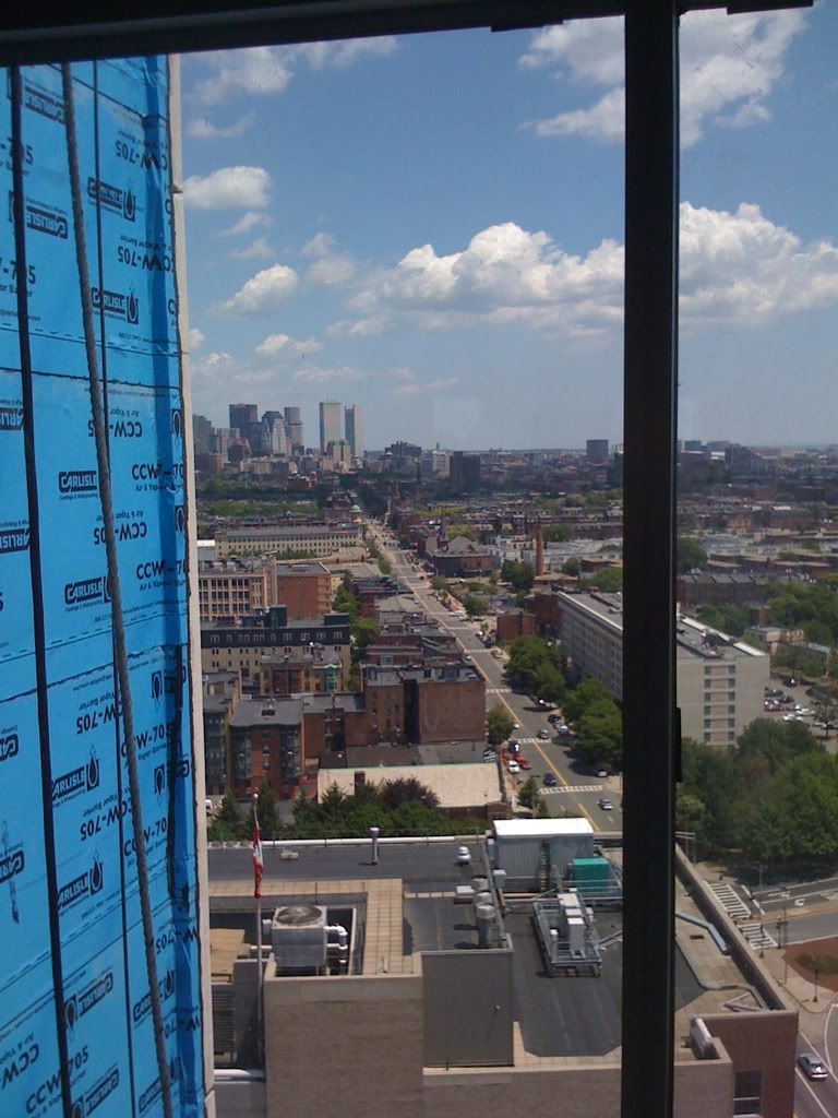
And for the record, whatever aesthetics this building lacks from the exterior, it completely makes up for on the inside. This place is massive, and the detail that makes an operation of this magnitude work is absolutely breathtaking. The city, suburb, and water (yes, water!) views from the top are jaw-dropping, and the green features of the construction are seen everywhere. Double-pain glass, low-flow plumbing, 85% post consumer dry wall, locally manufactured materials, and soon-to-come there will be a green roof. Ahh, I can't wait to show you guys my photos.
And for the record, whatever aesthetics this building lacks from the exterior, it completely makes up for on the inside. This place is massive, and the detail that makes an operation of this magnitude work is absolutely breathtaking. The city, suburb, and water (yes, water!) views from the top are jaw-dropping, and the green features of the construction are seen everywhere. Double-pain glass, low-flow plumbing, 85% post consumer dry wall, locally manufactured materials, and soon-to-come there will be a green roof. Ahh, I can't wait to show you guys my photos.
dshoost88
Senior Member
- Joined
- Apr 14, 2008
- Messages
- 2,167
- Reaction score
- 2,588
Alright, here we go:
(PHOTOS DELETED)
*************************************************
Please, feel free to shoot me any questions you have about the project. The tour was EXTREMELY informative, and frankly going on a tour like this really gives you an even greater appreciation for the detail and craftsmanship that goes into under-taking such a large project (and to think this is only a mid-rise, compared to what's going on in major cities around the globe).
Last edited:
TomOfBoston
Senior Member
- Joined
- Mar 29, 2007
- Messages
- 1,241
- Reaction score
- 465
WOW!! Impressive set. The red/brown facade does not appear as ugly in your pics as it did in earler shoots. I still think it would look better if the entire facade were the white/grey shown in the original drawings.
stellarfun
Senior Member
- Joined
- Dec 28, 2006
- Messages
- 5,709
- Reaction score
- 1,542
Dshoost, thanks for the pictures, but there are so many of them, you've probably killed the thread. I'm guessing there are perhaps 40 megs of photos, and the pages are going to take most users computers a while to download.
dshoost88
Senior Member
- Joined
- Apr 14, 2008
- Messages
- 2,167
- Reaction score
- 2,588
Dshoost, thanks for the pictures, but there are so many of them, you've probably killed the thread. I'm guessing there are perhaps 40 megs of photos, and the pages are going to take most users computers a while to download.
I may not be an expert on this, but I doubt that 40 megs of photos will kill the thread. On skyscrapercity, I know people on the Miami and Dubai threads that post upwards of 80-100 megs at a time, and those load times are fine.
BarbaricManchurian
Senior Member
- Joined
- Mar 12, 2007
- Messages
- 1,067
- Reaction score
- 65
Nice pics, really love the interior shots and skyline views, we get so few of them here.
Here's a tip: you can boost your post count and not overload a page with photos by posting maybe 10 photos per post, its not neccessary for me (yes, on some forums I posted 200 photo posts, it was a phototour so it probably was a little justified and anyway I use opera which has no problems with tons of photos, even on slow comps) but it would help others !
!
Also, a little problem: some of your image tags aren't complete, you need to finish them to post them. I'll post them for now, if you post them later I'll edit them out.
Here's a tip: you can boost your post count and not overload a page with photos by posting maybe 10 photos per post, its not neccessary for me (yes, on some forums I posted 200 photo posts, it was a phototour so it probably was a little justified and anyway I use opera which has no problems with tons of photos, even on slow comps) but it would help others
Also, a little problem: some of your image tags aren't complete, you need to finish them to post them. I'll post them for now, if you post them later I'll edit them out.


stellarfun
Senior Member
- Joined
- Dec 28, 2006
- Messages
- 5,709
- Reaction score
- 1,542
I may not be an expert on this, but I doubt that 40 megs of photos will kill the thread. On skyscrapercity, I know people on the Miami and Dubai threads that post upwards of 80-100 megs at a time, and those load times are fine.
dshoost, I was probably too high on the megs total. I went off the first three photos which average about 400 kb each, and I see you have lots of photos with half that file size.
I used Mozilla to load the pages this morning, and Firefox looks to be holding all the pictures in active cache and using nearly 300 megs of memory (293.068 megs to be exact). So at least on my version of Firefox, which is not the new release that came out this month, the page has become a memory hog.
Two suggestions if I may: (1) on some of the pictures it would be helpful to have a caption; e.g., is the panoramic perspective looking NW or SE; for the rooms on the lower floors which have been roughed in, how many students per room. (2) be judicious in what pictures you upload; multiple pictures showing pretty much the same thing don't add much to the story.
As an example of telling a story, I posted a bunch of photos a few days back on the new Harvard Law School building. In the course of preparing the site for the new building, Harvard moved three Victorian era buildings up Mass Ave to a new home. When taking pictures of the moved houses, I noticed they now sat on granite foundations, or what looked to be granite. I took maybe ten pictures of the granite from different angles and lighting because I thought maybe it was faux granite pre-cast. I only posted one, the one that convinced me that Harvard had gone to the expense of putting these buildings on real granite, at least that portion of the foundation that was above grade. (Harvard cheated too by not putting in brick sidewalks.)
BarbaricManchurian
Senior Member
- Joined
- Mar 12, 2007
- Messages
- 1,067
- Reaction score
- 65
HIDEOUS!!! Even the white parts looks like below average public housing, and the salmon parts makes me want to puke. This is a jarring contrast to the good detail in the foreground and even the public housing behind it, sometimes not blending in is a plus but in this it makes it look like an utter piece of shit. Worst new building in Boston, by far, I would give it a 0.5/10 (the only credit i'll give is for height, the execution is just terrible).
- Joined
- May 25, 2006
- Messages
- 7,029
- Reaction score
- 1,853
Anyone have any new pics of this thing?
I apologize in advance for the large quantity of pictures that I am going to post.
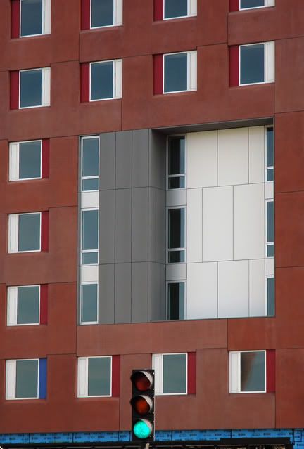
The "hole" in the middle of the 10 story facade facing Ruggles Station
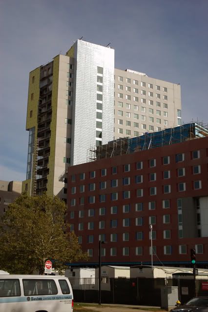
The North building and the 10 story connector from across Ruggles Street
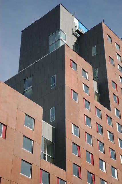
Detail of the South building from across Ruggles Street
The South Building from across Ruggles Street
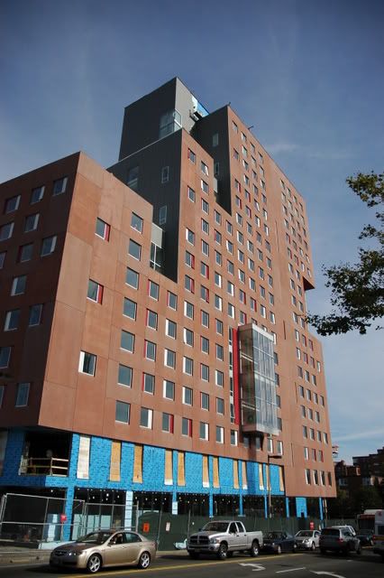
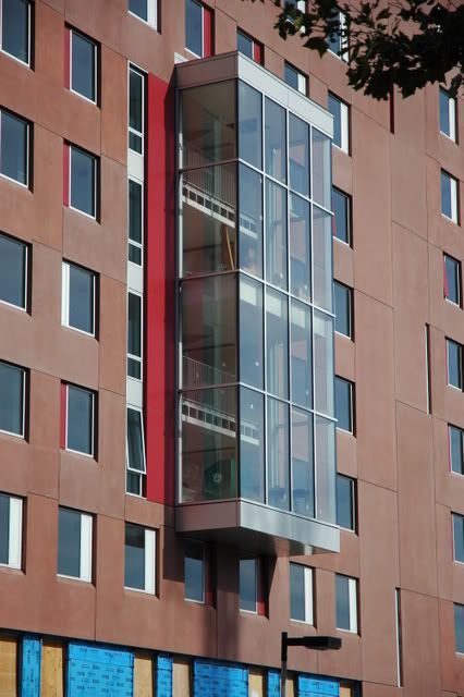
Detail of the glass cube thing on the South Building
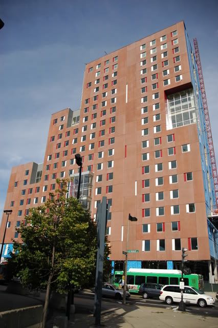
The South Building from the corner of Tremont St. and Ruggles St. (BP Headquarters)
North Building and 4 story connector building from across Tremont St.
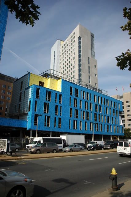
Across Tremont St.
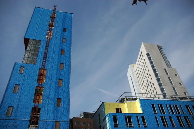
Further down Tremont St.
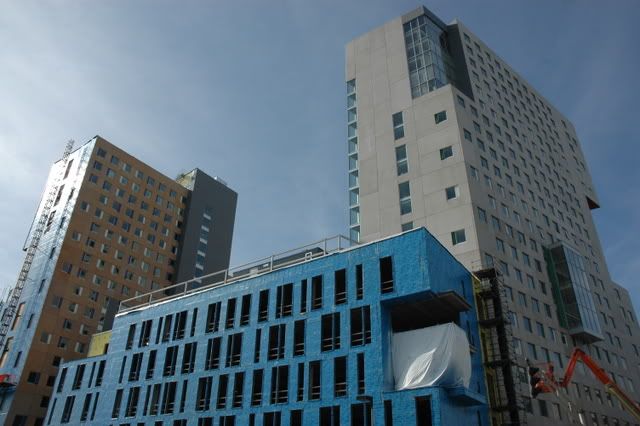
From the top of Renaissance Parking Garage
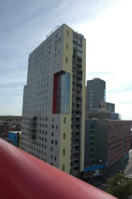
The fa?ade mock-up in the Gainsboro Street Parking lot (with my camera bag in front)
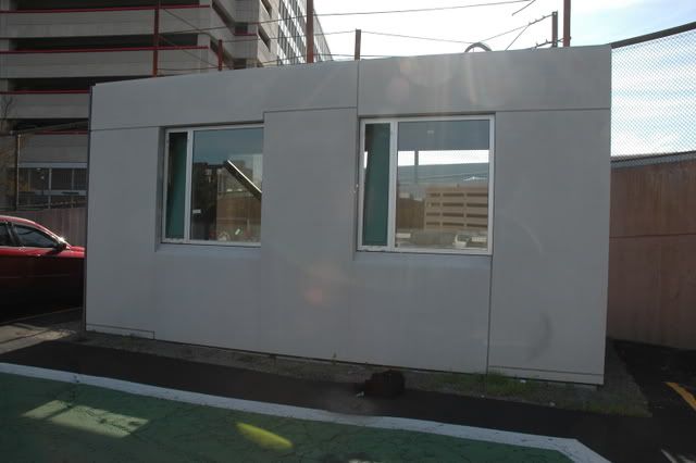
Detail
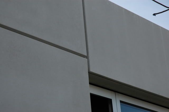
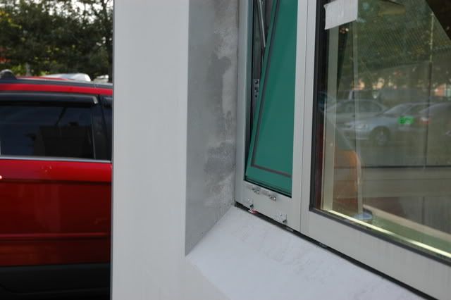
The new panels (did they try to put chemicals on it to rub away the color? it worked)
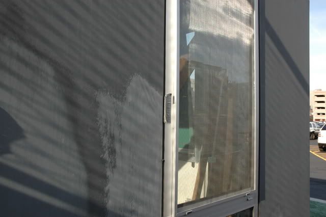
Weird windows
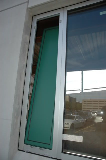
Reverse Side
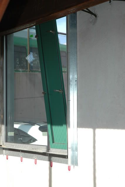
More Wear-and-Tear
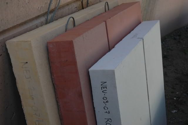
And finally, the infamous three colors:
The "hole" in the middle of the 10 story facade facing Ruggles Station

The North building and the 10 story connector from across Ruggles Street

Detail of the South building from across Ruggles Street

The South Building from across Ruggles Street

Detail of the glass cube thing on the South Building

The South Building from the corner of Tremont St. and Ruggles St. (BP Headquarters)

North Building and 4 story connector building from across Tremont St.

Across Tremont St.

Further down Tremont St.

From the top of Renaissance Parking Garage

The fa?ade mock-up in the Gainsboro Street Parking lot (with my camera bag in front)

Detail

The new panels (did they try to put chemicals on it to rub away the color? it worked)

Weird windows

Reverse Side

More Wear-and-Tear

And finally, the infamous three colors:

This is one of the ugliest buildings I have seen built anywhere in the past 5-10 years. It has no redeeming qualities that I can see. The gray looks like drywall patches placed by an amateur. My sister (a NEU Freshman) says that it's a topic of discussion and a running joke among the students there. There's no hiding it, this is ugly.


