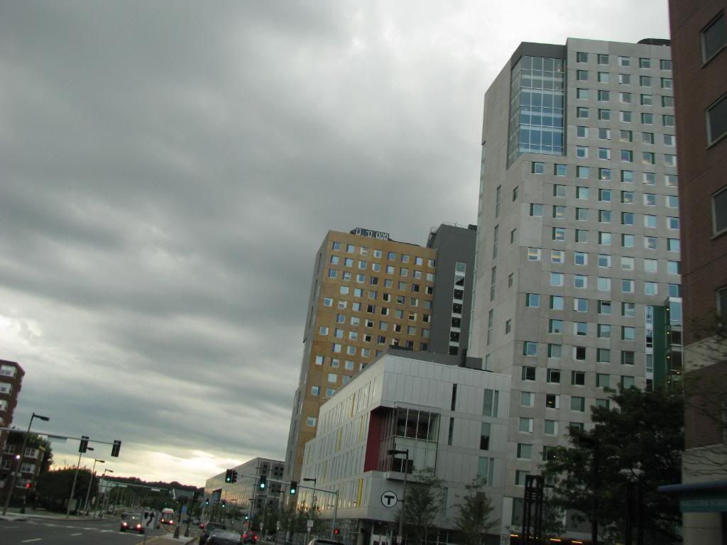
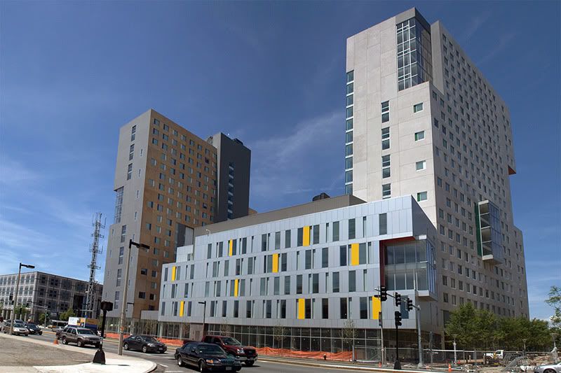
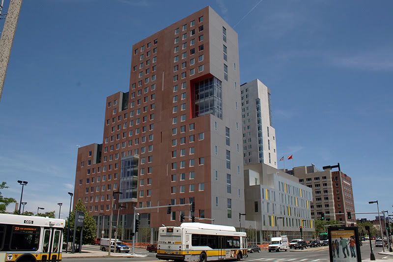
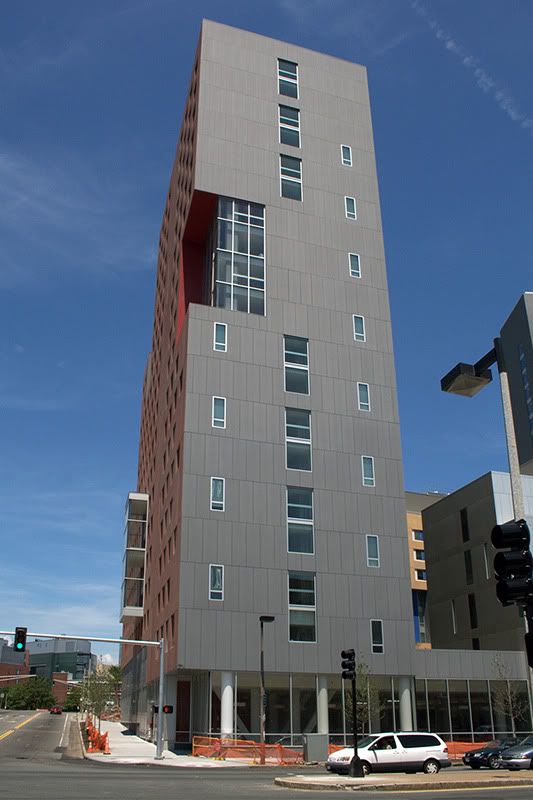
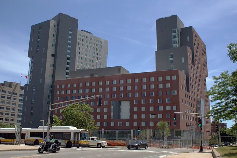
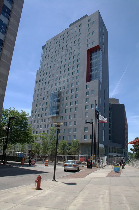
Northeastern eyes dorms

I'm not saying they aren't, I'm just highly sensitive to Green Wash. I'm glad that NU is committed to sustainability but I just have to wonder about the quality of the materials used, as in, will they have to be replaced by more standard materials that are not as "green" when the "green" materials give out sooner?

As an example, in that first link is a picture of the new Cooper Union building in NYC which is touted as being LEED-whatever. Having taken a tour of the building I can say it is quite nice but one major feature, "skin" that moves during the day to offset the heat of the sun, is controlled by hundreds of electric motors and pneumatic pumps. When anyone one of those breaks the heat inside will rise. To offset this they had to install a standard HVAC system. Kinda defeats the purpose, no?

I'm all about sustainability but I hate Green Wash.
 
Still looks cool though. And if I'm reading that correctly, the standard HVAC system is only used when a motor or pump breaks down- in which case that will not be very often at all (theoretically).
 
And if I'm reading that correctly, the standard HVAC system is only used when a motor or pump breaks down- in which case that will not be very often at all (theoretically).

But that defeats the entire purpose AND costs more. This needs to be addressed if actual "green" building technology is going to take off.
 
Actually, it doesn't defeat the entire purpose. Just because a business/organization wants to have a back-up system in their (otherwise) sustainable building doesn't mean that the building is no longer green.

Example: I did a research project in The Bahamas for three months on solar water heaters. The purpose of the project was to find the cost feasibility of installing solar water heaters in the homes and businesses of Eleuthera, The Bahamas. Something I learned is that you can't find a more sustainable and cost-effective way to heat your water in the tropics than solar water heating. Another thing we learned is that the systems don't only work in warm climates--they can be implemented in places like Boston and the north where seasons exist. As long as the temperature outside is above 32 degrees, these heaters work. So if we established earlier that a big component of LEED is to reduce energy consumption, using a SWH in the Northeast as a dominant system and having a back-up electric/gas heater is still a significant step to reducing that energy. If you use your SWH 80% of the year for your hot water needs and then the back-up for as little as 20%, then you're already consuming that much less energy than the next person.

That HVAC system at Cooper Union sounds like a similar scenario. It may be expensive, but that doesn't mean it's not green. And furthermore, when you factor in the simple payback from installing a system like the "skin" provides for heating/cooling, they probably save a lot more money in the long run compared to the costs they'd have associated with using HVAC 24/7.

With construction, something that has a higher fixed cost is generally a cheaper investment in the long run than something that has long-term variable costs with it.
 
You are right to a point, I guess a good analogy would be like these buildings are like hybrid cars. The problem is still that many developers are Green Washing their buildings with fancy sounds materials when all they really need to do is use non-sexy energy efficient products that have the same effect as so moving building skin that save more money in the end and are much cheaper to maintain. When talking about "green" you have to consider money as well. The only way "green" building technologies will become mainstream is if you can convince building owners that it will save them money in the long run. Having cool moving walls or a waterfall in your building might be LEED but it won't be cheap.
 
I disagree...This project is uninspiring from a purely architectural perspective but I think it succeeds urbanistically. I like the massing and I like the way it relates to the street. Where One Western follows a conventional modernist/corbusier anti-urban tact. This project, however, is fully urban. It maintains the streetwall and has an open, groundfloor, retail presence. To me that makes up for its myriad aesthetic shortcomings.

This project is developing a big FAIL on its exterior circulation and egress in relation to the bikepath.... they undoubtedly realized a bike path was there, but didn't seem to understand that it is kind of a superhighway as Boston bicycle circulation is concerned.... the path has always bottlenecked right into the T station entrance, so its always been a tricky spot, but it has been compounded severely by the siting of a main entrance to the building right at that same spot! Now they have had to not only put up several quickly made signs advising cyclists to slow and move with caution through the area, but have also had to have not one but TWO traffic cops mediating the flows during rush hour.....

and its not for lack of space, there is enough room along the NW facade for a huge plaza between the bike path and the building, probably 80' or more at its widest. But at the Northern corner it all comes together nastily
 
today
120-2.jpg
 
Columbus Ave really could be a grand boulevard entrance to Boston but instead remains a soulless highway with cheap architecture and the second lamest park in Boston (I am referring to the Southwest Corridor Park only along Columbus Ave, there are nicer sections in other places).
 
what is the first lamest?


edit: whoops read that wrong. thought you said part instead of park. The answer is clear to that.
 
Columus Ave. isn't the safest street last time I checked. Maybe that should get corrected first. (Or not, it is what it is)
 
I think he means form Melina Cass Boulevard, but even that thoroughfare is more of an clumsy anti-urban mess linking high traffic arteries more than a grand entry into anything.
 
I think he means form Melina Cass Boulevard, but even that thoroughfare is more of an clumsy anti-urban mess linking high traffic arteries more than a grand entry into anything.

Yes, and that is the problem.
 
Columus Ave. isn't the safest street last time I checked. Maybe that should get corrected first. (Or not, it is what it is)

Huh?

Nowhere is safe if you're not aware of your surroundings. Walk down the street with your shades on and iTunes blaring into your ear and you're an easy mark.

Columbus Ave is no more or less safe than any other street near the Northeastern Campus.
 
I think people are judging this building way too harshly.

I like it, especially in light of the wasteland that this stretch of Columbus Ave is. Considering this is a dorm after all, I think it makes a decent effort at being extroverted and interacting with the city around it. I can also appreciate the attempt to mitigate its austere and monolithic character with a bit of whimsical design flourish, albeit minimalist.

Could it be a lot better? Sure. But all in all I think this is a pretty good addition to NEU and this section of Boston.

neu_dorm_columbus.jpg


neu_dorm_columbus_2.jpg


neu_dorm_tower.jpg


neu_dorm_rear.jpg


neu_dorm_ruggles.jpg
 
I don't hate it either. An interesting design, marred by inexpensive finishes.

In a way, it's dumbed-down Steven Holl.
 
In a way, it's dumbed-down Steven Holl.

I am no fan of Holl but a dumbed down Holl is so much worse.

I hate this building because it seems so slapped together to me; the design and the materials all look like cheap knock off of other more notable 21st Century deconstructivist boxes. It wouldn't be so bad if it wasn't so f-ing huge!
 
the design and the materials all look like cheap knock off of other more notable 21st Century deconstructivist boxes.

And doesn't The Clarendon seem like the exact same set of stock 21st Century architectural gestures, dressed in a tux instead of cargo pants?
 
And doesn't The Clarendon seem like the exact same set of stock 21st Century architectural gestures, dressed in a tux instead of cargo pants?

The Clarendon executes them better and uses better materials. It doesn't look slapped together and it isn't as bulky.
 

Back
Top