Northeastern eyes dorms

DSCN0068.jpg
 
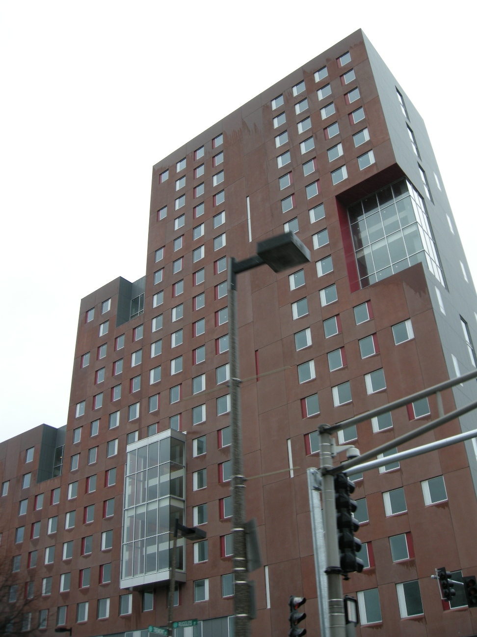
Yikes...this may be the ugliest building I have ever seen

Everything about it is a massive failure...and the facade looks like it is going to melt after being rained on.

Seriously it looks like a gigantic building made out of cardboard boxes...
 
I don't understand the recent trend of primary colors being used to accent buildings, such as the window panels here or the awful brick inlays on the House of Blues.

I think the BRA is in cahoots with the makers of Trashubond paneling.
 
If you're a little away from the building (like this picture) the outside looks like it's made of carpet. It's a horrible building indeed.
 
Okay, this project isn't quite a homerun... Nonetheless, the architect deserves credit for making the most of a tight construction budget by using the cheap materials in a creative and honest fashion. I think people are reacting strongly against these buildings because we're not used to new construction taking on such a hard and minimalist look around here. We're used to lame, faux historicism with a few polite modernist gestures. But these buildings don't try to hide the fact that they're made out of cheap precast panels. Rather, they try to create an interesting aesthetic out of this reality.

If I had to choose between this project and that other famous example of precast shittyness -- the Hotel Commonwealth -- I would take this one any day of the week.
 
Um, it's one hell of a dorm compared to some of the ones I've toured.

Remember, college dorm NOT Ritz-Carlton.
 
So it'll be abandoned for decades to come? And its the tallest building in the country?
 
Actually, compared to dormitories at other colleges, this place is more like a cruise ship. Granted the rooms are smaller than those in West Village @ Northeastern, but the list of amenities at Parcel 18 is jaw-dropping.
-1200 Bed dormitory
-22-story tower with Charles River & Boston Harbor views from the top floors
-Faculty housing
-A brand new dining hall facility that can serve up to 500 people at once; dining hall includes brick oven pizza, all-day breakfast buffet, and a sushi bar, along with traditional dining options.
-Ground floor retail, including Jamba Juice & Peet's Coffee
-Green Roof access to residents
-State-of-the-art fitness center with cardio machines and upper-body exercise equipment
-Multiple Nintendo Wii lounges throughout the building
-Expanded class space, including a 96-seat lecture hall in the basement of the building
-High occupancy laundry room capacity
-Immediate access to MBTA services via Ruggles "T" Stop, directly next to the main entrance of the facility
-LEED Gold Certification building candidate

Wait till you guys see the life this building brings to the area. You might think it looks like an annex for the Suffolk County Jail, but the reality is that Parcel 18 is the Sandals Resort of dormitories in the city.
 
That's what I mean-it's amazing considering it's a dormitory. Compared with others around the county, it's damn handsome.
 
Multiple Wii lounges? Jeez, my dorm can't even pool enough money to repair our dilapidated foosball table.
 
I'll have to check this place out on Saturday. I think I might go to the new student orientation thing that day to find my way around campus.
 
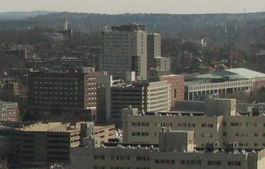
The bottom picture is the BU Law Tower. It's not a dorm.

It may be converted to one if and when BU builds a new law tower at the location of the former Burger King across from Warren Towers or at the current site of the Sargent Gymnasium.
 
The bottom picture is the BU Law Tower. It's not a dorm.

It may be converted to one if and when BU builds a new law tower at the location of the former Burger King across from Warren Towers or at the current site of the Sargent Gymnasium.

I know that but Bubbybu stated that the NEU dorm tower is the new Ryugyong tower. I'm just saying that there are other towers that are even uglier, not just limiting it to dorm towers, but any towers.
 
i toured parcel 18 recently.

it's inside is not nearly as ugly as it's outside and the first floor cafeteria has very tall ceilings. it's a nice space.

the rooms however have VERY low ceilings they feel pretty cramped.

i think they could have at least spent more time designing the operable colored sections of the windows.
 
I know I'm in a tiny minority here, but I have no problem with this project. It's a decent project in my estimation.
 
I biked by it when I was up last week. It has gotten better since I last saw it but I still think it is the ugliest building built in the last few years. It just feels like a poor man's machado & silvetti (I hate 1 Western as well but that building is glorious compared to this.)
 

Back
Top