One Post Office Square Makeover and Expansion | Financial District

I just wonder if the opaque glassification of so many buildings is losing its novelty also. It's great as a changeup, and I like it here - because it IS a changeup in Post Office Square - but in areas where these things are virtually next to each other (cough...cough... Seaport and Raffles/Hancock) it tends to "anonymize" neighborhoods.

Glass works best in a neighborhood as the Jelly to the Peanut Butter. Jelly on Jelly is just.....

Maybe some further diversifications.

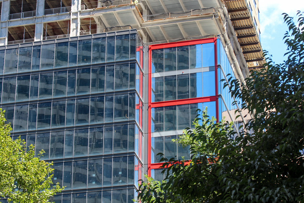
I like this sentiment, but disagree on 1 key point: I DON'T LIKE IT HERE AT ALL!!! With State Street, Winthrop, and soon South Station Tower, there will be a deluge of blue glass downtown. I didn't like the original cladding either, but at least it lent an air of solidity that all this glass doesn't bring. Just look at Toronto's overabundance of (admittedly cheap looking) blue glass and how terrible it all looks without sturdier looking buildings making up the brunt of that skyline. Also, in this building's case, the squat(ish) proportions are getting much worse by buffing out the corners, eliminating the unique cantilever overhangs, and adding that bulge to the back.

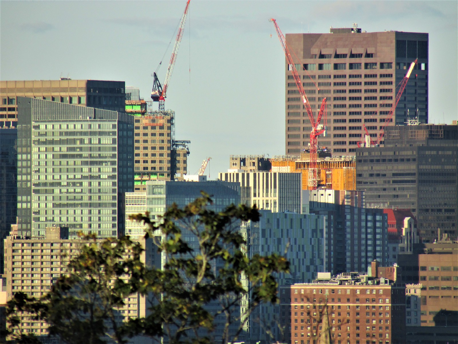
I agree completely on Raffles, and it's only going to get worse with the Back Bay Garage abominations. The (PERFECT) blue glass Hancock should not be juxtaposed with more blue glass buildings right next to it. The BPDA continues to fail the city by never pushing back on the designs that cheapen the overall aesthetics of the city, while beating the "too tall" drum over iconic proposals like at 1 Bromfield. Surrounding the Hancock with lousier blue glass buildings feels like the crime of the century from an architectural standpoint.
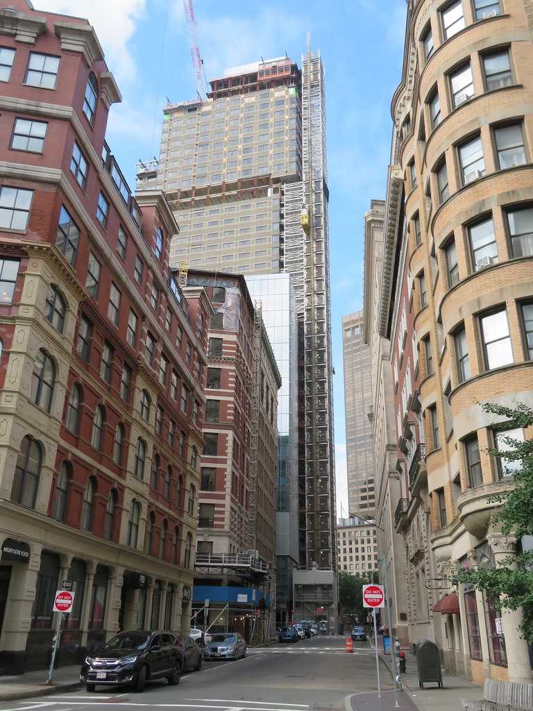
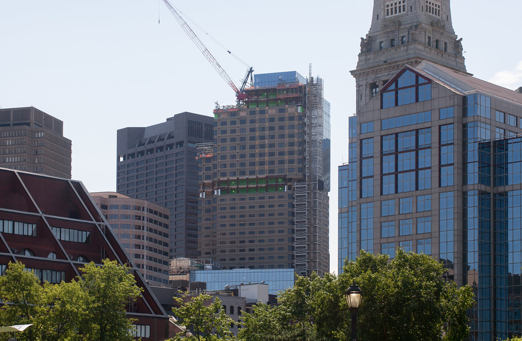
I agree with almost everything here except that I DO feel this new glass reclad is exactly right for the Post Office Square location. In its old form it blended in with all of the brown/beige/other dirt-tones it is immediately surrounded by. Now in its blue glass it definitely lets its presence be known. Yes there is a lot of blue glass going up around the city, but the other new ones are far enough away and most of those also stand out among their immediate neighbors- MT, 1 Congress, SST etc- all are unique because they are different from their surrounding buildings' color schemes. The big exception is how Raffles is going to look next to Hancock, along with the other glass boxes that will be at Back Bay station, all of which is not going to sit well in the very glass-heavy Back Bay skyline.
 
Isn't South Station Tower's glass more gray than blue and State Street is looking gray compared to the renders? There is such a thing as too much glass **ahem Seaport ahem** but different colors of glass thrown about the Boston Skyline really shows the character of the city with all the old stone towers. Boston has a big history but it's still alive and important. At least that's my thoughts when I see the contrasts of materials that make up our skyline.
 
State Street is, by no rational definition, "blue glass." It's an agnostic mirror w/o any tint.
 
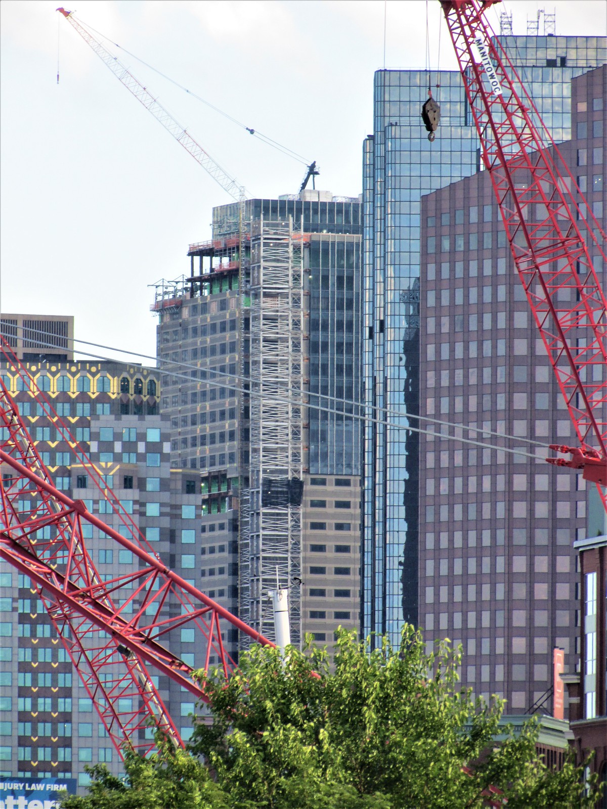
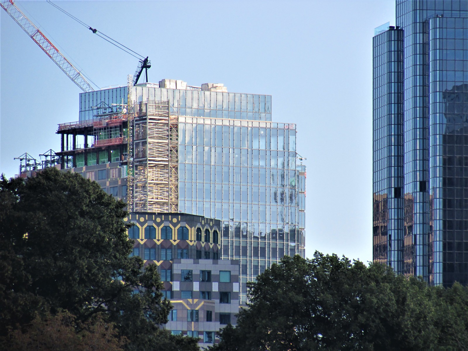
There have to be material supply issues here, right? This project started almost 2.5 years ago at this point (spring of 2019 from the pics in this thread). Could this end up being a 4 year project?
 
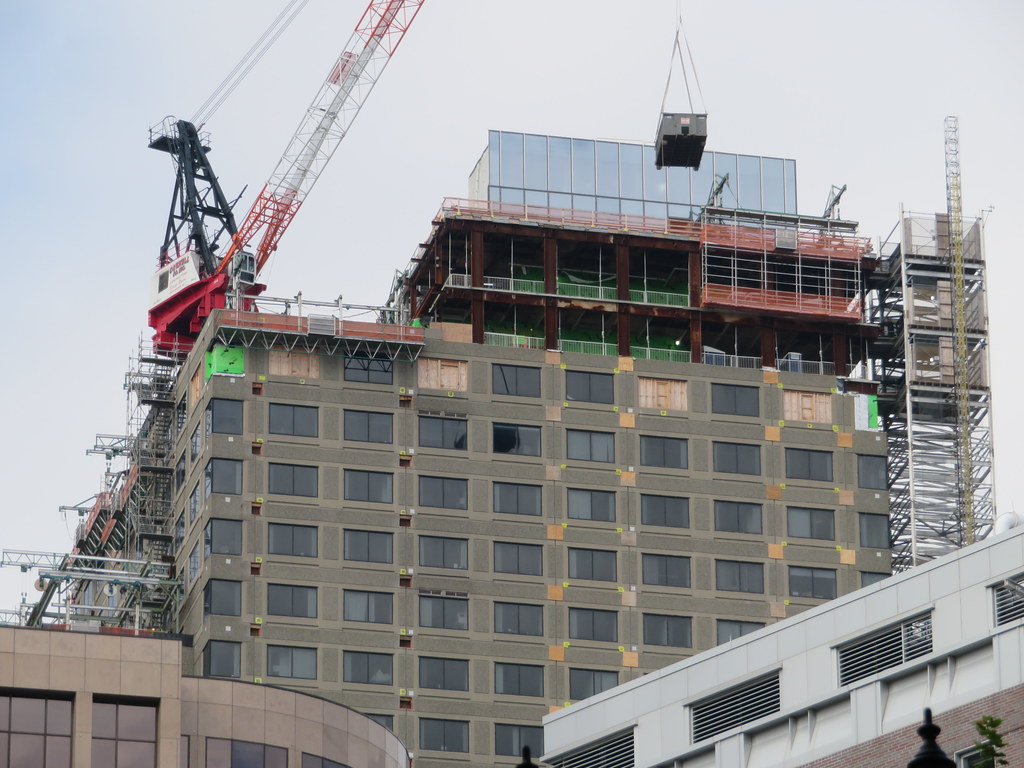
They still have to add steel to the corners like we see in these photos all the way back from August 2020 before they can continue cladding upwards so not sure why theyre not doing that first to get the floors ready. They also still have to remove the old cladding from about 1/3rd of the tower as well where it still has the smaller windows. They should be able to do these before the glass comes in. Looking back through the pages its been a LOOONG time since weve seen any movement on the lower half cladding.

50250274137_cdc423beca_b.jpg


50250273862_2a99eb0fa3_b.jpg


50250273697_754e599314_b.jpg
 
Gd18vGP.jpg


I said it before and I'll say it again: This is actually pretty damn cool looking!

I wish they'd just reclad a bit from the top down and leave the rest as is. I bet that would catch more eyes than the finished product will.
 

Back
Top