stick n move
Superstar
- Joined
- Oct 14, 2009
- Messages
- 13,482
- Reaction score
- 24,540
Again though just like with SST the VAST majority of people will not see the tower from that view.
Something like this is what people will see.
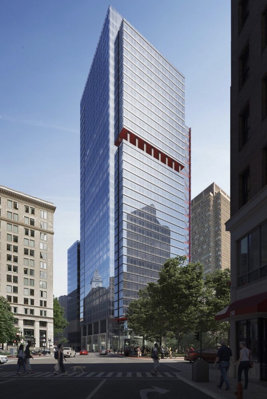
Im not saying its better or worse, just realistic.
Something like this is what people will see.
Im not saying its better or worse, just realistic.
")
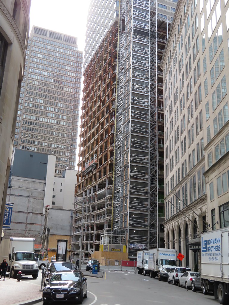 IMG_1280
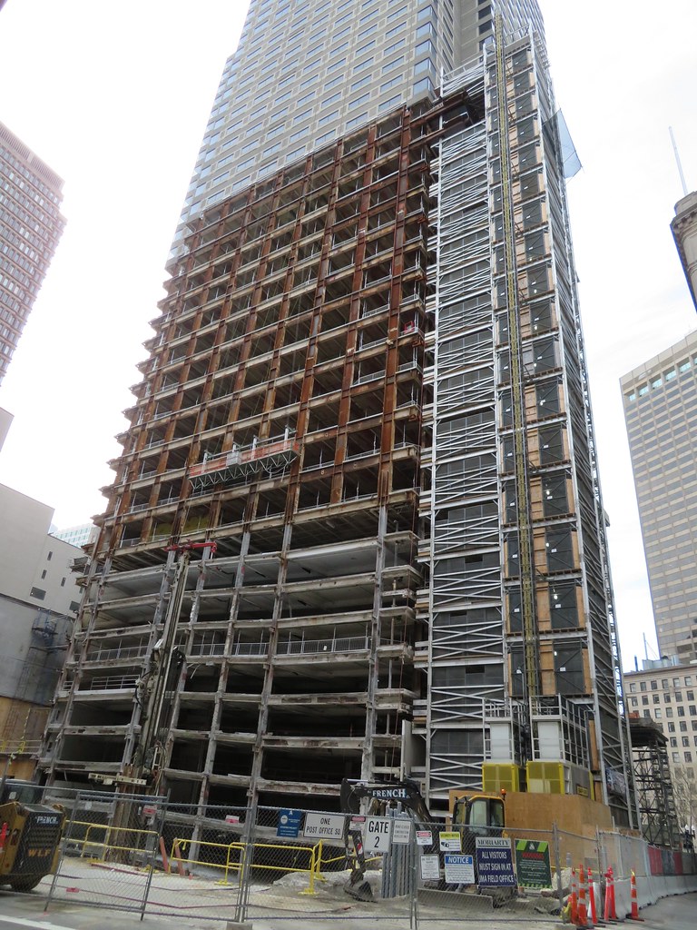 IMG_1282
 IMG_1283
 IMG_1287
 IMG_1292
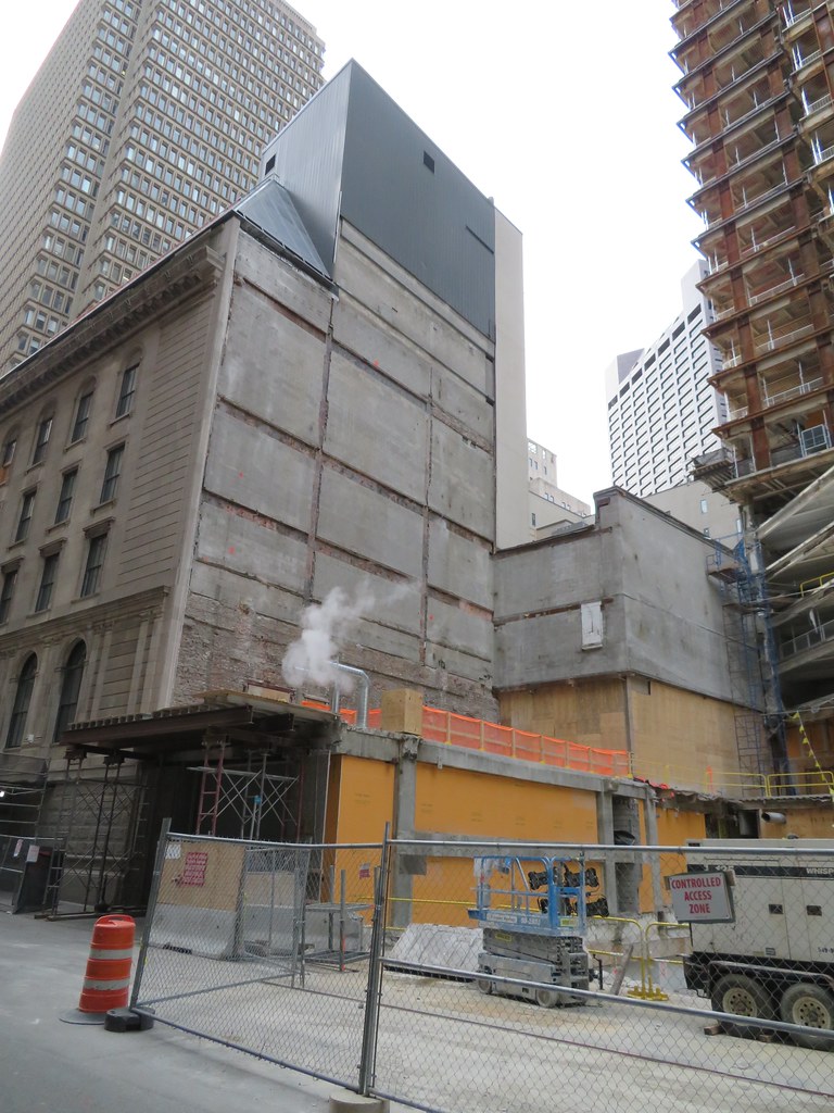 IMG_1288
 IMG_1291
 IMG_1335
 IMG_1297
 IMG_1300