You are using an out of date browser. It may not display this or other websites correctly.
You should upgrade or use an alternative browser.
You should upgrade or use an alternative browser.
One Post Office Square Makeover and Expansion | Financial District
- Thread starter JumboBuc
- Start date
 IMG_4375
 IMG_4437
 IMG_4477
 IMG_4508
 IMG_4510
 IMG_4538
 IMG_4896
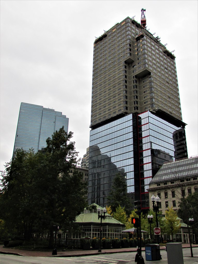 IMG_4919
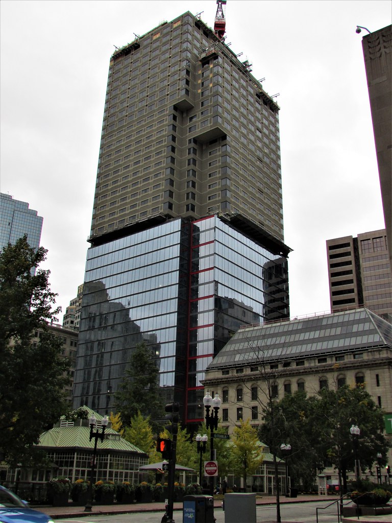 IMG_4920
atlantaden
Senior Member
- Joined
- May 31, 2006
- Messages
- 2,679
- Reaction score
- 3,344
In my younger years, this was one of my favorite buildings. But like many things, tastes change. I'm lovin this!
 IMG_5175
- Joined
- Sep 15, 2010
- Messages
- 8,894
- Reaction score
- 274
Baumeister
New member
- Joined
- Aug 8, 2020
- Messages
- 26
- Reaction score
- 287
- Joined
- May 25, 2006
- Messages
- 7,064
- Reaction score
- 1,990
They should stop the conversion there. It would confuse the hell out of people!
Equilibria
Senior Member
- Joined
- May 6, 2007
- Messages
- 7,229
- Reaction score
- 8,759
They should stop the conversion there. It would confuse the hell out of people!
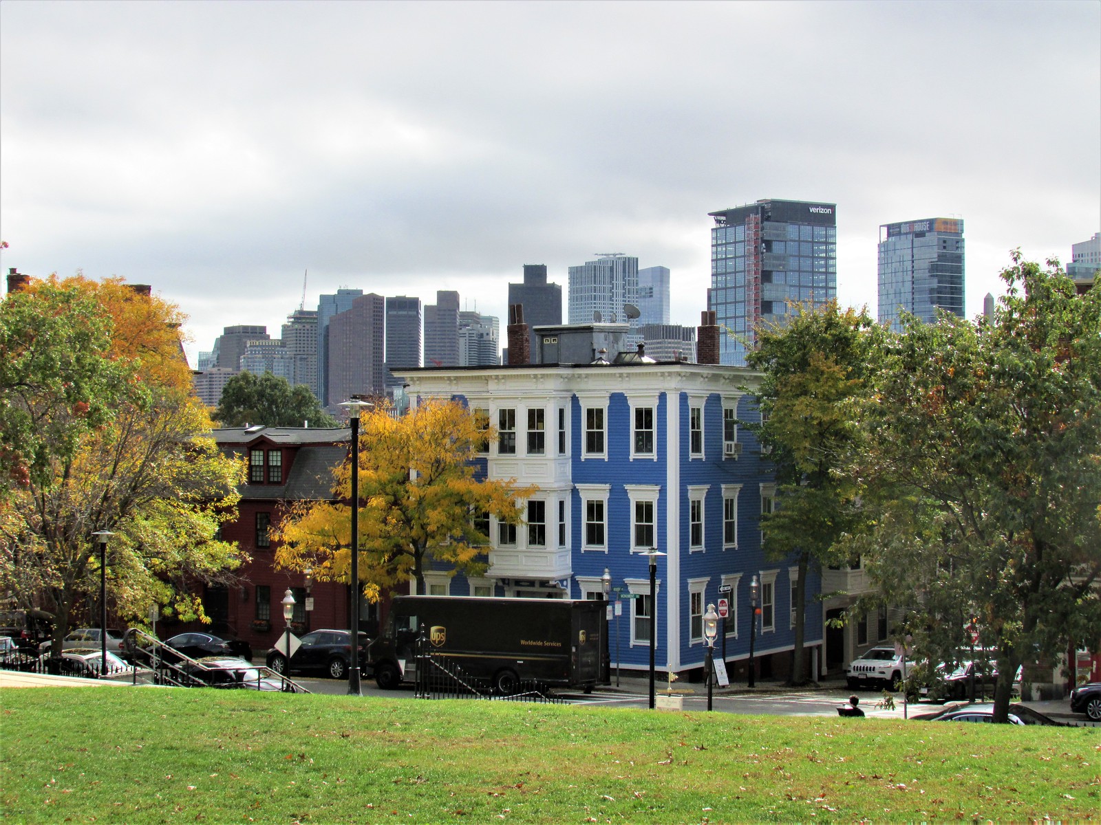
This is one of those pictures that will show up in Cracked.com lists in the future - "you won't believe this is real!!!!!!!"
JeffDowntown
Senior Member
- Joined
- May 28, 2007
- Messages
- 5,048
- Reaction score
- 4,226
You rarely get this kind of "before and after" in a single photo!
FormFollowsBudget
Senior Member
- Joined
- Jan 15, 2015
- Messages
- 2,318
- Reaction score
- 4,106
Please tell me those red accents arent staying.
They are - I like them so far.
literally the only interesting thing about this reclad. yes, let's lose the one element that makes this slightly less boring than just a glass box. super idea.Please tell me those red accents arent staying.
They are - I like them so far.
+1. We don't really need another anonymized boring glass box. Spice this baby up any way possible. I hope the red is lit at night.
+1. We don't really need another anonymized boring glass box. Spice this baby up any way possible. I hope the red is lit at night.
I agree, though it'd be interesting to see what some alternatives might have looked like. I'd have been a fan of deep green in homage to the Celtics, or Black & Gold for the Bruins, etc., as possibilities. I'm not even a big sports fan; I just like the civic aspect. But I definitely agree that bold red is better than plain box.
I agree, though it'd be interesting to see what some alternatives might have looked like. I'd have been a fan of deep green in homage to the Celtics, or Black & Gold for the Bruins, etc., as possibilities...
They should have done this with the towers by the Garden.
FormFollowsBudget
Senior Member
- Joined
- Jan 15, 2015
- Messages
- 2,318
- Reaction score
- 4,106
I agree, though it'd be interesting to see what some alternatives might have looked like. I'd have been a fan of deep green in homage to the Celtics, or Black & Gold for the Bruins, etc., as possibilities. I'm not even a big sports fan; I just like the civic aspect. But I definitely agree that bold red is better than plain box.
I imagine red was chosen as a homage to the historic brick color most of Old-Boston is built from.