You are using an out of date browser. It may not display this or other websites correctly.
You should upgrade or use an alternative browser.
You should upgrade or use an alternative browser.
One Post Office Square Makeover and Expansion | Financial District
- Thread starter JumboBuc
- Start date


 IMG_3735
 IMG_3755
- Joined
- Jan 7, 2012
- Messages
- 14,173
- Reaction score
- 23,688
 IMG_5261 by Bos Beeline, on Flickr
 IMG_5264 by Bos Beeline, on Flickr
 IMG_5266 by Bos Beeline, on Flickr
 IMG_5268 by Bos Beeline, on Flickr
 IMG_5269 by Bos Beeline, on Flickr
 IMG_5270 by Bos Beeline, on Flickr
 IMG_5274 by Bos Beeline, on Flickr
 IMG_5275 by Bos Beeline, on Flickr
 IMG_5279 by Bos Beeline, on Flickr
 IMG_5278 by Bos Beeline, on Flickr
Boston02124
Senior Member
- Joined
- Sep 6, 2007
- Messages
- 6,936
- Reaction score
- 7,088
Brad Plaid
Senior Member
- Joined
- Jan 17, 2013
- Messages
- 1,310
- Reaction score
- 1,559
bigpicture7
Senior Member
- Joined
- May 5, 2016
- Messages
- 4,068
- Reaction score
- 10,551
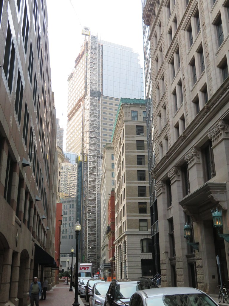
View down Milk St (from 9/18).
When this project's complete, this vista will certainly be quite different than it was:

When this project's complete, this vista will certainly be quite different than it was:
 IMG_4030
 IMG_4043
 IMG_4149
fattony
Senior Member
- Joined
- Jan 28, 2013
- Messages
- 2,099
- Reaction score
- 482
I saw the red panels in person the other day. They really seem out of place. Out of place on this building, out of place for PO Square, and even out of place for Boston in general. The saturated, primary RED is harsh and jarring. The color palette of PO Square is all beige, brown, muted red brick, and the soft greens of weathered copper and trees/plants. They easily could have a brought in another color to the mix, just not so saturated.
 IMG_4305
 IMG_4730
Boston02124
Senior Member
- Joined
- Sep 6, 2007
- Messages
- 6,936
- Reaction score
- 7,088


stick n move
Superstar
- Joined
- Oct 14, 2009
- Messages
- 13,482
- Reaction score
- 24,540
That first pic gives a pretty good idea of what the finished product is going to look like.
No. Boston buildings can either have one façade style or eight. It's the rules.Any chance they could just leave it the way it is now? Looks pretty cool.
Boston02124
Senior Member
- Joined
- Sep 6, 2007
- Messages
- 6,936
- Reaction score
- 7,088
stick n move
Superstar
- Joined
- Oct 14, 2009
- Messages
- 13,482
- Reaction score
- 24,540
What a massive improvement over what was one of the ugliest buildings in Boston.