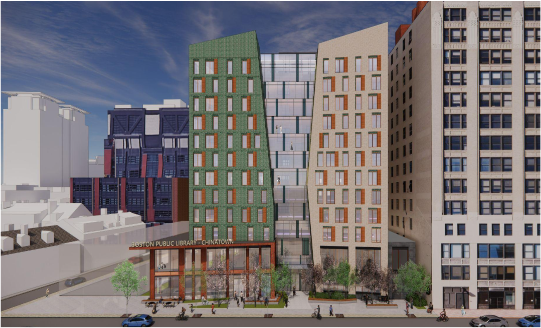
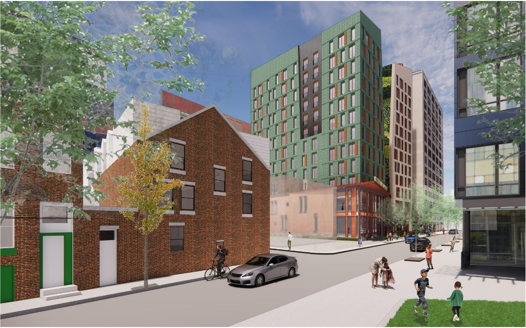
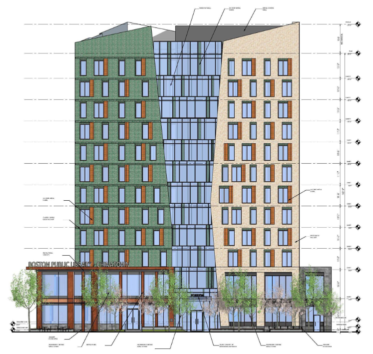
Responses to the RFP will include a Boston Public Library branch on the ground floor of the development.
You are using an out of date browser. It may not display this or other websites correctly.
You should upgrade or use an alternative browser.
You should upgrade or use an alternative browser.
Parcel R-1 | Chinatown
- Thread starter 12345
- Start date
MjolnirMan
Active Member
- Joined
- Jan 18, 2016
- Messages
- 255
- Reaction score
- 573
For those out of the loop since the Chinatown library branch was planned as part of the Parcel P-12 development on Tremont St.: that project was contingent on the developer bribe off-site affordable housing funds from Winthrop Center. The COVID-related redesign of that building, which reduced a 2nd residential tower, proportionally shrunk Millennium's contributions and rendered that project unviable in the short-to-medium-term.
I believe R-1 has a simpler developmental path because of an agreement for ownership transfer of the parking lot from Tufts to the BPDA/DND, and this was actually the original preferred site for a library by the community anyway. In a community meeting last November, several different wishlist items for the property were expressed:
I believe R-1 has a simpler developmental path because of an agreement for ownership transfer of the parking lot from Tufts to the BPDA/DND, and this was actually the original preferred site for a library by the community anyway. In a community meeting last November, several different wishlist items for the property were expressed:
- Permanent library branch and community space
- Affordable housing (specifically affordable by Chinatown AMI)
- Publicly-accessible greenspace
- Avoiding blocking sunlight to nearby facing residential units on Harvard Street or 66 Hudson
- Affordable parking for the neighborhood
stick n move
Superstar
- Joined
- Oct 14, 2009
- Messages
- 11,971
- Reaction score
- 18,415
MjolnirMan
Active Member
- Joined
- Jan 18, 2016
- Messages
- 255
- Reaction score
- 573
Interestingly, this project only includes about 2/3rds of the parking lot on the side closest to the existing Kneeland building. The remaining 1/3 facing Harvard St. is owned by another party (a church?) who did not engage the developer when they sought to acquire it. This is why a "ghost building" is rendered in these shots.
stick n move
Superstar
- Joined
- Oct 14, 2009
- Messages
- 11,971
- Reaction score
- 18,415
I think this is actually the style of building that looks good with staggered windows because of the angles of the building created by the opening. Overall I think its a nice addition. Nice colors too.
Charlie_mta
Senior Member
- Joined
- Jul 15, 2006
- Messages
- 4,542
- Reaction score
- 6,430
As much as I usually hate asymmetrical windows, in this case they look pretty good.PUT THE FUCKING WINDOWS ON STRAIGHT
Equilibria
Senior Member
- Joined
- May 6, 2007
- Messages
- 7,072
- Reaction score
- 8,287
As much as I usually hate asymmetrical windows, in this case they look pretty good.
I agree. It works here because the building forms aren't rectilinear.
JeffDowntown
Senior Member
- Joined
- May 28, 2007
- Messages
- 4,765
- Reaction score
- 3,606
Really frustrating that the church would not play nice with the empty lots. It is a big impediment to the design of this building.Interestingly, this project only includes about 2/3rds of the parking lot on the side closest to the existing Kneeland building. The remaining 1/3 facing Harvard St. is owned by another party (a church?) who did not engage the developer when they sought to acquire it. This is why a "ghost building" is rendered in these shots.
The parcels along Harvard Street are all owned by the Chinese Christian Church (a series of former row house parcels).
Last edited:
goldenretrievers
Active Member
- Joined
- Nov 14, 2014
- Messages
- 877
- Reaction score
- 615
NorthshoreCity
Active Member
- Joined
- Sep 9, 2020
- Messages
- 122
- Reaction score
- 661
12 floors, 158' tall. Not sure how feasible a 12 storey living wall will be but one can dream that it won't get VE'd out, right?
via PNF: https://bpda.app.box.com/s/mhd7lfl7wqvsra2umzsg4ah19a43kr0x


via PNF: https://bpda.app.box.com/s/mhd7lfl7wqvsra2umzsg4ah19a43kr0x
MjolnirMan
Active Member
- Joined
- Jan 18, 2016
- Messages
- 255
- Reaction score
- 573
The Chinatown Community Land Trust has reached out to the Chinese Christian Church of New England (currently located on Beacon Street in Brookline) to explore the potential purchase of the remaining strip of parking lot, with the goal of developing it into a public green space for the particular benefit of neighborhood children and families. No clue what the odds of success there are, but it would be a great additional impact of this project.
The adjacent streets Hudson and Tyler are also part of a Neighborhood Slow Streets plan, with multiple speed humps being installed directly next to Parcel R-1 on Hudson Street. Hudson is commonly used as a reckless speedway from Kneeland to the Pike or I-93 onramps, despite Albany Street a block to the East providing both functions on a non-residential street, so hopefully traffic calming deters those uses before a kid gets hit crossing from 66 Hudson to the future library.
The adjacent streets Hudson and Tyler are also part of a Neighborhood Slow Streets plan, with multiple speed humps being installed directly next to Parcel R-1 on Hudson Street. Hudson is commonly used as a reckless speedway from Kneeland to the Pike or I-93 onramps, despite Albany Street a block to the East providing both functions on a non-residential street, so hopefully traffic calming deters those uses before a kid gets hit crossing from 66 Hudson to the future library.
atlantaden
Senior Member
- Joined
- May 31, 2006
- Messages
- 2,602
- Reaction score
- 2,726
Loving the green!!12 floors, 158' tall. Not sure how feasible a 12 storey living wall will be but one can dream that it won't get VE'd out, right?
via PNF: https://bpda.app.box.com/s/mhd7lfl7wqvsra2umzsg4ah19a43kr0x
View attachment 28367
View attachment 28368
View attachment 28369
Charlie_mta
Senior Member
- Joined
- Jul 15, 2006
- Messages
- 4,542
- Reaction score
- 6,430
I really love the whole look. It's innovative, but also derivative of some great moments in architecture. I'm thinking art deco, maybe even Le Corbusier, or? I'm no expert, but it seems like it draws from some great things. Can't put my finger on it.Loving the green!!
stick n move
Superstar
- Joined
- Oct 14, 2009
- Messages
- 11,971
- Reaction score
- 18,415
The half and half looked really good imo, hopefully the green isnt too much.
