You are using an out of date browser. It may not display this or other websites correctly.
You should upgrade or use an alternative browser.
You should upgrade or use an alternative browser.
Photo of the Day, Boston Style - Part Deux
- Thread starter castevens
- Start date
- Status
- Not open for further replies.
DowntownDave
Active Member
- Joined
- May 30, 2006
- Messages
- 315
- Reaction score
- 71
I think that the 'base' there is a different building which is indeed from the 50s. 
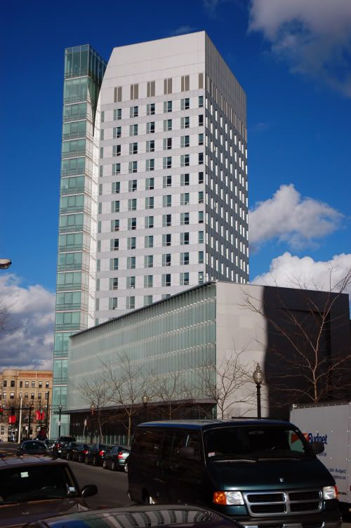
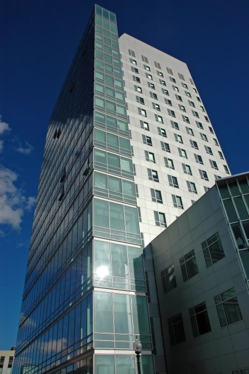
The base of West Village H (the tower 2 posts above) looks just like the rest of the tower. the part of West Village H that comes toward my camera was built with the rest of the building in 2004.
It just looks weird from that angle...
It just looks weird from that angle...
I don't know, I guess just looking at that building every day, I feel like the base looks just like the rest. I think the reason it looks weird in the first image is because they have flaps coming from the windows and from that angle, the flaps make it look like there are no windows...
kz1000ps
Senior Member
- Joined
- May 28, 2006
- Messages
- 8,983
- Reaction score
- 11,813
That's the thing.. from any vantage point other than straight on, the fins make the building look like it has a dull vertical repetition pattern that blocks out the glazed facade. The building is all-right, but I'm not sure what the fins do for it, aesthetically or functionally (it gets sun only later on in the day).
DowntownDave
Active Member
- Joined
- May 30, 2006
- Messages
- 315
- Reaction score
- 71
Nice. Thank you for ressurecting this thread. 
- Status
- Not open for further replies.


