Photo of the Day, Boston Style - Part Deux

Status
Not open for further replies.
Ron Newman said:
Nice photo of a street I walk down every weekday. (Do you live there?)

Forgive my ignorance, but what street is that? Bowesst - beautiful shot.
 
blade_bltz said:
Ron Newman said:
Nice photo of a street I walk down every weekday. (Do you live there?)

Forgive my ignorance, but what street is that? Bowesst - beautiful shot.

Newbury, of course. On what other street in Boston do you see exotic Italian supercars.
 
I believe he is referring to the first pic...where is that?
 
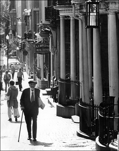
The photo I referred to is the upper part of Hanover Street, less commercial and touristed than the lower part.
 
img9836oz2.jpg
 
Today's vista is brought to you by 101 Huntington

img4885pd0.jpg


img4886ul4.jpg


img4887pn8.jpg
 
great shots ... but looking at those pictures makes me wonder why people here are so worked up about the buidings in the seaport. how are they any worse than the copley tower/mall, the westin, trinity, belvidere, etc ... ? and those buildings are in the back back. why do they get a pass?
 
Good question, Mike. I don't tend to give them a pass any more than some of the mediocrity I see in S. Boston. Most of these Back Bay towers were built at time when the city was desperate to fill in the hole created adjacent to Copley Sq. by the turnpike ramps. Personally, I hated the design of Copley Place. I don't like the idea of a retail center turning its back on the street scape. The blank wall of the Westin, the unrelenting boredom of the Marriott and the lack of imagination sheathing Copley Place offices/mall still depress me, when compared with the old S.S. Pierce building formally on the corner of Huntington Ave. 101 Huntington was an improvement, but it had little competition. It was supposed to be much taller, but S. End residents objected and it was cut in half. I think the taller version would have been even more interesting. The next-door Greenhouse Apts. look like cardboard cut-outs making the nearby buildings look positively inventive. The Trinity is smaller in scale, but I liked much more the old brick office building it replaced, especially being so close to the BPL.

The issue in the Back Bay for may, I believe, is the fact that there exists so much great and very good architecture, that a few mediocre towers do not detract from the area as much. The argument in S. Boston, as I understand it, is that there is a blank slate which runs the risk of being filled with boring architecture, since it is being developed over a relatively short period of time. We mustn't forget that the Back Bay was built over a fifty to sixty year period initially. The change in architectural tastes from Arlington St. to Bay State Rd. is remarkable. It remained moribund for decades until it continued developing from the period of the first Hancock and New England Life buildings through to the Pru phase of the sixties and the Christian Science Center and Copley Place phase that followed. Too bad in some ways that we're in such a hurry to get S. Boston developed (or maybe it will indeed take as long as the Back Bay!) The one thing I can say about the Back Bay is that all those towers look spectacular at night!
 
Padre Mike said:
101 Huntington was an improvement, but it had little competition. It was supposed to be much taller, but S. End residents objected and it was cut in half.

Do you mean 111 Huntington? In all my time researching the history of the Pru I never heard of 101 being originally proposed at twice its final height.

And about Mike's question: 1, I think the simple fact that all those developments have been around for at least a few years lends a sense of futility to our cries and hence there isn't much a point in complaining so much, and 2, like Padre Mike said, the Southie Waterfront is more or less a tabla rasa, and, given recent and current architectural practices, it appears this area is a total loss, and knowing that most any future develpments out here will only add to the problem leaves us here and now foaming at the mouth.
 
Yes, kz, I meant 111 Huntington Ave. I particularly love the two large bas reliefs and the treatment of the top of the building. It hearkens back to the some of the best of the Art Deco era with a modern twist.
 
Brass and pink marble.. gotta love the '80s!

img5014aw0.jpg
 
I love how tall the First National Bank of Boston looks at this angle.

DSC00008.jpg


Didn't notice the traffic pole at all when I took this. O well.

DSC00007.jpg
 
That first picture is awesome. It's an angle of that area I've never seen.
 
I'm going to second that opinion. Boston is great for getting different buildings (different architectural styles) at different angles.
 
Status
Not open for further replies.

Back
Top