Portland Museum of Art Expansion | Portland

I've got to say, I'm also impressed with how recently some of these renderings were made! Based on the fact that we can see 201 Federal topped off...you can tell they took their drone footage and compiled their rendering just within the last ~3 weeks!

1668825070251.png
 
After watching the videos again I've come up with my final ranking with an understanding that I would be extremely proud to have any of my top 3 come to fruition:

1) Toshiko Mori
2) Adjaye Associates
3) Lever Architecture
4) MVRDV

After watching the videos this would be the order of my preferences as well. Mori has the best interior/exterior combined. I like the Adjaye interior.....but prefer the Lever exterior. I personally can't stand the MVRDV design and really disliked their presentation as well.
 
After watching the videos this would be the order of my preferences as well. Mori has the best interior/exterior combined. I like the Adjaye interior.....but prefer the Lever exterior. I personally can't stand the MVRDV design and really disliked their presentation as well.
Very well said, I wonder if MVRDV watched the other presentations and said “on s***” 😂. That was pretty bad in my opinion. Love the Adjaye design and presentation!
 
After watching the videos this would be the order of my preferences as well. Mori has the best interior/exterior combined. I like the Adjaye interior.....but prefer the Lever exterior. I personally can't stand the MVRDV design and really disliked their presentation as well.
My thoughts exactly. MVRDV's presentation looks as though they were still hashing out ideas when they realized they were running out of time and had to get something together to present. It is very poorly put together and doesn't really convey a congealed concept. Gut reaction to the exterior of Toshiko Mori's design was not great but it has grown on me and I think their interior is absolutely #1. Lever forgot that this is a museum and needs wall space not windows for much of the art to be displayed. Adjaye's proposal leaves me lukewarm. Toshiko Mori it is.
 
Really impressed with all these. Fun to watch the slick presentations for each.

For what it's worth, my picks in order 1) Mori & Lever (a tie). 2) Adjaye, 3) MVRDV.

In my opinion just based on the videos and photos and a couple minutes of reflection, I think the Mori and Lever designs strike the best balance between aesthetics and function. I like how these two would both create a grand entrance on Free Street while also utilizing the space on the High Street. The Mori design has that beautiful glass and the Lever design has that smooth curved roofline. The Adjaye design has great looking materials and that cantilevered extension looks beautiful but I wish the main entrance was on Free Street instead of a blank wall there. Even the MVRDV design has some cool features (and I like some of their other work, hello book mountain) but it doesn't strike me as a unique building for this space vs, any other location.
 
Mori alongside the 1982 main structure produces a complimentary duality of styles. I thought I had seen the Adjaye influence somewhere, and sure enough here it is: 1978 National Gallery of Art in D.C. Nothing new here. Levy is nice, though could belong in the woods. Portland is not that now. And MVRDV produces images for me of hipsters growing weed in an urban commune in Brooklyn. Mori gets my vote.

stringio.jpg
 
Last edited:
Looking through all of these again, they all have positives and negatives. After trying to come up with pros, cons, and questions on each, I now feel less sure about which I like - there isn't one that is clearly better than the others. Here are the things that occurred to me:

LEVER
  • Still love the overall form of the building, but I'm unsure about the massing of the Free St side being so close to the massing of the Payson.
  • Unsure about the emphasis on indoor/outdoor spaces - the first floor performance space falling out into the High St courtyard, for example. I like the rooftop outdoor space, but how much of the year would it be useful?
  • Overall I love the openness of the inside - all that interior glass.
  • Judging just from the renderings and videos, I like the layout the best of all of the concepts.
  • The top level indoor spaces are great.
  • I love the location of the performance/multipurpose space, but I have questions about how use of the space would work during the day when other museum activities are going on. Does it inconvenience someone who isn't attending an event? Not crazy about the use of curtains, either. The whole addition being so open and with so many hard, flat surfaces, I have to image you would need to add giant doors to both sides of this space in order for an event to take place while other things are happening at the museum.
Adjaye
  • Entrance on High St is great! Too bad its on High St.
  • Not a huge fan of the performance/multipurpose space. Too much glass for a space like this - its OK for a performance/lecture space to not have much/any glass! Compared to LEVER, I do like that it seems closed off - better for creating that acoustical separation with other museum activities. Also uses curtains.
  • Hard to tell how successful the upper floor cafe/views are - odd they didn't feature these spaces prominently in the presentation.
  • The Free St side:
    • I prefer this side to have an actual entrance
    • I don't mind the overall massing and the translucent video screen. The video screen would undoubtedly be the biggest change to Congress Square of all of the concepts, especially if it was allowed to be on at night. It could potentially add color, texture, movement and would make that whole area feel more urban.
  • This might not ultimately be a bad design, I just have too many questions.
Mori
  • I am a fan of the overall massing, however I'm still apprehensive of the exterior form and possibly the materials.
  • I've moved from disliking the use of the existing building's facade to being neutral about it.
  • The 'new wing arrival' is fine, but I don't like the support columns breaking up the flow.
    • I'm not sure where they are proposing the ticketing to go (entrance hall to the right?), but under the balcony in the Free St lobby would be great. If it is down the hall to the right, would it be obvious enough?
    • I think I see the gift shop also down the entrance hall to the right, but why not also in the Free St lobby al la Whitney?
  • From the inside I love the giant solarium - is this the proposed performance/multipurpose space? I'd need more information about how easy it is for someone to get inside the building and up into this space - will this actually be OK or hard/confusing for people to get to?
    • Also would be hard/impossible to show a film with the large windows
    • A concert with the skyline in the background would be stunning!
  • I'm split about the "new wing rooftop" - the narrow vertical opening frames the skyline as a panorama - on the one hand that's cool, but I think I would prefer that view to be more open. Like the solarium side or the LEVER. I'm also not sure about the large covered deck - nice for a few months, but make the interior space feel disconnected from the city. There's already a large outdoor deck on the floor below - push the interior cafe all the way to the edge of the building. Maybe with glass that can slide open on nice nights?
MVRDV
  • I've come around the most on this one - I initially wrote it off because of the video. I need to see more, but this is now very much in the running for me.
  • The exterior massing and form is probably the closest to what I've had in my mind all along - not saying this is a good thing or bad thing.
    • The books are stacked more haphazardly than fits my aesthetic - tone that and the textures down a bit and this one gets even closer for me.
  • I don't mind (and may actually like) that it is quirky and uses different materials than the others.
  • The top floor sculpture park/cafe could be a stunner.
  • The performance/multipurpose space is on the 5th floor - before/after a performance either a lot of people will have to wait for an elevator or take the stairs.
    • It seems like (at least) the east facing side of this could feature a retractable skin - so that performances could be silhouetted against the islands. This could also be stunning. If this is true - and the other sides of the space have solid walls - I might like this performance space the best. Excellent view, no retractable curtains.
  • How much gallery space is actually included in this? The section they show has some cute names, but it's hard to tell what's actually happening.
  • It seems like they're proposing a park next to the building on Free St ("Its so nice to enter through the park now") But isn't that Maine Med's parking lot?
  • I like that they've considered the Spring St side and have added an entrance there. The thought put into this now may be beneficial during Phase 3.
 
01.+Adjaye+Associates+Campus+Unification+++Expansion.jpg

The vision to actually frame the Payson Building in order to make it remain relevant from Congress Square vantage points is really impressive. This plan is a close second to the Mori design the more time I spend reviewing the two. As TC mentioned, it may be reminiscent of of the National Gallery of Art in DC but it is very classy and I agree with nomc as far as the video screen adding color, texture and movement to the area at night.
 
Last edited:
I agree with some of the assessment about Lever - is it Aspen, or Portland Maine in design? Is it passe, or pushing the boundary of the future?
What I do know is I love how elegant it is and how much glass there appears to be (allowing the structure to be more see-through, lit up, airy, etc.).

The Mori Building looks great, except the renderings make the sides and front look like stark flat white metal panels with SOME sections of glass. If it were entirely glass, then I'd like it more.

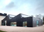
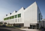
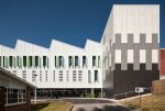
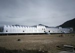
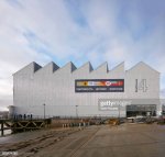
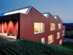
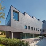
The "Sails/Waves" on the top are too reminiscent of Saw-Tooth factory roofs for me rather than progressive. Saw-Tooth came back in the 80's/90's and was "eh".
If they do it right, it could look okay. However, interiors of Saw-Tooth can be sexy. I personally think Portland deserves better than the Mori design and I question if it'll age well.

c286b1900632a381184fa5c5f25f3f82.jpg
5aa1cf91e79c2054b9c74b3b4f2d2f9f--community-center-factory-design.jpg
AD_001.jpg
portada_AD_014.jpg
Saw Tooth.jpg
Saw Tooth1.jpg
sawtooth.jpg
taubman-college-preston-scott-cohen-architecture-michigan-usa_dezeen_2364_sq-411x411.jpg
 
Whichever design wins, the key is creating exhibits and social experiences that will bring people back, and creatively done food and drink options are critical. It's how people want to experience their social activities today. CIA's renovation is a de facto failure because they didn't understand this idea. Experiencing art is no different. The space to do this within will have to be grandiose and fun. If they don't do it right with the aforementioned idea, eventually the museum will go back to what it is now: Seen that done that. In Boston, even though the ICA in the Seaport is small, next door to it now is the Snowport winter market. Wow. TD Garden just spent over $100 million to fix its food and drink problems on the 3rd deck. Art is no different. It's still people leaving their house and paying admission wanting to either look at a piece of art or watch a baseball game. Can you imagine going to a baseball game without food and drink offerings? Who would go? It's a big revenue generator along with a dynamic gift shop with creative clothing merchandise. They need to think more like a business, and not a mere repository.
 
Last edited:
The form of which has inspired or reinforced the MVRDV design.... This is an actual photo. The exterior panels make it look like a cut and paste job! (The nearly completed B.U. Data Sciences Bldg.)

52584767200_5d2519caf2_3k.jpg
 
It appears they have chosen LEVER for the museum addition. I like this choice, it was probably my 2nd favorite after the Mori design, and hopefully it will be improved even further in the final design phase.

 
It appears they have chosen LEVER for the museum addition. I like this choice, it was probably my 2nd favorite after the Mori design, and hopefully it will be improved even further in the final design phase.

It's nice to see some additional renderings in this article. Gives more perspective to the massing and actual look of the Lever Design. From the High Street Side, it was hard to tell the overall look Seeing a Congress and Free St view helps visualize the overall project. It is just bold enough, has a sense of place, and should be timeless.

I did like ADJAYE for wrapping around the existing building and the High Street entrance, but wasn't "WOW" enough on Congress street. A giant screen is great for many reasons, but the façade wasn't a stunner. This design would be somewhat timeless, but dull/plain. I think the Museum would regret not taking a bolder risk if they chose this design.

I'm really really sorry, but I hated the MORI design - the Saw Tooth roof design is a hard pass for me, the angle of the Congress/Free Street façade was ugly IMHO. If there were fewer angles, more glass, something sweeping then maybe it could have been a stunner. Curves rather than sharp lines. It's bold, but I don't think it would age well. Perhaps rendered in black instead of white I would have liked it better - would have looked industrial modern. Saving the Children's Museum building within the entry doesn't make sense - nice thought, but get rid of it and make better use of the space.

I didn't understand the MVRDV Design at all. Maybe there weren't enough images to see what they were thinking. It seemed too busy, clustered, choppy. They didn't tell the story enough for me to understand it let alone be sold on it.
 
Last edited:
This design is "sawing" through the brilliant Henry Cobb facade design from I.M. Pei Architects, one of the most hallowed arch firms in the world (or was). Pei designed the 60 story Hancock Tower in Boston. The PMA facade was on the cover of Architectural Record back in the early 80s! That's impressive. I don't remember seeing this idea, this cutting a hole into the existing building. I guess I missed it. I also think that their tribute to the native peoples of Maine was significant in the decision (not architecture, but politics). The Mori design could have been revised to reduce the "saw tooth" roof, if most or many hated that. And the Mori design had more dynamic use of the interior spaces, in my opinion. But at least something gets built. Oh, and it looks like it removes the fancy front doors that were just installed. Those were quite pricey.

01._pma.lever_.roof_.010623.jpg
 
Last edited:
This design is "sawing" through the brilliant Henry Cobb facade design from I.M. Pei Architects, one of the most hallowed arch firms in the world (or was). Pei designed the 60 story Hancock Tower in Boston. The PMA facade was on the cover of Architectural Record back in the early 80s! That's impressive. I don't remember seeing this idea, this cutting a hole into the existing building. I guess I missed it. I also think that their tribute to the native peoples of Maine was significant in the decision (not architecture, but politics). The Mori design could have been revised to reduce the "saw tooth" roof, if most or many hated that. And the Mori design had more dynamic use of the interior spaces, in my opinion. But at least something gets built. Oh, and it looks like it removes the fancy front doors that were just installed. Those were quite pricey.

View attachment 32719
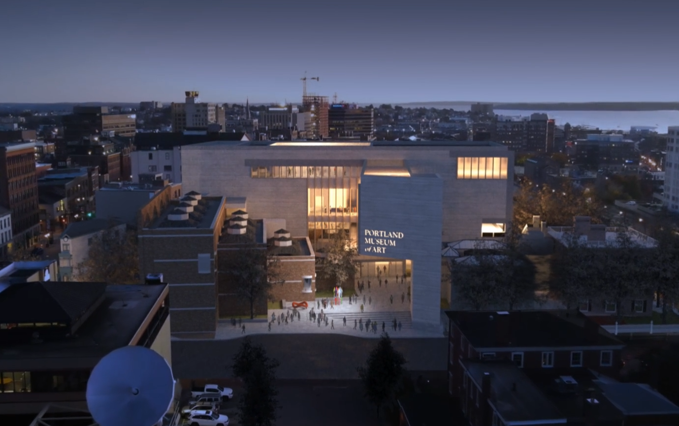
Yeah, it was there in the submission. I remember seeing it and thinking it was odd at first. But part of the mission of this is campus unification and that building is so close to the road, if they don't need that exhibit space then I'm all for drilling through the brick.
 
Condensing the choice of Lever down to mere politics might be cynical.

Honoring a sense and spirit of place, history, and culture is a good thing. It's not about making amends, contrition, or some empty shrug of a tribute. That's not how Portland minds work. Lever is also not a conservative or "safe" choice.

Building some Blockish, Scandinavian, or Japanese-esque addition for the sake of being different (or putting Portland on some proverbial map) is misguided and ignores the identity Portland tries to preserve. Lever is both forward while honoring the sense and spirit of place.
 
It was my third favorite of the four but I'll be extremely proud of the project once it's built. If this was the ONLY option and I never saw any other concepts I'd be totally blown away. I do think this design adds the most substance and wow factor from the Congress Street vantage point compared to the other proposals. My only concern would be the PMA's driving force behind the expansion was to add substantial gallery space in order to display more of the permanent collection that is hidden in the bowels of the current building. I worked at the museum for many years and am well aware of the current gallery limitations especially when it involves the necessary square footage for major touring exhibits.

The LEVER layout appears to be focusing more on contemporary open spaces enhanced with ample light and glass which is stunning but I don't see a lot of dedicated galleries in the video or renderings. Am looking forward to seeing the actual floor plans when they become available and maybe my concerns will be answered. I also feel this design blends in with the current I.M. Pei building the best due to its height and massing and looks less like an "add on" when compared to the other options. The PMA will do very well financially with weddings, conferences and special events due to the gorgeous upper level outdoor areas that will have stunning views of downtown Portland and the waterfront.
 
Last edited:
I think that honoring the Wabanaki people is perhaps done best inside the museum, and not on the roof where "angles of a setting sun reflect and honor them." That's simply a feel-good rationalization to get the gig. And they did, get the gig. The roof will probably be a space popularized for cocktail hour, as today that seems to be what most people want to focus on--eat and drink. The exhibits are somewhat of an afterthought, or after they've seen them. But the more I look at this design and think about it, the more I do like it. They certainly have the intelligence and creativity shown within their work. I do think the sawed-out hole on the existing museum is too large. Perhaps half that size would be better. It wasn't "balanced" before. Henry Cobb of I.M. Pei got it right, although early on the top of the facade design was rectangular, not arched.
 
Last edited:
Oh, and Lever should have done some research into the air temperatures for Portland, the East Coast one. Who wants to go outside on a roof, six stories up, in Portland, Maine from mid-November to mid-April? If so, it will be a fast one. Hope it has tall glass sides. Wicked cold. (Put a clear plastic bubble on top.)
 

Back
Top