Quaker Lane + Congress Square | Downtown

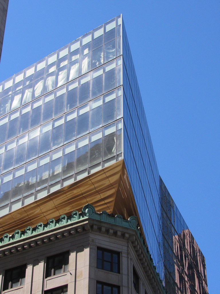
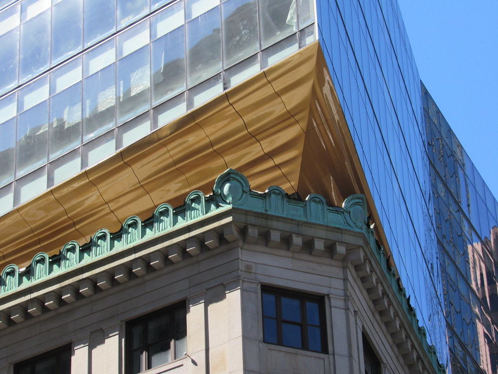
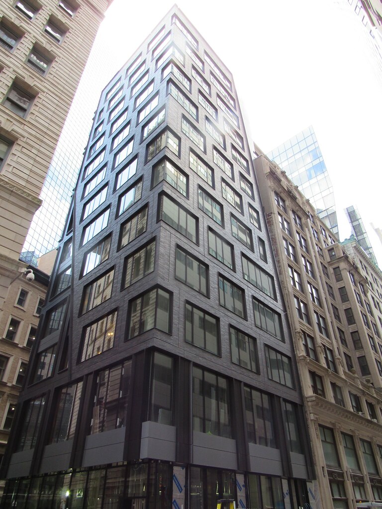
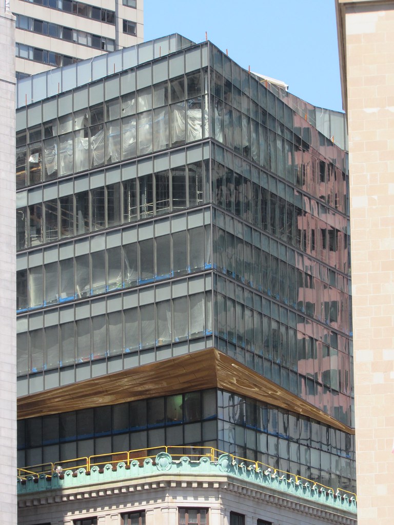
This. The underside may actually be one of my favorite parts of this project (after the shaping of the vertical addition). It is unusual and interesting and yet somehow manages to serve as a backdrop for the historic copper cornice.

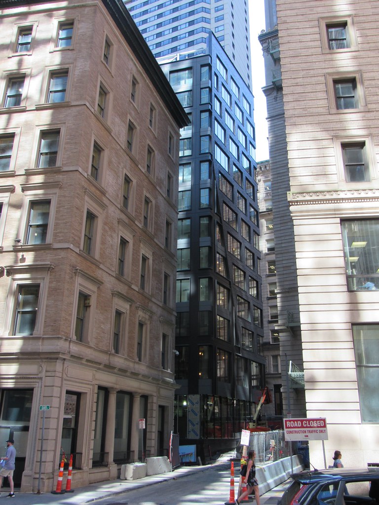
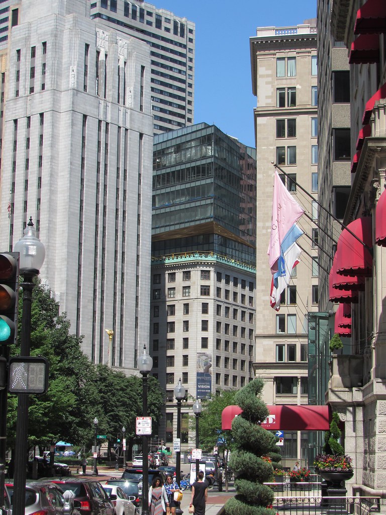
A bunch of these wouldn't work in the city but one really lovely example is pretty interesting.

No, but it draws your eye up and you wonder what is causing that gold/copper 'reflection' on a sunny day (even though further inspection you see the illusion). It also helps the addition float in the sky a bit, which is kind of a nice effect. Before, it was interesting, but felt very heavy. This reduces that a bit.
 
No. It just doesn't work. Even alucobond panels would have been better, they would have gone fine with the elegant simplicity of the addition. Now the ribbon and the old cornice will be fighting it out like rival divas for attention. Big mistake.
 
the ribbon and the old cornice will be fighting it out like rival divas for attention

That's my biggest takeaway so far. I still don't see where they pulled this butterscotch color from, and having it so close to the copper only compounds this problem.
 
I walked by two people on Devonshire the other day who were trying to make sense of it. It was fun to eavesdrop. They were trying to figure out whether it was wood or plastic with multiple color "swirls" or if it was all one color and "rippled." I didn't interrupt, but the last comment I heard about it was "it looks really cool." So I guess it's a win?
 
My friend, the project architect on the hotel part of the project, appreciates the compliments from the members of this board.

I thought the whole thing would be ghastly.

I was quite wrong. I really like the result. Including the butterscotch taffy. Well done, son or daughter.
 
A lot of people object to this underside treatment, but walking by, in person it looks really nice.
 
A lot of people object to this underside treatment, but walking by, in person it looks really nice.

When walking by can you see the lines in between the panels? Seems like one of those things where you only notice them because we can zoom in with a camera.
 
I like it...and love the project. The loss of the wrought iron windows on Water Street entrance has me twitching negatively, a little bit. The replacement is not commensurate with what they removed.


i-dKmx4jv-M.jpg
 
It's probably a brightness thing. The new windows allow far more light in.
 
When walking by can you see the lines in between the panels? Seems like one of those things where you only notice them because we can zoom in with a camera.

Yes you can, but it's a LOT more subtle.

People are noticing this treatment and for the most part they like it. I've notice a lot of people in the street stopping and staring.
 
Yea so Id say this is a success. I had no idea what the hell to expect with this one so just let it go and watched. Its definitely weird, so is the New Balance HQ, but I think overall it came out good. I like the new masonry the best vs the top glass portion.
 
I like it...and love the project. The loss of the wrought iron windows on Water Street entrance has me twitching negatively, a little bit. The replacement is not commensurate with what they removed.


i-dKmx4jv-M.jpg

Wows thats a big loss.

Hope the metal gets creatively reused somewhere by someone...
 
Wows thats a big loss.

Hope the metal gets creatively reused somewhere by someone...
Probably Bronze, not wrought iron or cast iron. Valuable for art's sake as well as for scrap. Too bad they're gone.
 
IThe loss of the wrought iron windows on Water Street ... The replacement is not commensurate with what they removed.

Why in the name of puck did they commit this senseless act of barbarism?

Is the subcontractor working on the windows a native of Heathen Worcester, where Urban Redevelopment lives on at its worst?
 

Back
Top