Renaissance Seaport Hotel

Hi all,

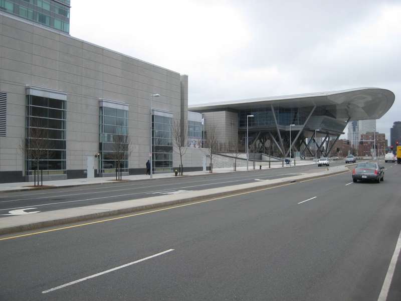
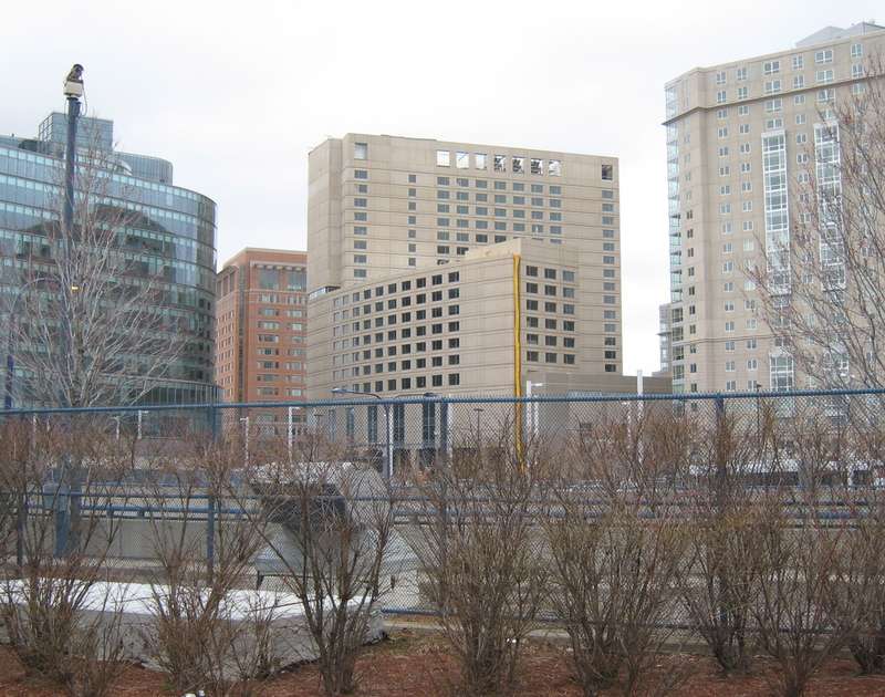
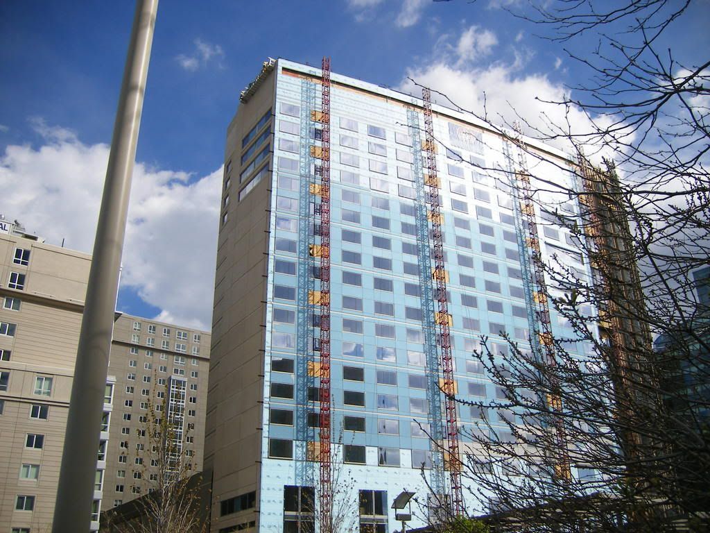
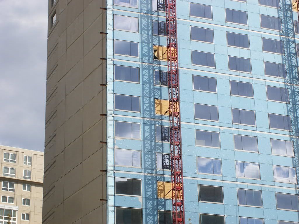
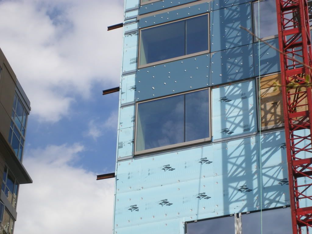
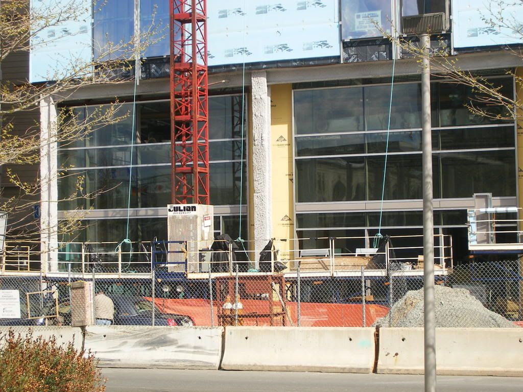
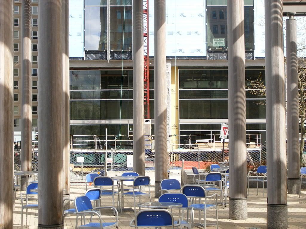
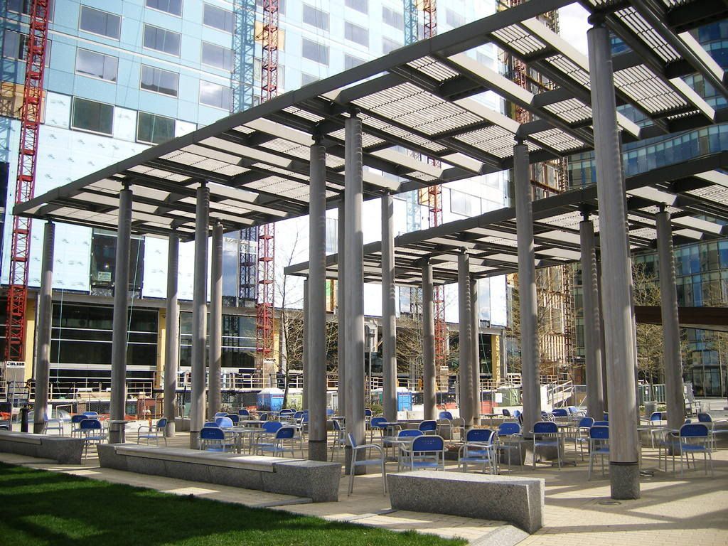
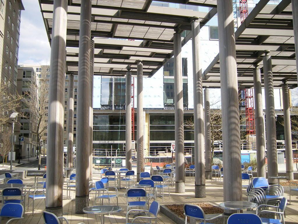
This is my first post on the forum, but I have followed it for some time. It's a terrific resource. Regarding this building, I'll reserve final judgement until the final finishes are complete, but at this point, it appears this may very well be the most dreadful building to be constructed in Boston in recent memory.

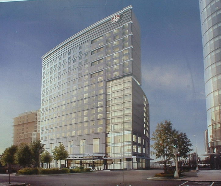
Anybody know who had jurisdiction over design review, if any, for this building? Is it Massport land? Massport or BRA? What a shame that this type of schlock made the cut.

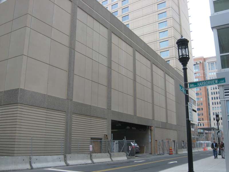
Menino wants to move city hall to the Waterfront, the new frontier. If business continues as is out on the far waterfront, the next mayor may very well be longing for the view of City Hall Plaza and the JFK building complex rather than these mistakes.
 
^^^
If I'm not mistaken, Joe Fallon developed the Renaissance Hotel and the Park Lane Apartments (on land leased from MassPort) next door. This is a scary thought but Joe Fallon is also developing Fan Pier!! I remember seeing the first renderings of Park Lane and the Hotel thinking, "hey, this looks pretty nice." Needless to say, the renderings and the actual product are much different. Fallon didn't even bother to cover up the rooftop AC equipment on a couple of the apartment buildings. He could have done so much more for buildings with such awesome views. More glass in all these buildings would have been so appropriate along with some color scheme variations. I hate to think what the final product on Fan Pier is gonna be.
 
I dont really get up in arms about the seaport like some people around here, but its definately not great. Its better than what used to be there, although i have alot of fond memories of the old seaport.

I was driving through on the way to the bar last night and saw one of them was lit up with blue lights, i like lights but this looks pretty weak. Didnt notice it before cuz i usually dont go that way at night theres just nothing down there at night.

BTW driving by/under the convention center is always sick.
 
Actually, an architecture convention is coming to Boston in May 2008.

AIA 2008 (American Institute of Architects)

25,000 to 30,000 architects will see the SPECTACULAR architecture and urban environment of this hotel. I'm sure they will be very impressed.
 
Don't forget about the architectural marvel that is the Westin. I mean, just look at that streetfront interaction!

img4831xt0.jpg
 
Java King said:
Actually, an architecture convention is coming to Boston in May 2008.

AIA 2008 (American Institute of Architects)

25,000 to 30,000 architects will see the SPECTACULAR architecture and urban environment of this hotel. I'm sure they will be very impressed.


uhoh!
 
I like the Westin.

And if whoever designed it liked it, and whoever funded it liked it, whos to say the architects wont?
 
xec said:

The rendering is nicer.

Also, with regards to the Westin, that street wall is horrible BUT the entrance is well designed and relates very well to the convention center, which is where most people who was stying there will be going, so it works really well on one side and really horribly from the angle that picture is taken at.
 
Where is Vivian Li to protect us from the likes of this?

kz1000ps said:
img4798fk5.jpg


img4799wt6.jpg


img4800ct3.jpg


img4802cj8.jpg


yes, let's get farther away from this God-forsaken place

img4804zh8.jpg


The danger of mindless boosterism is that it leads its practitioners to heap praise upon such things. The conclusion precedes and invalidates the observation: it must be good, it's Boston!
 
Where is Vivian Li to protect us from the likes of this?


Better yet, where was Steve Bailey who just wrote that column bashing Russia Wharf.
 
All I can think of when I see those huge blank walls is this is perfect for graffiti.
 
^why not? Marriott should commission a giant mural dedicated to the seaport's past (or something like that) for those horrible blank walls. It would attract people to their building and break up the monotonous beige plague that is the seaport district.

Actually, I have a better idea. All of the forumers on archboston should meet up one night at the Renaissance and cover the walls with a beautiful image of what Boston's skyline should look like :D
 
0705050211.jpg


Not much change here except for these. Maybe to attach a remnant of the second curtain wall shown in one of the early renderings?
0705050214.jpg


0705050238.jpg


At street level it makes the right gestures. The entire wall facing the park is glass the first two levels.
0705050231.jpg


The transparency will make the activity inside visible from the park and vice versa. The park almost becomes an outdoor room extension of the hotel and you get a nice little public space in the making.
0705050229.jpg


0705050223.jpg


0705050224.jpg


Overall the building itself isn't bad, even with the blank walls. What really kills it is the cheap precast paneling. Maybe when the Seaport is a little swankier it'll be reclad in higher quality materials.
 
It looks like a totally new building with that new facade...I remember that being in the rendering and was wondering why it wasn't on the building when pics were posted here a couple weeks ago. Seems a little strange though, are they just sticking the glass to the precast? Also, how does it look from a distance? Any better than before?
 
If you think this is bad, try visiting Crystal City in Arlington, VA just outside DC where I am now. An unbelievable collection of precast boxes, highway ramps and wasteland. It make this development look truly inspired . It's amazing to see the absolute crap going up all over the US.
 
Developers are constantly looking for cheaper ways to get a building up and make money. I think that there are fewer and fewer developers who really spend the time to make their projects look unique and interesting. My dad is always talking about new development (he's in the business) and some of the renderings that he brings home are truly bland and atrocious. He agrees with me, but he unfortunately can't do much about it since the companies design it and the he just gets hired to build it.
 
Friday the 25th.. just like with the Archstone-Smith tower, I prefer the light blue insulation panels to the actual cladding

img1783ih5.jpg
 
kz1000ps said:
just like with the Archstone-Smith tower, I prefer the light blue insulation panels to the actual cladding
Or it looks good just the way it is with its touch of blue. Why are architects afraid of a little color? Wait, don't tell me ... NIMBYs?
 
Those crazy Russians! I kind of like it. It works under the same principle that they used for camouflaging ships in WWI and WWII. The eye is distracted by the larger image and you can only see what it really is when you concentrate. Even then it is hard to make out.

I live across the street from projects like this (Peter Cooper Village and Sty Town if you care) and they would certainly look...different... if you did this to them.
 

Back
Top