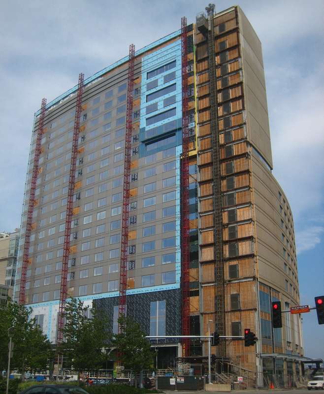
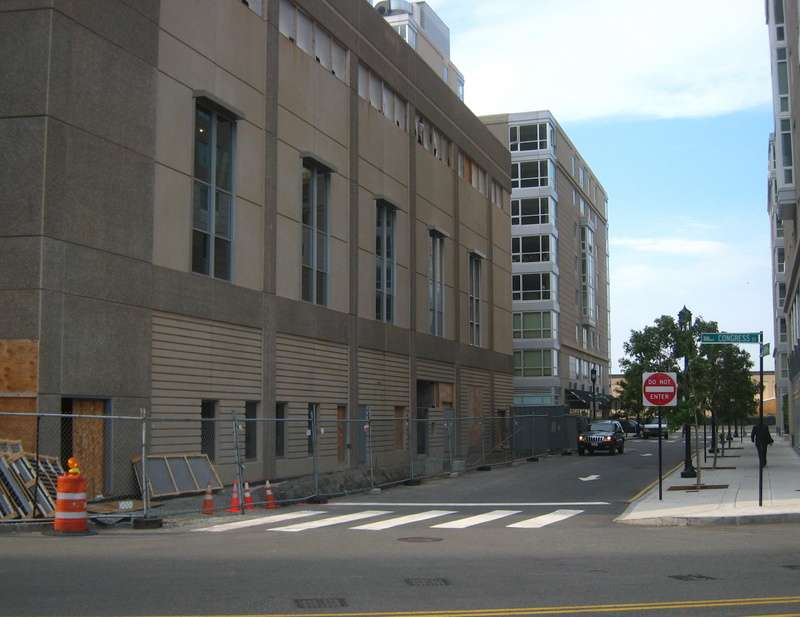
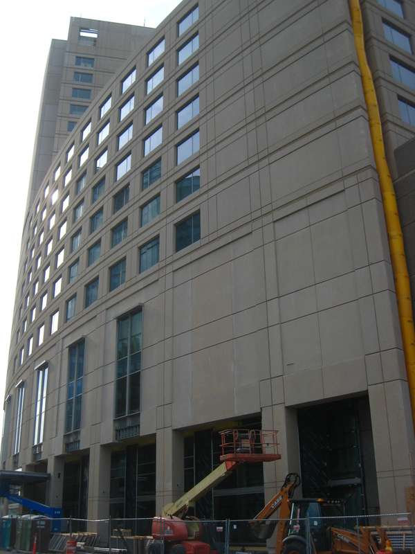
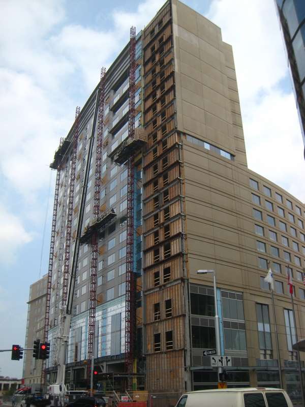
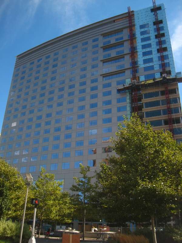
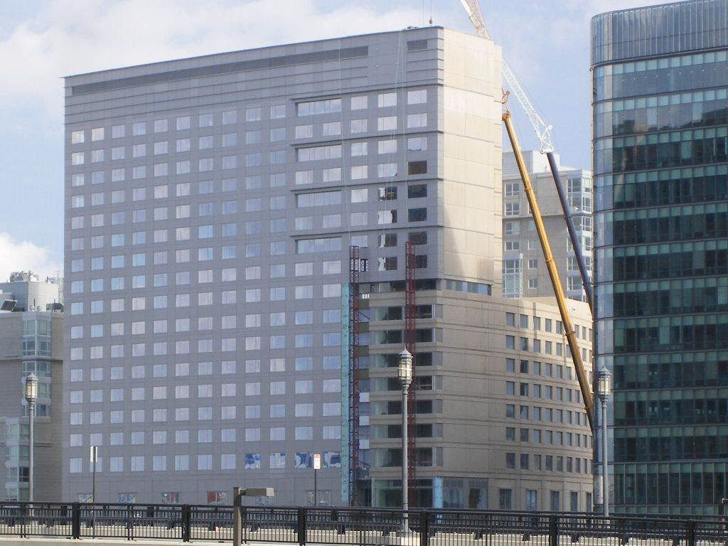
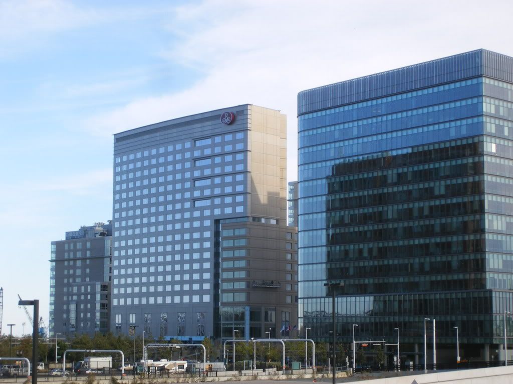
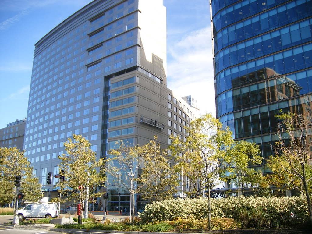
Renaissance Seaport Hotel

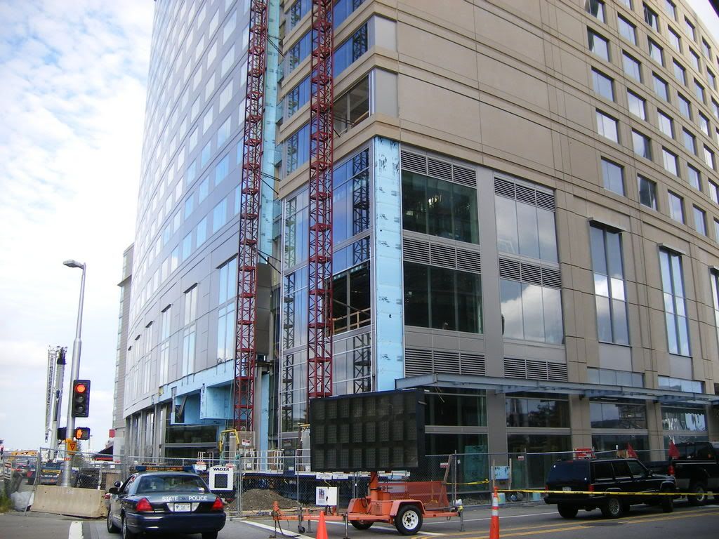
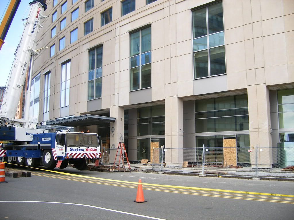
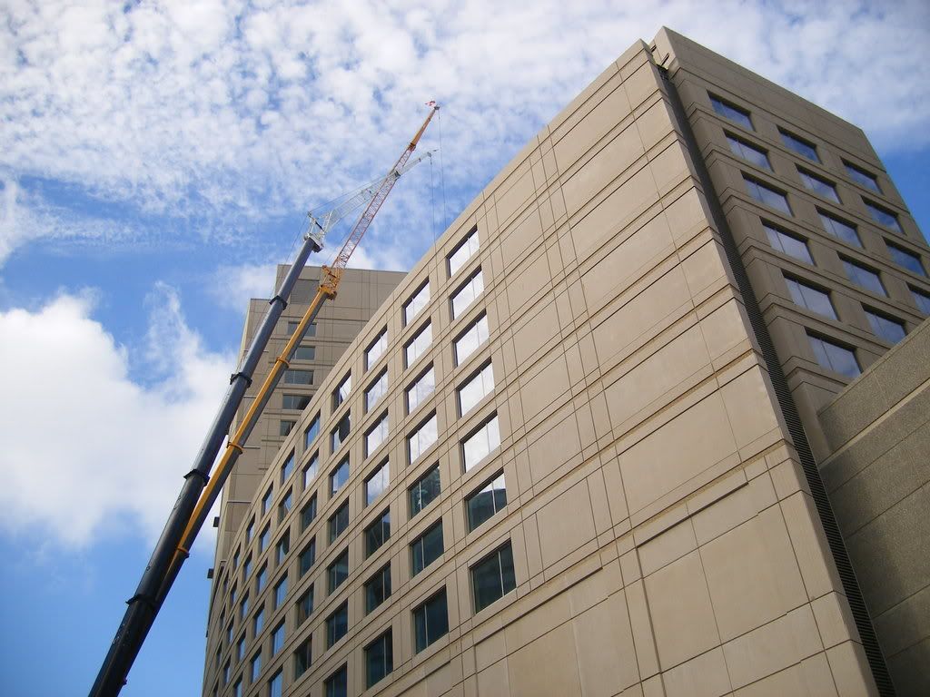
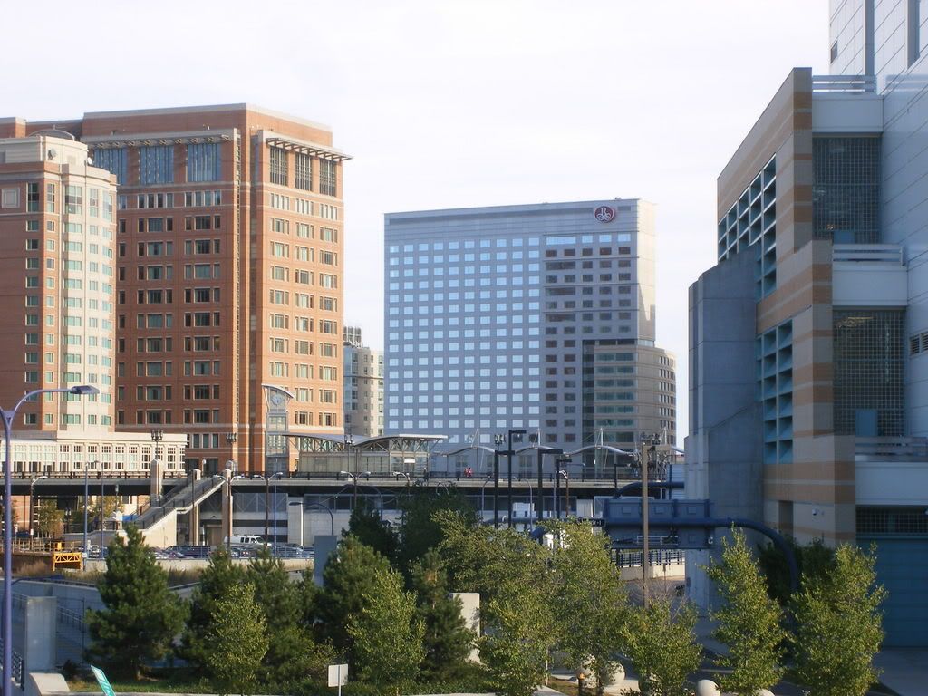
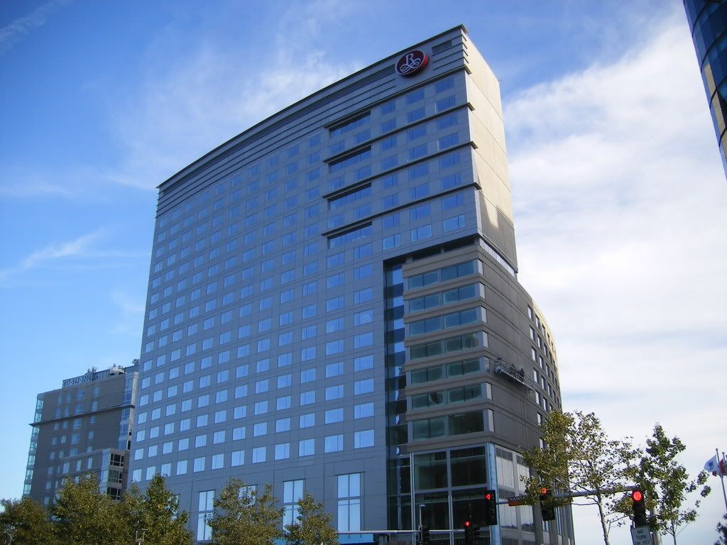
I might cry. That isn't actually the hotel, right (I'm not talking about the colorful Russian stuff)? They'll paint the precast, right? Some nice blues, with a lightish brownish greyish olive greenish? Or, maybe this is a joke. Maybe the walls are really made of wallpaper, and when they are done they'll rip it off to reveal something stunning, and inspired. Oh god, I hope so. Marriott/Renaissance usually have nicer buildings.
 
Actually the comparison to East Germany is quite apt. In the 1980s, the government there began experimenting with postmodernism, but their preference for precast concrete panels kept these buildings from matching their counterparts in the West. Some examples from Berlin:

Nikolaiviertel (attempt to rebuild a 17th century neighborhood) -

Nikolaiviertel.jpg


c02070041nikolaiviertel.jpg


800px-Berlin_Nikolaiviertel_Nussbaum.jpg

(note the contrast here)

778px-Nikolaiviertel_2a.jpg


Apartments for high officials (the swankiest apartments in 80s East Germany):

Berlin-2005-Natal-9.preview.JPG


BER_BRAN-exter-1.jpg


Actually, these may be better than the Renaissance. They have a smaller footprint, and have variegated forms...
 
Wow, those are actually really nice for concrete. It's the little design touches that turn it from an inhuman slab into a human-oriented livable building. Also the fact they they are not "towers in the park" help.
 
...

seaport is much, much worse than any of those... obtuse though they may be, i rather like them.
 
You're right, vansnooken. If these facades in the Seaport were broken up creatively to half the extent of East German pomo buildings, they would feel infinitely more welcoming (and infinitely less monotonous). Large footprints don't have to suck if they're at least somewhat variegated. There have been few gestures toward that in this area.
 
* yawn *

img9993zb0.jpg


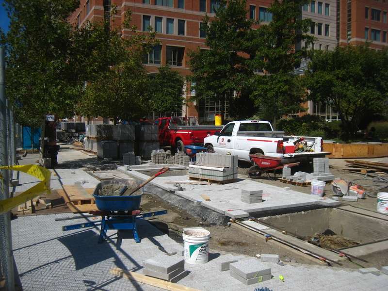
In other news, the neglected sidewalk on the south side of WTC East (aka 2 Seaport Lane) is finally getting upgraded

img9991hl1.jpg
 
I think a game of super vertical checkers is in order for the side of that building. I CALL THE PRECAST!
 
that just isn't a beautiful or impressive building by any stretch of the imagination. if i were to guess not knowing it was just done, i would have said that it was built in the early eighties.
 
All I can say is thank you for not showing my eyes the horror that is the back of that building.
 
Did Fox Business News just print their press release?
 
Fox News said:
The $165 million hotel project is the next chapter in the fast-paced development story of the South Boston Waterfront's Seaport District.

Is this a typo, or did that heap of shit really cost $165 million?
 
The picture on the Marriott site is deceiving; it makes this finished product actually look interesting. Too bad; another missed architectural opportunity. The Fox report tells us that the architect designed this building to recall "billowing sails" of ships coming into port????? The only thing billowing here is the boilerplate advertising and the contractors' pocketbooks!
 

Back
Top