You are using an out of date browser. It may not display this or other websites correctly.
You should upgrade or use an alternative browser.
You should upgrade or use an alternative browser.
Rose Kennedy Greenway
- Thread starter callahan
- Start date
Merper
Active Member
- Joined
- May 25, 2006
- Messages
- 255
- Reaction score
- 0
...
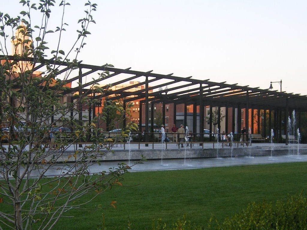
gotta say, those 'light blades' do absolutely nothing for me. they seem to just add clutter to the streetscape unnecessarily. They are trying to do a job that is meant for the buildings surrounding the space (that is, framing an outdoor space). They just seem in the way to me.
the Hard Rock garage has gotta go too. Prominent location, hideous. It gets often overlooked because the GC Garage is so close by...
KentXie
Senior Member
- Joined
- May 25, 2006
- Messages
- 4,209
- Reaction score
- 834
Well the street vending is a good start. I hope there are a bunch more, maybe the vendors from DTX can vend here. I also hope they place a few solar powered trash receptacles to keep the park clean. A few vending machines will be nice too.
kennedy
Senior Member
- Joined
- Feb 12, 2007
- Messages
- 2,820
- Reaction score
- 7
Every picture I see, it makes it look better. I must say, the entrance to Faneuil Hall looks very easy to get into, blends extremely well. Maybe with more street vendors, and more global warming, this park will become better.
Charlie_mta
Senior Member
- Joined
- Jul 15, 2006
- Messages
- 5,090
- Reaction score
- 7,619
With more global warming, in about 50 to 100 years the Greenway may become beachfront property.
:?
:?
dirtywater
Active Member
- Joined
- Nov 16, 2006
- Messages
- 686
- Reaction score
- 357
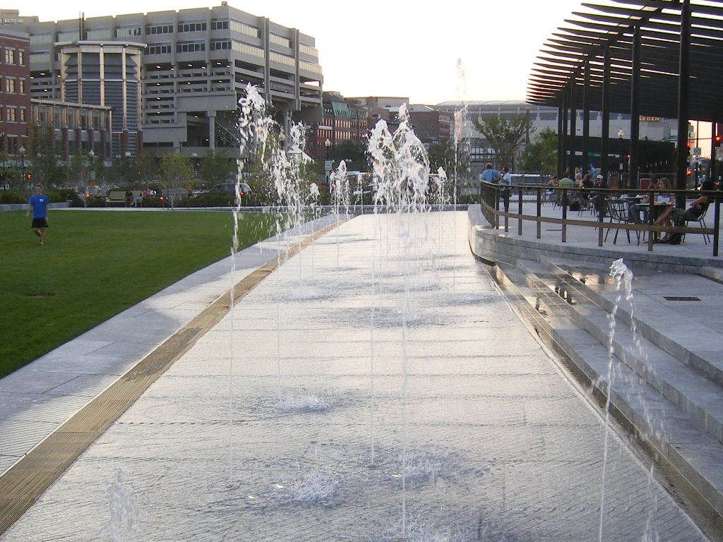
According to a construction worker in the North End Parks, the southern parcel is opening in a couple of hours. The fencing around the perimeter of the site has been removed, the water is flowing, and the park looks good to go.
RandySavage
New member
- Joined
- Apr 28, 2007
- Messages
- 10
- Reaction score
- 0
^ Thanks for the heads up...
lexicon506
Active Member
- Joined
- May 25, 2006
- Messages
- 567
- Reaction score
- 306
I'll still feel that the Greenway is unfinished until all three of the building parcels are complete....the uncovered highway ramps make it feel so much more disconnected. I think that no matter what design those buildings take, they will add life and definition to the space, which it desperately needs right now.
A mess. ^kz1000ps said:
Meadowhawk
Active Member
- Joined
- Jun 16, 2007
- Messages
- 265
- Reaction score
- 0
Light Blades - YUK!
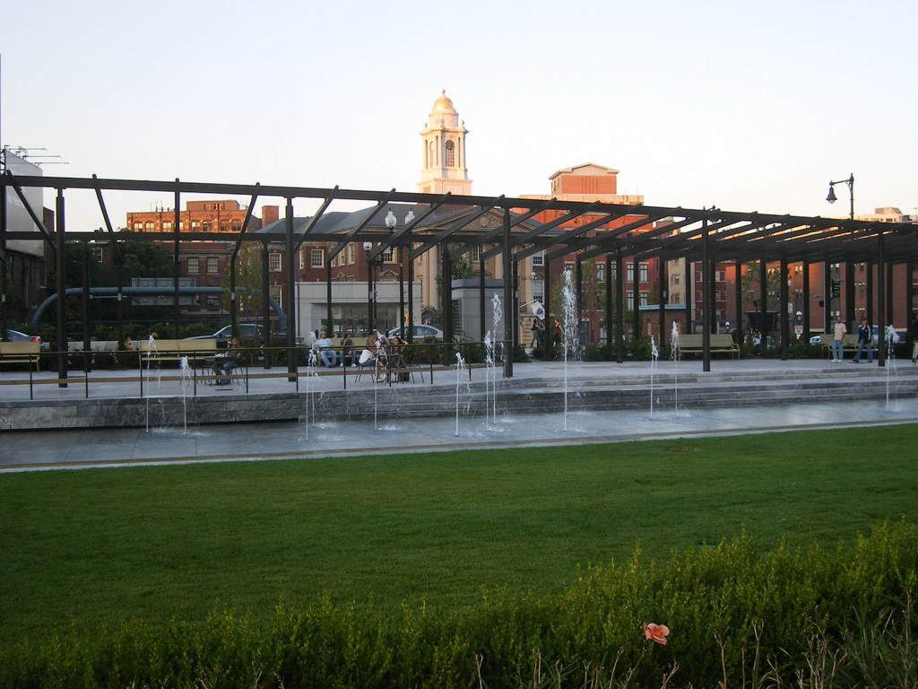
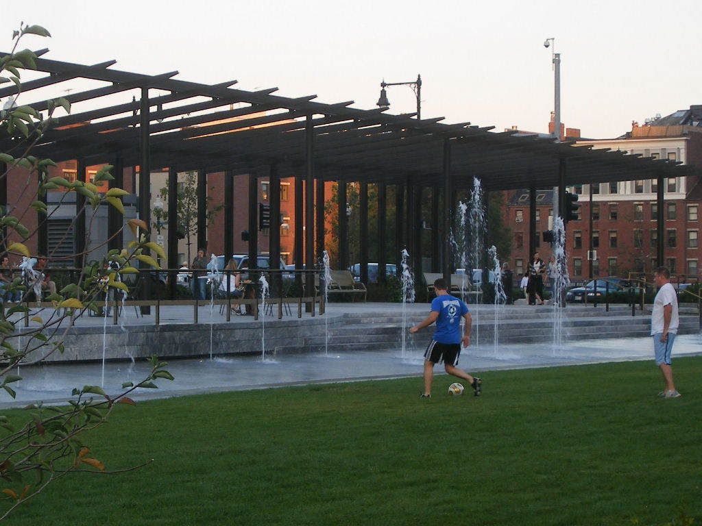
I don't like the shape of them to begin with, very sophomoric in design. They are also too spread out. Maybe they would have worked better if they were side by side in a circular design in the middle of one of the park spaces to appear as a single light sculpture. I'm trying to be optimistic about this project, but there is so much wrong with it. At least they should have planted bigger trees as they did at Fidelity Park to make it look less barren. I have to say that I am bummed out that there are no evergreen trees. It will be interesting to see how barren this thing looks like this winter, very depressing I am imagining. That sign that was posted prohibiting skateboarding and bicycles. That's a great way to kill any kind of life right there. So far, the only park that appeals to me is the North End parks, the rest are disastrous. What bothers me most about this whole project is that it had unlimited potential. As Boston had the rest of the world to use as an example, this is the best they can come up with?
I don't like the shape of them to begin with, very sophomoric in design. They are also too spread out. Maybe they would have worked better if they were side by side in a circular design in the middle of one of the park spaces to appear as a single light sculpture. I'm trying to be optimistic about this project, but there is so much wrong with it. At least they should have planted bigger trees as they did at Fidelity Park to make it look less barren. I have to say that I am bummed out that there are no evergreen trees. It will be interesting to see how barren this thing looks like this winter, very depressing I am imagining. That sign that was posted prohibiting skateboarding and bicycles. That's a great way to kill any kind of life right there. So far, the only park that appeals to me is the North End parks, the rest are disastrous. What bothers me most about this whole project is that it had unlimited potential. As Boston had the rest of the world to use as an example, this is the best they can come up with?
whighlander
Senior Member
- Joined
- Aug 14, 2006
- Messages
- 7,812
- Reaction score
- 647
Took a Stroll Saturday
I started walking toward South Station from just below the Custom's House. Alternately, I walked, sat lay upon the green carpet, and scanned the sky and the skyline.
Then I sat some more and watched the crowds of people walking by, stopping and strolling including some parents with cameras little kids and a few dogs
I ended-up walking down to the Chinatown Park with a detour through the Federal Reserve Bank Bunker {aka garden -- very well done security structures}
Overall Observations:
1) There is already life in the Wharf District Parks!
2) Chinatown is a near miss ? the waterfall / fountain / stream should have been bigger ? the major problem is the nearby very boring end of two buildings and the ugly old garage across the street
3) Federal Reserve security landscaping showed how to make a very functional design that is quite pleasant ? but it must have cost a lot of money
4) Paradoxically, I liked the unfinished or temporarily finished park segments further down and including the un-built ramp parcels better than the one fully open Wharf District segment.
5) The rawer more simplistic pieces seemed to have more growth potential
6) Yes the trees are small -- but they also were quite small down by South Station when they were first installed
In summary: -- I'm withholding judgment until at least next September
Westy
PS: We really don't want those "Cultural Buildings" on the Greenway -- stick them in some adjacent vacant lot
kz1000ps
Senior Member
- Joined
- May 28, 2006
- Messages
- 9,140
- Reaction score
- 13,323
czsz said:Plenty of people ride bikes on the narrow paths in Harvard Yard without causing frequent injuries; I can't imagine why they shouldn't be able to here.
Yeah I rode my bike through the park Friday when I took those pictures, I did the exact same thing today (pictures coming tomorrow hopefully), and I'll probably do it again tomorrow. There's nobody to catch me, and it's not like I'm riding through the park at some wrecklessly fast speed, so why not.
My one pic I'm posting today was taken at 12:45 PM -- the height of lunch hour -- and there were a whopping 5 people using the park just south of State St. I understand that there's probably a lot of office workers who aren't aware that the parks are open yet, but I expected more than a handful to be out here, especially considering its extremely visible location and the continuing idyllic weather.

atlantaden
Senior Member
- Joined
- May 31, 2006
- Messages
- 2,675
- Reaction score
- 3,324
Sitting on stone for any length of time, even to eat a 20 minute lunch, is not the most comfortable for a lot of people. To read a book or people watch for any length of time, forget it! Maybe it's just me but I like to lean back in my seat after a while. I walked the length of the Greenway last week (the part that were open) and couldn't help but notice the lack of park benches. BTW, the area in front of the Boston Harbor Hotel looks like it's really gonna be nice; lots of flowering plants and shrubs. Very attractive landscaping. Chinatown Park very nice as well.
Isn't the real problem with the greenway the location? They are trying to put a park 1 block away from the real attraction being Boston Harbor.
The city has been pushing the 'Harbor Walk' for so long that much of it is actually accessible. And if I had my choice of sitting next to the water or on the median strip; I'd probably have my lunch by the water.
The city has been pushing the 'Harbor Walk' for so long that much of it is actually accessible. And if I had my choice of sitting next to the water or on the median strip; I'd probably have my lunch by the water.


