KriterionBOS
Active Member
- Joined
- Mar 18, 2018
- Messages
- 196
- Reaction score
- 74
Yeah not the greatest aesthetic on this. But it looks tall-ish aprox 350 feet and adds density around the Clarendon which is good.
Yeah not the greatest aesthetic on this. But it looks tall-ish aprox 350 feet and adds density around the Clarendon which is good.
It says it's 390' and the only question is whether or not that includes the slanted top (ie the crown may push it over 400').
Okay, so we lose another Boston building - one that may not be historically or architecturally significant, but is clearly Boston and long been a good neighbor - for something that looks generically trendy and says nothing about its neighbors or Boston. I realize this has to happen from time-to-time. Change. Growing cities change. But this kind of trade-off is happening over and over.
Think about it...
Look up the block. Another generic glass box under way that speaks more of Tampa or Phoenix than Boston.
Someone please tell me, who is the adult in the room?
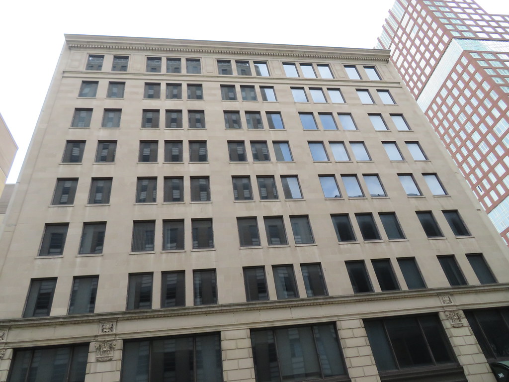
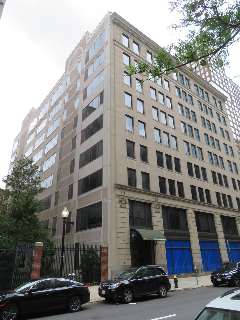
It is very much a masonry area (including the new Liberty Mutual building). While I think Boston can get a little obsessive around masonry, this feels so alien--more so than the original. I think the quietness of the earlier version fit in better. It might be how they are rendering the glass as super blue and shinyIt's this building. The front is grand, but I'm pretty sure the sides/back were redone in the 1980's and look awful. I too would like to save that front face, but a lot of the damage has already been done. (on a rant tangent, this is why I advocate so hard for full facadectomies in exchange for extra height on top, to retain the street level presence while maximizing the return and skyline presence)
EDIT - Looks like just the 2 side walls were redone and the original back wall, in a state of disrepair, remains.

Google Maps
Find local businesses, view maps and get driving directions in Google Maps.www.google.com
View attachment 14217
It is very much a masonry area (including the new Liberty Mutual building). While I think Boston can get a little obsessive around masonry, this feels so alien--more so than the original. I think the quietness of the earlier version fit in better. It might be how they are rendering the glass as super blue and shiny
I find the uniform "insurance gray" of those Stuart Street blocks very oppressive. (Excepting 200 Clarendon)It is very much a masonry area (including the new Liberty Mutual building). While I think Boston can get a little obsessive around masonry, this feels so alien--more so than the original. I think the quietness of the earlier version fit in better. It might be how they are rendering the glass as super blue and shiny
I agree with you. Sadly, BU has been gradually forcing us, through its architectural choices, to exclude Bay State Road and that end of Comm. Ave, and environs, as NOT part of Back Bay, which seems now to end just east of Kenmore Sq.It reminds me of the stack-of-books under construction at BU. The new rendering of the building doesn't fit the Back Bay architecture and neither does the old one. Maybe I'm in the minority but it really dislike t.
The glimmer is much appreciated (and desperately needed), but the fact that the Raffles Boston/45 Trinity building ISN'T included in this render unfortunately reduces the glimmer to a half-glimmer at best... but here's hoping the near-future proves my skepticism to be wrong.
I'm pretty sure Raffles is in there. Look at the grey building surrounding by the 3 blue Back Bay Garage buildings, to the lower left of the Hancock. If Copley Tower comes back it would be a game changer since all the other Back Bay buildings in the works are under 450'. It's also the building I have most wanted built since it was proposed like 15 years ago!
 IMG_9660 by Bos Beeline, on Flickr
 IMG_9663 by Bos Beeline, on Flickr
 IMG_9668 by Bos Beeline, on Flickr
 IMG_9667 by Bos Beeline, on Flickr
 IMG_9669 by Bos Beeline, on Flickr
 IMG_9674 by Bos Beeline, on Flickr
 IMG_9675 by Bos Beeline, on Flickr
 IMG_9676 by Bos Beeline, on Flickr
 IMG_9679 by Bos Beeline, on Flickr
 IMG_9687 by Bos Beeline, on Flickr
 IMG_9632 by Bos Beeline, on Flickr