Brad Plaid
Senior Member
- Joined
- Jan 17, 2013
- Messages
- 1,310
- Reaction score
- 1,559
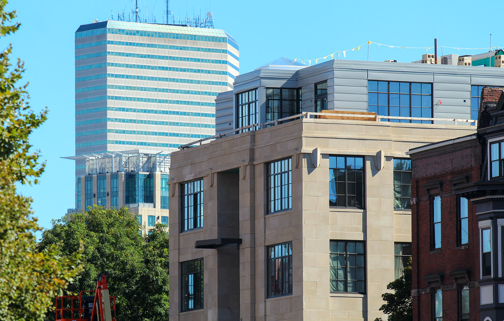
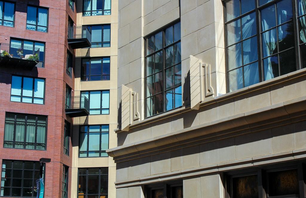
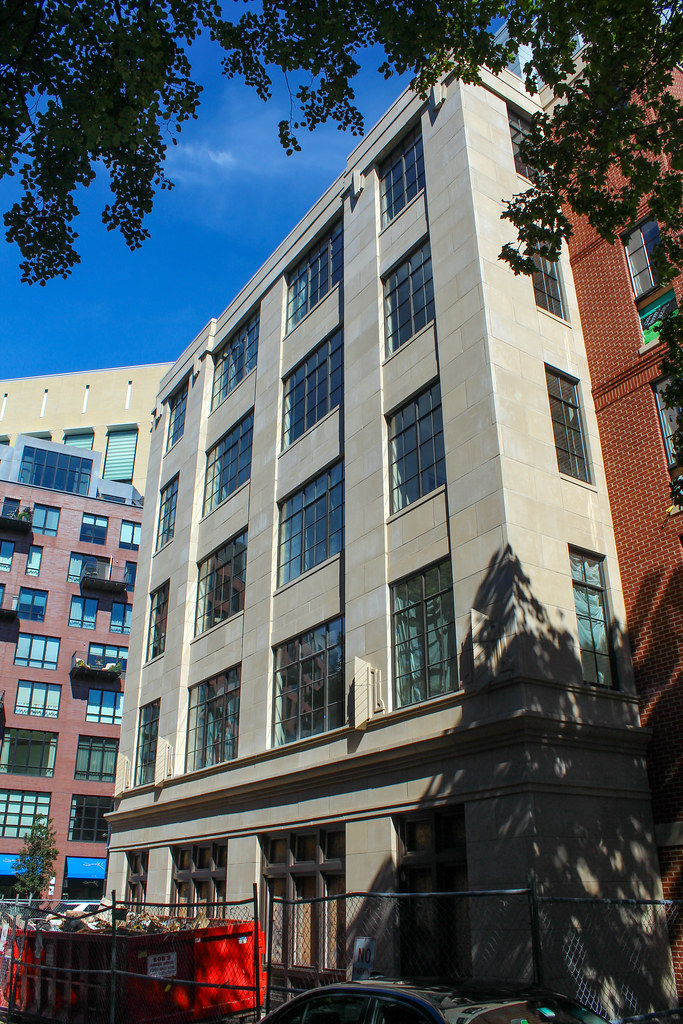
Zero Worcester has a vertical emphasis that should happen more often. The only sour note is the struts underneath the roof. It would have been much more elegant without them. They don't look structural, they look like what they are: superficial and unnecessary nods to 19th century cornices.


