South Station Tower | South Station Air Rights | Downtown

i think they did what they did, to get

1. height
2. all the cool stuff at the ground level.
3. adding revenue density at the bus station.

Bravo to the effort! Got to make it pay, BB.

As a background building, it's acceptable; as an "addition" to our venerable southern transit hub, it remains a snooze...
 
Like so much of Pelli's work, this is slick and anonymous. As a background building, it's acceptable; as an "addition" to our venerable southern transit hub, it remains a snooze...

What would it take to add some vertical dimension to the form? I'd suggest prominent (and preferably dark) metal mullions tracing up the tower's surface. Something to lead the eye upward, to give it presence.

It's no surprise that Hines is based in Houston -- there's an entire collection of towers just like this...

To each his own I guess. The two vertical lines followed by the tapering on both sides culminating in the crown isnt anonymous to me at all. Especially when paired with the base. Its literally impossible to please everyone though and when too many towers are trying to stand out you get the mess that is London so its a fine line. In my opinion this is pretty damn good and will look better in person with real glass with reflections.

 
Like so much of Pelli's work, this is slick and anonymous. As a background building, it's acceptable; as an "addition" to our venerable southern transit hub, it remains a snooze...
What would it take to add some vertical dimension to the form? I'd suggest prominent (and preferably dark) metal mullions tracing up the tower's surface. Something to lead the eye upward, to give it presence.

It's no surprise that Hines is based in Houston -- there's an entire collection of towers just like this...

Yup, would be perfectly fine plopped into some random corner, but it does not work at all with south station.

Drop the glass wall for one
 
Would have loved to have seen staggered/asymmetrical set-backs. Would have made it look more slender and likely taller if the bottom two in particular were not the same height.
 
^^i had a similar thought some time back--with something akin to the final Accordia render plopped right here, with the same mixed plan as the economic driver the developer settled upon.
 
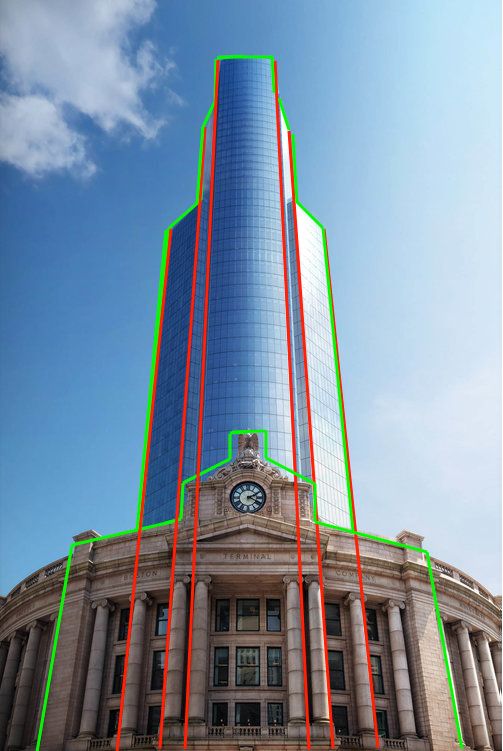
I wasn't exactly sure how to put this into words so I color coded it. This tower is more than it seems at first glance. There is attention to detail that is well hidden.


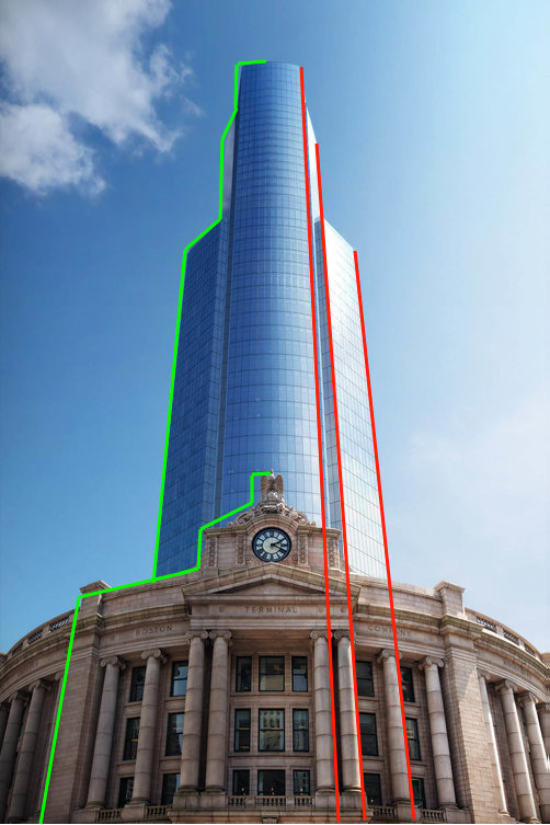
On the left if you trace the outer front face of the station and then paste it behind the base and stretch it into a tower you get this. Then coming back down the other side following the 3 vertical lines of the tower to the ground you get this. Look where they end up when you just draw a straight line down from the top of the tower to the ground following the towers vertical lines. They line up perfectly. They fall right on the outer right edge of the first 3 columns.


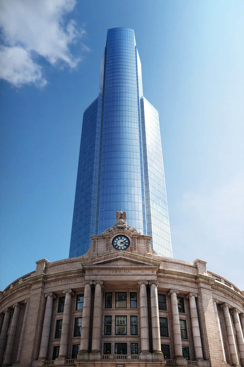
It comes together to make this below. If you draw vertical lines up from the outside edge of the front 6 columns, then drag the outline of the station up, and paste it on top of them, lining up the outside lines... you get the exact shape of the tower. How cool is that? Just fill it in with blue glass and there you have it. Simple, understated, and completely on purpose. 3 markings of great architecture.
https://gasstation-nearme.com/mobil


When looking at it this way it makes perfect sense why this is low key a much more thought out design than it first seems. They took the most important visual lines from the face of the station, stretched it into a tower, and filled it in with glass. Things like this make a great tower, where you dont even realize why it works so well, but it just does. The architectural elements are not completely obvious at first, but dig a little deeper and theyre all there. Thats why most people will just look at this and go hmm idk why but it just works, thats the mark of good design. Above is why.
DBOX for Hines - Boston South Station by David Couhig, on Flickr
 
Last edited:
Thanks guys, I wasnt sure if I was going to be able to explain what I was seeing, but honestly its so intentionally done, and done well, that it just falls into place.
 
Amazing work Stick. i really love the cladding and the asymmetry of Accordia.

Thinking about architecture (more than before), i realize i'm not a big fan of as much symmetry as is done in so much architecture. But this one screams for it.

It screams for a lot of marble or granite, too.

Thanks.
 
This building is a gem from all angles. Its probably the 2nd best looking tower downtown after MT, in my opinion.
 
Here are what my 6 minutes in paint got me

TXGNFht.jpg


You will find that ff you draw vertical lines up from the outside edge of the front 6 columns, then drag the outline of the station up, and paste it on top of them, lining up the outside lines... you get the exact shape of the tower*.

*Pending proper scaling

My problem is this:

Just fill it in with blue glass and there you have it.

Thats not great architecture. Thats just ugly
 
Amazing work Stick. i really love the cladding and the asymmetry of Accordia.

Thinking about architecture (more than before), i realize i'm not a big fan of as much symmetry as is done in so much architecture. But this one screams for it.

It screams for a lot of marble or granite, too.

Thanks.


Absolutely, nobody HAS to like anything, and Im not telling people they have to like this. I was just trying to point out why it does what it does. Whether people like it or not is personal, as with anything.

My suggestion was to throw a 30 park place type tower on South Station anyways. I do like this though, its not the greatest building ever made, but it looks MUCH better from the “actual” view of it at ground level vs the tobasco bottle drone shot from before. I can definitely live with this now.
 
Last edited:
Here are what my 6 minutes in paint got me......

I'm sure the University of Pittsburgh won't notice if we just borrow their tower for...ever.

But really, this would have been the perfect tower to plop here back in, say, the 1920's. They don't build 'em like they used to.

I have zero issues with the glass tower here per se. However, factor in the glass tower at Winthrop Square, glass tower at Congress Street Garage, and the impending switch to glass at 1 POS, and it might be a little bit overkill.
 
^^re; all that glass: i hear you. But i think we're going to be ok. There aren't many more tall glass towers coming (until the monoliths are developed). Until that happens, the 70's rock n stuff will continue to balance things.
 
Like so much of Pelli's work, this is slick and anonymous. As a background building, it's acceptable; as an "addition" to our venerable southern transit hub, it remains a snooze...[/quote

Totally agree. Pelli's been mailing it in two decades at least.
 
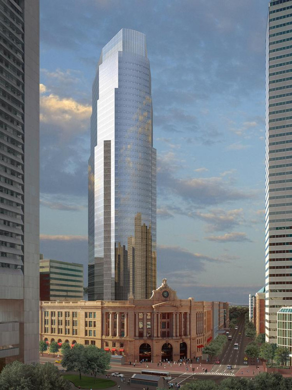
Ppl forget the foundation is already in place. The octagonal shape of the base is due to the layout of the existing columns. At the time this 1st tower was designed it was great, still is imo. So take this tower below, make the top half skinnier to allow condos, and you get the tower you see now. Its just this tower with a skinnier top to make the numbers work in the current climate...


Its literally the same tower minus 1 setback.
south-station_hres_web.jpg
 
Excellent job stick. The money shot is the ground view with the building rising up behind South Station. Very nice addition to the skyline. NIMBY's gotta NIMBY I guess but one would assume the difficulty of building over the tracks prevents the developer from recreating the Taj Mahal or whatever else some people's personal preferences are for what goes up here (while contributing zero dollars of their own money to make that happen).
 
Kudos on your analysis, stick.

To clarify, my complaint here isn't about the form or silhouette of the tower, but the lack of expression on the facade. The smooth reflective glass is utterly featureless, and that needn't be the case. Given the depth and variation of South Station's facade, this tower looks "cheap" even if it isn't...
 

Back
Top