You are using an out of date browser. It may not display this or other websites correctly.
You should upgrade or use an alternative browser.
You should upgrade or use an alternative browser.
South Station Tower | South Station Air Rights | Downtown
- Thread starter castevens
- Start date
dirtywater
Active Member
- Joined
- Nov 16, 2006
- Messages
- 687
- Reaction score
- 366
That is not the current design of the project. Go to the Hines website or earlier in the thread to see the current design.
B
BostonSkyGuy
Guest
dirtywater said:That is not the current design of the project. Go to the Hines website or earlier in the thread to see the current design.

That is the new design. I actually like the new design (this one) rather than the original sword fish looking one.[/img]
Joe_Schmoe
Active Member
- Joined
- May 25, 2006
- Messages
- 374
- Reaction score
- 0
OK, thanks for clearing that up.
Beautiful. Absolutely beautiful.BostonSkyGuy said:
Pelli at his best. As good as Bank of America (Charlotte) or 2WFC (Hong Kong).
He knows how to do Deco Revival massing so well that he can pull it off in glass. This is the guy who should be hired to finish design on Winthrop Square.
If Raymond Hood were alive today his work would look like this.
Three stars.
lexicon506
Active Member
- Joined
- May 25, 2006
- Messages
- 568
- Reaction score
- 308
I agree, ablarc, the SST is a beautiful skyscraper....when seen from Dewey Square. I don't know if you've seen the renderings of the tower from the Harbor, but unfortunately, when viewed from that angle, it completely changes character. The sleek, graceful SST turns into the squat, fat SST. O well, I'll just have to make sure I only look at it when I'm walking through Dewey Square.
kz1000ps said:
TheBostonBoy
Active Member
- Joined
- May 8, 2007
- Messages
- 442
- Reaction score
- 0
ya from Dewey square it looks absolutely amazing....but from those other angles, it does look fat...
In the end though, these are just renderings, and I am pretty sure that the actual completed building will look great and hopefully not that fat
In the end though, these are just renderings, and I am pretty sure that the actual completed building will look great and hopefully not that fat
B
bosman
Guest
It looks like the tower may begin construction this fall:
http://www.bostonnow.com/news/local/2007/06/12/south_station_tower/
If I were you, I would take this with a grain of salt. For one, there is bound to be some issue between the city and developer (always happens). Two, this source also reported that the Gateway Center was alive and well. I am cautiously optimistic about this.
stellarfun
Senior Member
- Joined
- Dec 28, 2006
- Messages
- 5,726
- Reaction score
- 1,586
FWIW, I noticed the other week that at the bottom of the stairs at the Atlantic Ave. entrance to South Station, the sidewalk had been marked off as if they were going to dig a small construction pit. Some preliminary engineering?
B
BostonSkyGuy
Guest
czsz said:If it reflects the light and water like that, I don't mind the seeming girth.
Yeah, I don't mind it as much as I once did. I don't think it's going to look as bad as it does in the rendering either. The rendering is grainy and looks a little crooked (or is it just me?).
Besides, does anyone get giddy when they think of the city from the harbor? I sure don't.
B
bosma
Guest
From:http://www.cesar-pelli.com/flash.cfm
then click on "new work"
Boston South Station Air Rights Development
Boston, Massachusetts, USA
The 1.2 million square foot mixed use South Station Air Rights Development is designed to complement the historical and architectural context of existing structures, while minimizing the impact of development on the surrounding neighborhood. The tower?s faceted oval form echoes in a contemporary manner, the curve of the main facade of the South Station Headhouse. The tower?s glass skin and top are composed of several layers of varied glass types, designed in collaboration with James Carpenter Designs. The design promises to enhance South Station, create a fitting symbol for Boston?s Financial District and offer a graceful and contemporary addition to the skyline of Boston.
B
bosman
Guest
That cleaner rendering on the Cesar-Pelli website looks *MUCH* better than the other rendering posted in this thread earlier. I suddenly don't mind the tower that much anymore.
aHigherBoston78
New member
- Joined
- Oct 25, 2006
- Messages
- 24
- Reaction score
- 0
Does anyone know if SST's top will be lit up at night? It's tough to see from the renderings what the top consists of. Lighting like BoA tower in Charlotte would be nice. Bright, vivid white light (as opposed to blah yellow-ish light a la 2 Intl Place) would add a lot to the skyline at night. Boston's lighting at night is piss-poor compared to other cities.
Joe_Schmoe
Active Member
- Joined
- May 25, 2006
- Messages
- 374
- Reaction score
- 0
I definately think that it needs a more distinctive and decorative top. It just sort of... ends.
- Joined
- May 25, 2006
- Messages
- 7,064
- Reaction score
- 1,990
It needs a...hat. Where is Menino?
TheBostonBoy
Active Member
- Joined
- May 8, 2007
- Messages
- 442
- Reaction score
- 0
Haha a hat, sick...
And on the the topic of lighting, it definitely needs to be lit up! They should use wikid vibrant and distinct colors. They need some red or blue or green or something lighting in Boston. I am getting sick of yellow!!! Actually, they should just change the city to the city of lights, and have every building having vivid and exotic colors that dazzle anyone who sees it. Then Boston would have more tourists, and actually be known for something crazier than Red Sox fans. :wink:
And on the the topic of lighting, it definitely needs to be lit up! They should use wikid vibrant and distinct colors. They need some red or blue or green or something lighting in Boston. I am getting sick of yellow!!! Actually, they should just change the city to the city of lights, and have every building having vivid and exotic colors that dazzle anyone who sees it. Then Boston would have more tourists, and actually be known for something crazier than Red Sox fans. :wink:
aHigherBoston78
New member
- Joined
- Oct 25, 2006
- Messages
- 24
- Reaction score
- 0
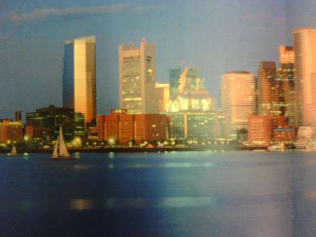
The rainbow colors are a bit much...I was talking more along the likes of this:
