atlantaden
Senior Member
- Joined
- May 31, 2006
- Messages
- 2,679
- Reaction score
- 3,344
Pic credit goes to my friend Tommy Bullock.
 IMG_3941 by Bos Beeline, on Flickr
 IMG_3948 by Bos Beeline, on Flickr
I was just walking to city hallThose are some angles you dont see often.

Wow, basically the finished product! Nice pic!
This is a stellar shot, but the uninspired/old fashioned State Street "logo" (if you can call it that -- what is it, a slightly tweaked Times New Roman or Cambria font?) is completely at odds with the daring, fluid design of the building, itself. Bigtime mismatch.
The font is a bit stodgy, but it is an old Boston bank after all. They certainly don't want to look too Vegas-y.
")
More to the point, State Street isn't a retail bank - being a custodial bank (the biggest globally) it's customers are large institutions. It doesn't need to impress Joe on the street, it needs to convey stability. A staid, solid, serif font logotype does that. See those of BNY Mellon, JP Morgan, Credit Suisse, for examples.The font is a bit stodgy, but it is an old Boston bank after all. They certainly don't want to look too Vegas-y.
Some photos from today. Looks like the State Street sign is going up.
View attachment 22413View attachment 22414View attachment 22415
 IMG_9057
 IMG_9081
 IMG_9088
 IMG_9130
 IMG_9131
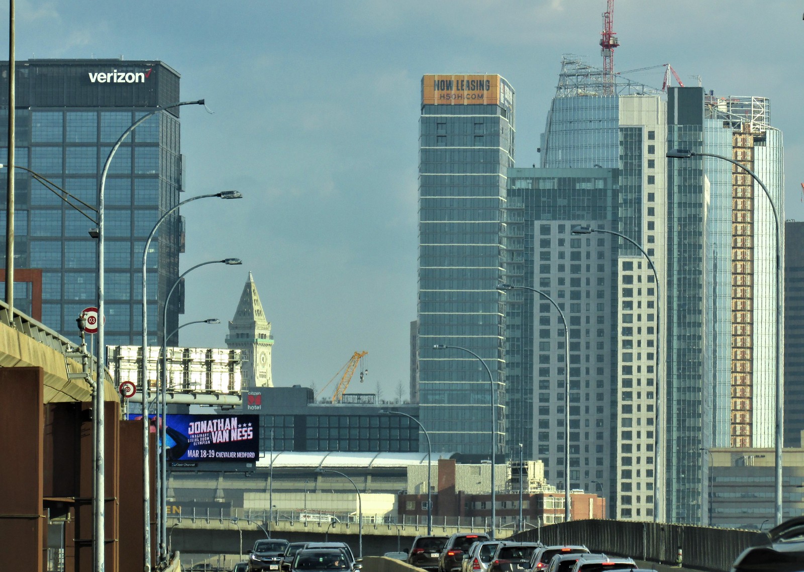 IMG_9140
 IMG_9172
 IMG_9173
 IMG_9201
 IMG_9204
 IMG_9220
 IMG_9222