citydweller
Active Member
- Joined
- Aug 23, 2019
- Messages
- 479
- Reaction score
- 752
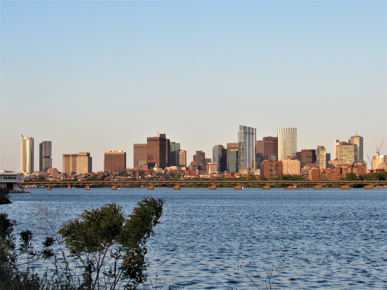
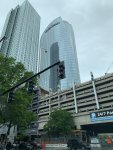
This building is way too wide. Grotesquely wide. And that curtain wall looks like something out of the 70s. The raised, metallic mullions contrast starkly with the blue glass, making the skin look busy and negating any sensual effect the building's smoothly curving facade might have had otherwise.
What an enormous disappointment this one turned out to be.
The same was said about JHT ... it was too wide. Turns out to be the icon of the Boston skyline.

 IMG_0710
 IMG_0820
 IMG_0889