State Street HQ | One Congress | Bulfinch Crossing | West End

Do the different color glass panels and that one section of the night time lighting that is not lit bother anyone else to death? 💀
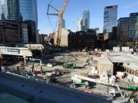
I'm hoping and expecting that the mismatched panels will be replaced.
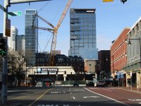
As for the lighting, it looks great even with the missing area, as the lighting going all the way up the end pleat gives it a continuity.
 
As of 12/23/23
 

Attachments

  • IMG_2160.JPG
    IMG_2160.JPG
    6.1 MB · Views: 213
  • IMG_2163.JPG
    IMG_2163.JPG
    5.6 MB · Views: 192
  • IMG_2167.JPG
    IMG_2167.JPG
    5.4 MB · Views: 190
  • IMG_2171.JPG
    IMG_2171.JPG
    5.3 MB · Views: 189
  • IMG_2172.JPG
    IMG_2172.JPG
    4.7 MB · Views: 194
  • IMG_2173.JPG
    IMG_2173.JPG
    6.2 MB · Views: 200
  • IMG_2174.JPG
    IMG_2174.JPG
    6.1 MB · Views: 200
  • IMG_2176.JPG
    IMG_2176.JPG
    5.4 MB · Views: 220
Anyone know how long the Haymarket busway will continue to be closed and unavailable for use? The busway has been closed for what I think is about 2.5 years already?
 
The Christmas sign really messed with me, especially from up close. It kept looking like the letters weren't lined up somehow, like a loopy optical illusion. It's cool that they can do this but I wasn't a fan.

IMG_1138 by David Z, on Flickr
I hate it. I admit to hating all high building signage and stuff that randomly changes is even worse
 
I hate it. I admit to hating all high building signage and stuff that randomly changes is even worse

Well... it was the Christmas Season and they changed the lettering from all-white to red-and-green. Is that really an instance of "randomly chang[ing]"? Seems pretty purposeful, deliberate, and with obvious catalyst.
 
I know I am whining to the wrong people, but the chasm of open sky the demolition has opened up after decades of this hulking monstrosity makes me wonder about the hypocrisy of shadow laws for Boston Common or the Harbor Towers/Aquarium Garage nonsense.
How was this totally ok, but a 700-foot tower that casts a shadow on part of a park for a few hours the end of the world? And how was the Aquarium Garage tower so awful?
In defense of the garage, afaik it was built in the 60s during the heyday of urban renewal and razing of the surrounding areas. No one back then, who had a voice at least, cared about shadows - at least not in the leveled West End and Scollay Square. If anything much of the modern NIMBY movement was born out of this destruction causing the complete 180 we see today on opposition to everything that changes anything (and sometimes things that don't even change a thing).
 
Well... it was the Christmas Season and they changed the lettering from all-white to red-and-green. Is that really an instance of "randomly chang[ing]"? Seems pretty purposeful, deliberate, and with obvious catalyst.
Sure, but what's nest? Green because the Celtics win? Hot Pink for breast cancer? Purple because it's the CEO's favorite color? State Street is a bank and they are barely in that building (subleasing a lot of their space).

I love the cacophony of signage in Chinatown. It's organic and purposeful. Old pictures of the theater district are the same way. Color changing lights just feel arbitrary and even more of a blot on the skyline. I know I'm tilting at windmills on this site, I just find it dreary and disappointing.

Particularly in the case of one of the few architecturally interesting buildings downtown in recent memory.
 
I'm actually surprised that the marketing department permitted this sort of mucking with the State Street brand. Every time you see the name "State Street" it shoulld be the same font and color.
 
I'm more surprised at the actual color choices. It's as if someone just said, "oh we have color changing lights, lets set them to the default 'red' and the default 'green' setting". It's the most default, saturated, red and green color, like FF0000 and 00FF00 in rgb hex codes. The same thing happened with the rainbow colors and other colors they've changed to throughout the year. It would be 10x better if they weren't so saturated or they had an interesting hue so that they "match"

Currently it's something like this: Sᴛᴀᴛᴇ Sᴛʀᴇᴇᴛ instead of something like: Sᴛᴀᴛᴇ Sᴛʀᴇᴇᴛ

Edit: here's what I mean from other times they did different colors. The colors are sooooo saturated.

IMG_6127-EDIT.jpg
IMG_1886 copy.jpg
 
Last edited:
How would any of these scenarios be problematic?
Right? The Pru has been coordinating with various team's color schemes for years (as has the Zakim, and IP, and others).

Celtics in the playoffs: green lighting; Red Sox: red lighting; Bruins: yellow; Patriots:... well, we don't have to worry about that for a while.
 
As I’ve said before, I find it immensely tacky and the obsession with this kind of signage on the part of some here oozes with insecurity over Boston’s perceived stature. You certainly don’t see this silliness with State Street’s New York-based competitors.
 

Back
Top