The Alcott (née Garden Garage Towers) | 35 Lomasney Way | West End

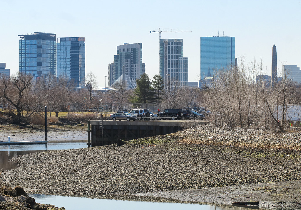
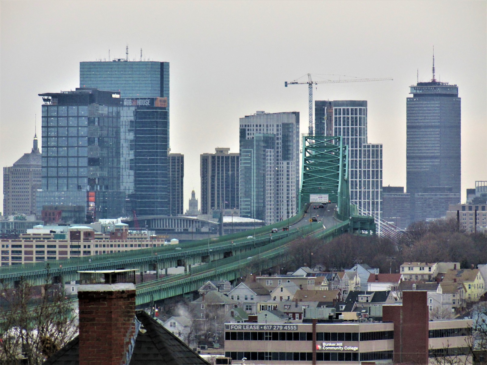
^^^A good visualization showing how different height buildings enhance the look of the city skyline and highlight its architecture. It's hard to understand how our planners and decision makers cannot put this simple, cost-effective concept into our urban planning and design.
 
This came out so much better than the Sudbury. This can't be mistaken for the JFK Fed bldg
The sudbury is a level above the alcott in my opinion. This is still a great addition to the area though, but the sudbury just got it right.. without a glass facade either.

I see the Sudbury as a distinct step down from any skyscraper with style. The renders pegged it for what it has become: a bland gray monolith that just sort of looms over the city, like a castle's donjon looms over a village. It also conjures images of a kid's first Lego skyscraper built once s/he had enough matching blocks, more a prototype or a vague idea than anything else.

Perhaps you really love it, or think that once the development is built out it'll blend in or compliment, sins will be forgotten, etc... but the tower in and of itself, is big, boxy, boring, and bland.
 
^^ I'll add that when scanning the skyline for things to shoot, my eyes already completely gloss over the Sudbury... at this point it's just there for me. With this one, its prominent location helps for sure but I also think its design speaks more clearly at greater distances (colossal order ftw) whereas the Sudbury gets repetitive from even a short distance.

51061795487_5eb13bb0cf_b.jpg


51061713921_69befcb9b4_b.jpg


51061713031_ef8d3779bc_b.jpg


51060995008_7bd0974509_b.jpg


51060994918_35fb6b66b6_b.jpg
 
To each, his or her own.

I love, love, love the Sudbury. It has a verticality and busy-ness of pattern that I find unique and very good looking. (BTW, the Sudbury isn't in any of those above pics - other than blocked by some trees on the left of the second pic). I only wish it was more engaging at the street level.

Your pics above seem to be contrasting the Alcott with the Avalon much more. I think the Alcott wins that one hands down (although I have nothing against the Avalon).

The Sudbury revels in being tall without trying to avoid that look with multistory window treatments. If there is one thing that irks me is Boston's shaming of everything tall, so much that these multistory window bracketing has become "The Boston Style", sadly. The Verizon building (along with its other faults) is a prime example.
 
Last edited:
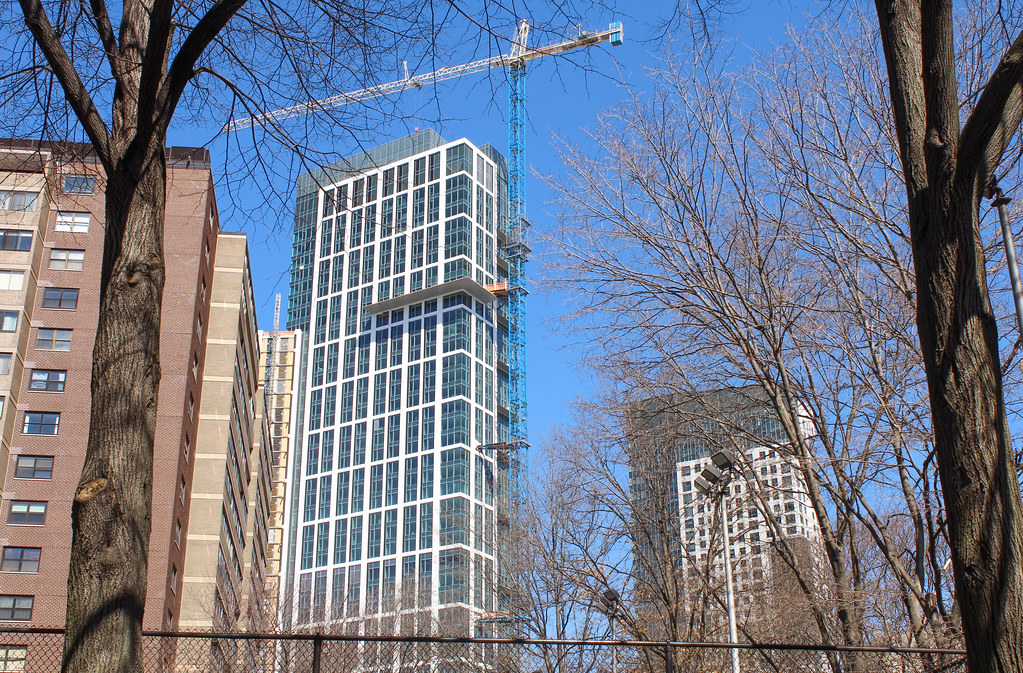
It's kinda weird that the glass on the top/crown shows as a different color than the rest, and that throws off the cohesiveness of the design. I wonder if it will look darker after everything is done and all the mechanicals or whatever are up there.
 
The top of MT looks totally different than the rest of the building, too. 1 Dalton as well, but much more subtly.
 
It's kinda weird that the glass on the top/crown shows as a different color than the rest, and that throws off the cohesiveness of the design. I wonder if it will look darker after everything is done and all the mechanicals or whatever are up there.
A fairly cheap fix for the color difference would be to apply a darker adhesive film to the inside of the lighter glass,
 
It's kinda weird that the glass on the top/crown shows as a different color than the rest, and that throws off the cohesiveness of the design. I wonder if it will look darker after everything is done and all the mechanicals or whatever are up there.
I was thinking exactly the same thing. It's obvious the crown is a different color/material than the glass that runs up the side. Maybe when they put a roof on it will darken it. I hope they light up the top portion when it's complete.
 
A question for those who understand these things better than I do (and I guess who agree with me): why does colossal order work so well here where it fails on Atlantic Wharf and on other buildings throughout the city? Is it the relative emphasis on verticality? Or is the Alcott simply tall enough to make colossal order work, whereas Atlantic Wharf is too short for it to have even been attempted?
 
A question for those who understand these things better than I do (and I guess who agree with me): why does colossal order work so well here where it fails on Atlantic Wharf and on other buildings throughout the city? Is it the relative emphasis on verticality? Or is the Alcott simply tall enough to make colossal order work, whereas Atlantic Wharf is too short for it to have even been attempted?
In my opinion it has to do with proportions of the windows, height to width and the use of an odd number of bays and an odd number of stories per bay. Atlantic Wharf divides its fat side into five bays but spoils the proportions by having four stories, instead of 3, in each bay. Also the bays are too wide for the height of the tower; there should have been 7 narrower bays and 3 stories per bay for the colossal order to work better. The shorter the tower, the smaller the height and width of the attempt. Another successful attempt at this is 500 Boylston St as seen along the sides.
 
A question for those who understand these things better than I do (and I guess who agree with me): why does colossal order work so well here where it fails on Atlantic Wharf and on other buildings throughout the city? Is it the relative emphasis on verticality? Or is the Alcott simply tall enough to make colossal order work, whereas Atlantic Wharf is too short for it to have even been attempted?
Height to width ratio (narrower the better). It also helps that the top floor of each section is actually shorter than the ones below because it creates a force perspective. They do it with Cinderella's Castle in Disney parks.


In general, the colossal order looks better when applied closer to the lower floors since it really emphasizes the massiveness and grandeur from a human scale and better when it is applied less towards the top. Personally, I think the building on 49 Court St did the best job at utilizing the colossal order correctly
1616615351696.png
 
Last edited:

Back
Top