atlantaden
Senior Member
- Joined
- May 31, 2006
- Messages
- 2,679
- Reaction score
- 3,344
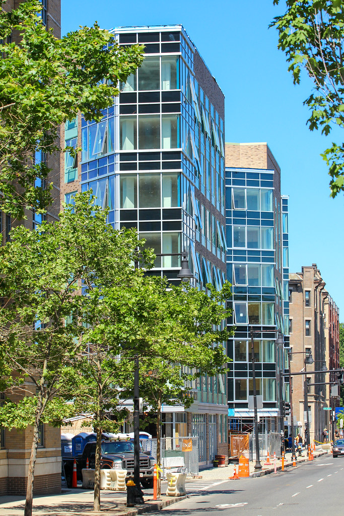
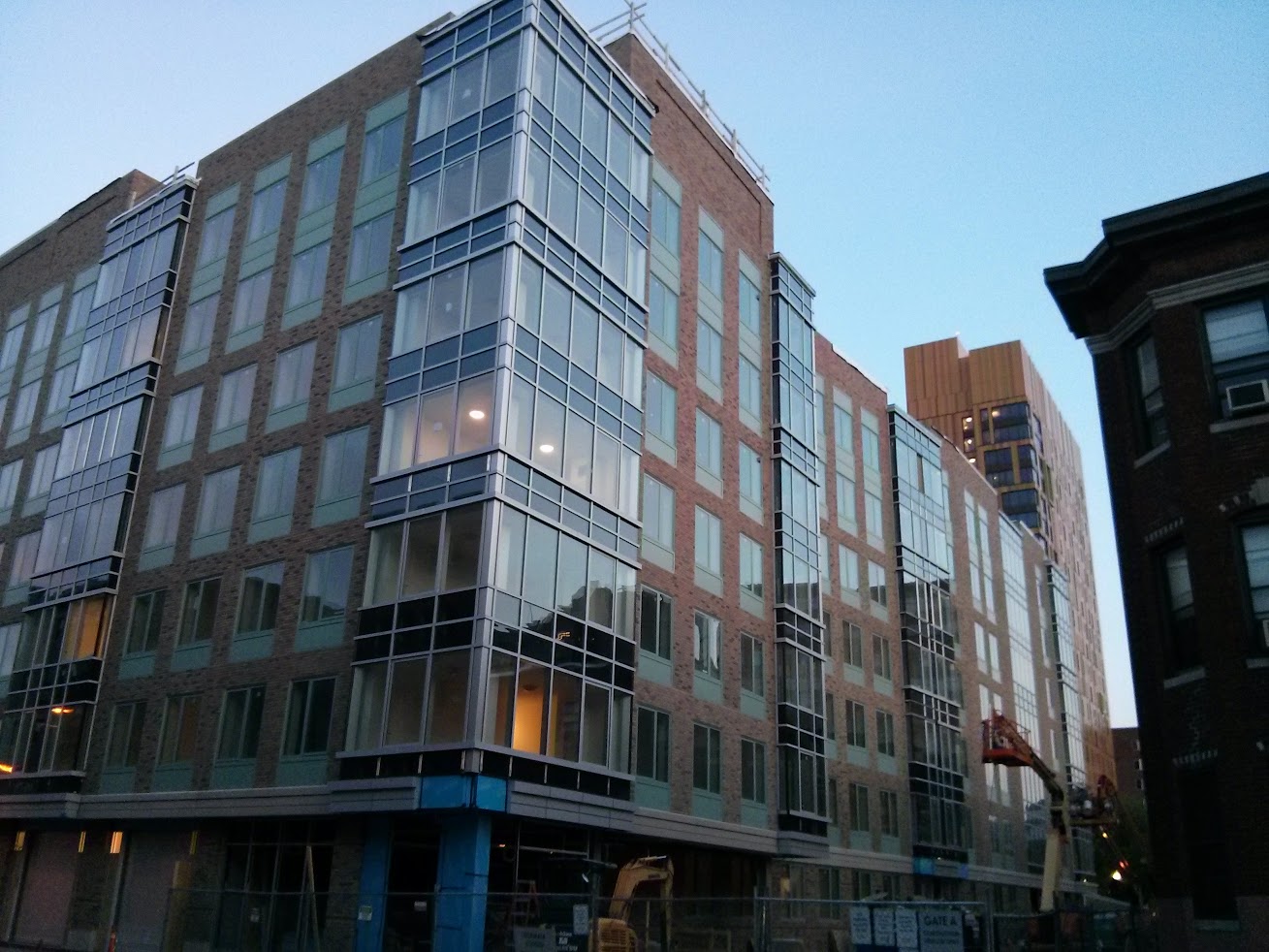
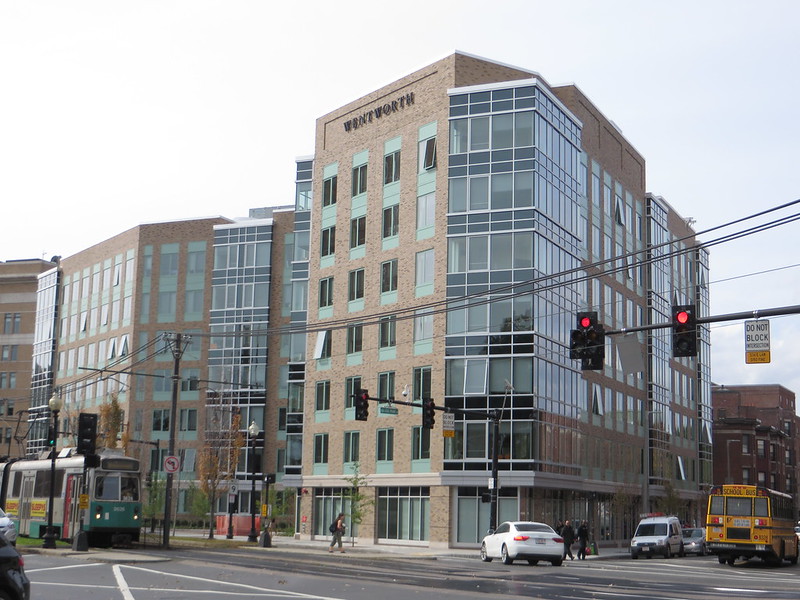
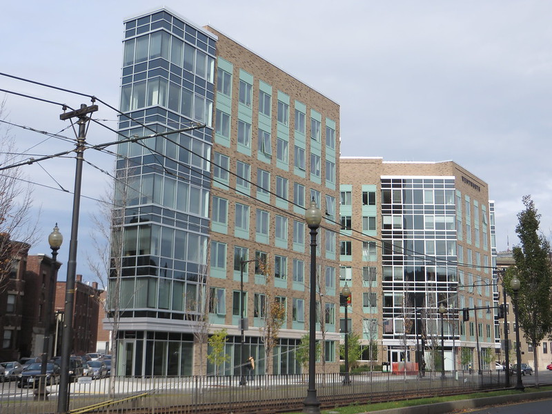
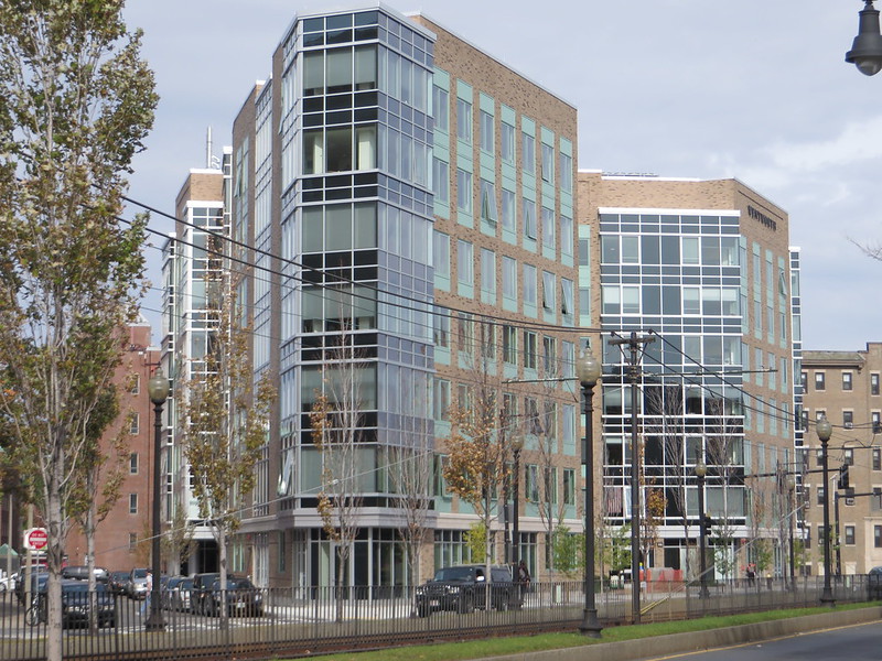
Like the brick, the glass, the sexy angles!
the sexy angles!
The angles may be sexy from the outside, but they create horribly awkward spaces inside that I've experienced first hand. Ultimately, this is a building designed for people to live in and the spatial environment inside leaves much to be desired. Housing should always be designed from the inside out, that is, the units and the grouping of the units should define the shape of the building, not the other way around which is designing the footprint then cramming the units inside like what happened here.
Well we all want to know who's to blame, so who is it: the lunkhead architects, or the triangular site?
Also, I agree with you that the windows help this building out a lot -- they made it go from awful to not horrible IMO.
If the new-ish Mass College of Pharm building down the street could pull off a tough site with a great design why not this?
I don't mind the massing but the stripped down modern look is more stripped down cheap.