You are using an out of date browser. It may not display this or other websites correctly.
You should upgrade or use an alternative browser.
You should upgrade or use an alternative browser.
The Boulevard (née The Times/Littlest Bar) | 110 Broad St | Downtown
- Thread starter Hutchison
- Start date
Beton Brut
Senior Member
- Joined
- May 25, 2006
- Messages
- 4,383
- Reaction score
- 354
"I'm really proud of this"?
I'm pretty sure they just cashed their paycheck.
What a pile of shit...
stick n move
Superstar
- Joined
- Oct 14, 2009
- Messages
- 13,361
- Reaction score
- 23,947
I havent really paid attention to this but it looks like retail ground floor? Along with that other new building too. At the end of the day the greenway is going to be lined with retail from the victor to one greenway along with fanuel hall, the waterfront, the blackstone market, the Boston public market...etc. Some of these new buildings arent anything to be proud of architecturally, but overall they improve the ground level of one of the most beautiful parts of the city. Ill take it.
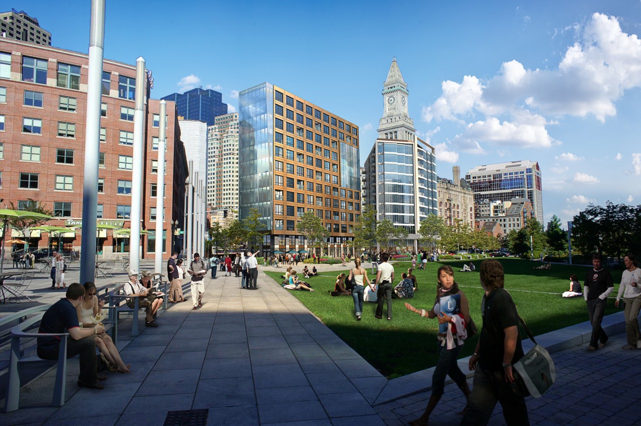
Obviously I liked the first design better even though that was bad too, but once it is filled with people, furniture, curtains, itll break up the monotony of those glass parts.
Obviously I liked the first design better even though that was bad too, but once it is filled with people, furniture, curtains, itll break up the monotony of those glass parts.
DigitalSciGuy
Active Member
- Joined
- Apr 14, 2013
- Messages
- 670
- Reaction score
- 421
Yeah, it'll be nice when all the developments from here to The Victor fill in. Every block from The Victor down to North Street is spoken for, then you hit this alternating pattern of inert blocks starting with the garage between North and Clinton Streets, then the 'butt' of 200 State Street with a brief opening to Quincy Market, then another inert block from State to Central street, a tiny sliver of activity with Granary Tavern, another inert block with Related Beal's 177 Milk Street, and finally retail again at 55 India and this building.
Doing another double take on the approved renderings and the latest renderings, I get where you guys are upset over the value engineering, but at least to my layperson eye, I don't see that dramatic a change on the Greenway face. It looks like decent infill to me, so I'm not getting some of the outrage. Perhaps I'm just not getting it because I never experienced whatever was magical about The Littlest Bar?...
Doing another double take on the approved renderings and the latest renderings, I get where you guys are upset over the value engineering, but at least to my layperson eye, I don't see that dramatic a change on the Greenway face. It looks like decent infill to me, so I'm not getting some of the outrage. Perhaps I'm just not getting it because I never experienced whatever was magical about The Littlest Bar?...
whighlander
Senior Member
- Joined
- Aug 14, 2006
- Messages
- 7,812
- Reaction score
- 647
This is way too short for this location.
I'll take what we're getting.. its not that bad, but a sleek 350-400' tower on top of this would've improved this tenfold.
Stefalar --- Sorry its not way to short -- a tall tower in that location would look cheap and irrelevant when placed next to the true gem of the Custom's House -- a sleek 450' - to 500' tower
F-Line to Dudley
Senior Member
- Joined
- Nov 2, 2010
- Messages
- 9,926
- Reaction score
- 12,079
So...go short, cheap, and irrelevant?
citylover94
Senior Member
- Joined
- Oct 27, 2012
- Messages
- 1,140
- Reaction score
- 58
A tall tower on either or both of the sites being discussed here would be very thin and sleek and could actually offer a really interesting counterpoint to the Custom House. So long as the materials and design are good there is no reason a modern skyscraper couldn't be a good complimentary element to the Custom House Tower.
lapradetom
Active Member
- Joined
- Feb 7, 2015
- Messages
- 296
- Reaction score
- 8
"Good design doesn't date. Bad design does".... Paul Rand
citylover94
Senior Member
- Joined
- Oct 27, 2012
- Messages
- 1,140
- Reaction score
- 58
+1
I think some people emotional attachments may be clouding their judgement. The latest version of this actually looks like a pretty solid design to me.
I think some people emotional attachments may be clouding their judgement. The latest version of this actually looks like a pretty solid design to me.
stick n move
Superstar
- Joined
- Oct 14, 2009
- Messages
- 13,361
- Reaction score
- 23,947
I havent payed attention to this until like 2 days ago but this actually looks good and meshes with the surrounding area. I went through the entire thread these have not been shown here, although very similar renders have. This is the design we currently stand with at the moment. Not bad if I do say so myself. I agree with other posters on here let the Custom house tower be shown. 99.9% chance whatever would have been built here if they went tall would not have been better. Anybody can have a skinny glass tower in 2016, nobody else can have a Custom House tower.


Last edited:
dirtywater
Active Member
- Joined
- Nov 16, 2006
- Messages
- 686
- Reaction score
- 357
^ Agreed
Suffolk 83
Senior Member
- Joined
- Nov 14, 2007
- Messages
- 3,021
- Reaction score
- 2,489
People are basing their opinions off of Charlie mta 's renderings he posted. I guess it all depends on what version we are getting
Charlie_mta
Senior Member
- Joined
- Jul 15, 2006
- Messages
- 5,090
- Reaction score
- 7,619
I'm liking these renderings. Apparently sanity prevailed.
stick n move
Superstar
- Joined
- Oct 14, 2009
- Messages
- 13,361
- Reaction score
- 23,947
Depending on what that bronze portion of the facade is made of if they keep this it looks amazing.
DigitalSciGuy
Active Member
- Joined
- Apr 14, 2013
- Messages
- 670
- Reaction score
- 421
I REALLY love seeing contrast like this when I walk around cities. I also just noticed the band of granite/concrete and cladding just above the ground floor that wraps around the entire building and is a design nod to the older building.
I'm really curious about that bronze/metal map at eye level on the Broad Street side...
Czervik.Construction
Senior Member
- Joined
- Apr 15, 2013
- Messages
- 1,959
- Reaction score
- 1,223
Personally, I love the shrunken BMW Z8 parked out front. What a disaster of a car.

