Beton Brut
Senior Member
- Joined
- May 25, 2006
- Messages
- 4,382
- Reaction score
- 338
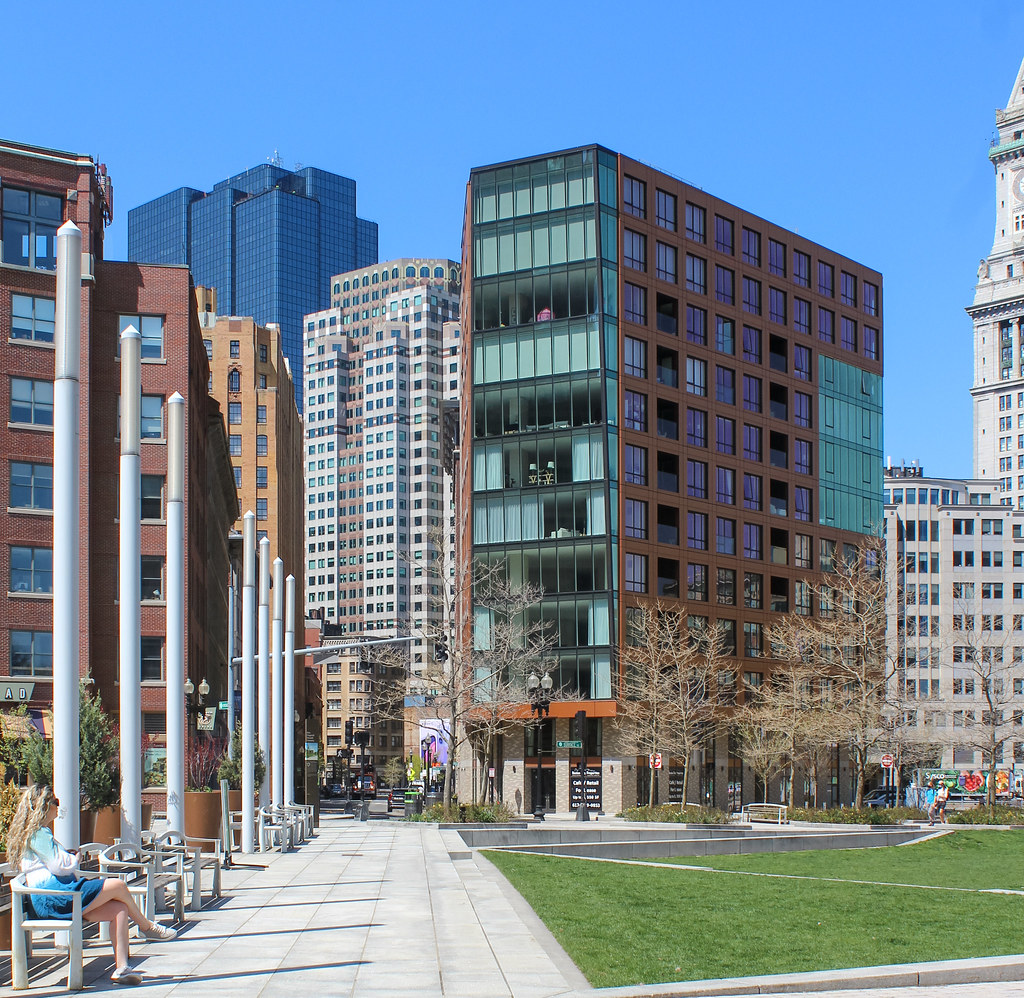
My favorite take on this building.
I'd have preferred black or charcoal brick to the dusty taupe the used.
Though I haven't been inside of any unit here, to may also be important to consider the tension between "how things look" and "how things are" before we censure the architects. There's a time-honored approach within modernism to create a space that functions as both shelter and "viewing platform." I'd suggest that this concept was part of the architect's wider agenda.
I agree, this isn't bold. At best, it's blingy contextualism, a loud background building. Given that this was proposed some time ago (in the shadow of the Kairos Shen era), perhaps we'll get something sexier on the adjacent site.
Is it nice, sure. Does it look like the base of a tower that was never built, totally.
I'd have preferred black or charcoal brick to the dusty taupe the used.
Though I haven't been inside of any unit here, to may also be important to consider the tension between "how things look" and "how things are" before we censure the architects. There's a time-honored approach within modernism to create a space that functions as both shelter and "viewing platform." I'd suggest that this concept was part of the architect's wider agenda.
I agree, this isn't bold. At best, it's blingy contextualism, a loud background building. Given that this was proposed some time ago (in the shadow of the Kairos Shen era), perhaps we'll get something sexier on the adjacent site.

