You are using an out of date browser. It may not display this or other websites correctly.
You should upgrade or use an alternative browser.
You should upgrade or use an alternative browser.
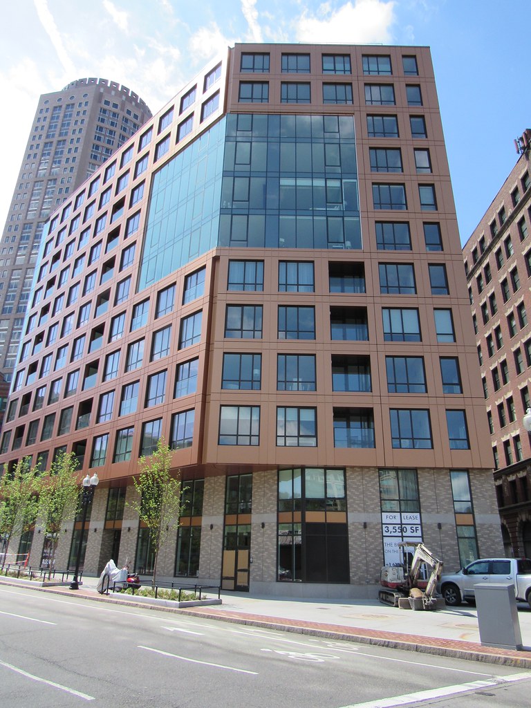
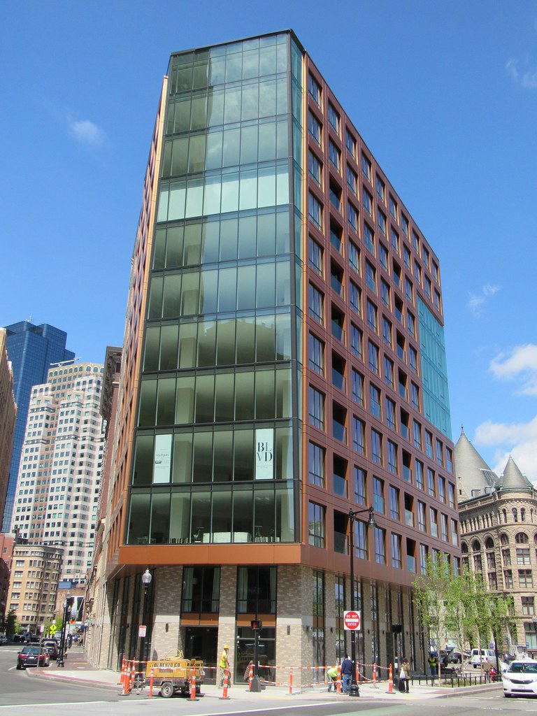
The Boulevard (née The Times/Littlest Bar) | 110 Broad St | Downtown
- Thread starter Hutchison
- Start date
https://www.architectural-review.co...ion-at-the-folly-of-facadism/10026645.article
Outrage: future generations will laugh in horror and derision at the folly of facadism
2 JANUARY, 2018 BY THE GENTLE AUTHOR
Outrage: future generations will laugh in horror and derision at the folly of facadism
2 JANUARY, 2018 BY THE GENTLE AUTHOR
stick n move
Superstar
- Joined
- Oct 14, 2009
- Messages
- 13,361
- Reaction score
- 23,947
That didnt really happen here though, but I agree for the most part. Things like the Filenes building are how its done right. Here and Filenes the whole buildings are gutted, but kept in tact with a new tower next door that article is more for that church in the south end with the residences popping up through the middle which is kind of weird. Atlantic wharf would be another, but I think that was done in good taste.
https://www.architectural-review.co...ion-at-the-folly-of-facadism/10026645.article
Outrage: future generations will laugh in horror and derision at the folly of facadism
2 JANUARY, 2018 BY THE GENTLE AUTHOR
I think even in the examples shown in that link, there is something that I enjoy about it. They have a somewhat steampunk look to them in the chaos and makeshift-ness of it all. I actually think these examples will be looked at with enjoyment from future generations, unless they get completely destroyed...maybe someday they'll get a third round of facadism
I can appreciate the critiques of the Boulevard's facadism. I mostly dislike the disconnect between the two buildings, and how cold the newer section feels towards the facadectomy. The walls facing it are mostly barren and all attention to detail and design was focused on the Greenway side.
stellarfun
Senior Member
- Joined
- Dec 28, 2006
- Messages
- 5,719
- Reaction score
- 1,563
.....
I can appreciate the critiques of the Boulevard's facadism. I mostly dislike the disconnect between the two buildings, and how cold the newer section feels towards the facadectomy. The walls facing it are mostly barren and all attention to detail and design was focused on the Greenway side.
^^^^This. Wrong brick bond, wrong palette. On the Greenway side, perhaps potted plants and shrubs mill help mask the brick some day.
As for facadism, Dainty Dot could very well have resembled the egregious London examples. The preserved facade was just that, with nothing behind the facade preserved and replaced by a building, while architecturally distinctive, was totally disconnected from the facade.
TheRifleman
Banned
- Joined
- Sep 25, 2008
- Messages
- 4,431
- Reaction score
- 0
Closings have begun. Units 901 and 1001 both over $4m.
Wow —4 million a unit? Broad st is the best location in my opinion in the city
stellarfun
Senior Member
- Joined
- Dec 28, 2006
- Messages
- 5,719
- Reaction score
- 1,563
Robots in control.

Park-it-yourself? No way. Parking attendants. What are those?
https://www.bostonglobe.com/busines...town-garage/6ebIV6ASThqdRMCj7TtqgO/story.html

Park-it-yourself? No way. Parking attendants. What are those?
https://www.bostonglobe.com/busines...town-garage/6ebIV6ASThqdRMCj7TtqgO/story.html
stick n move
Superstar
- Joined
- Oct 14, 2009
- Messages
- 13,361
- Reaction score
- 23,947
Did anyone else catch the segment about this building on tv? It was pretty good, in depth, and they went into great detail about the parking system.
stick n move
Superstar
- Joined
- Oct 14, 2009
- Messages
- 13,361
- Reaction score
- 23,947
Video tour/description.
https://youtu.be/yat-iCW3ZFw
https://youtu.be/yat-iCW3ZFw
stick n move
Superstar
- Joined
- Oct 14, 2009
- Messages
- 13,361
- Reaction score
- 23,947

BostonRealestateTimes
stellarfun
Senior Member
- Joined
- Dec 28, 2006
- Messages
- 5,719
- Reaction score
- 1,563
^^^^That looks more like a render, too many lights, no traffic.
Its from here:
https://faainc.com/projects/110-broad-street-boston/
Its from here:
https://faainc.com/projects/110-broad-street-boston/
- Joined
- Jan 7, 2012
- Messages
- 14,172
- Reaction score
- 23,677
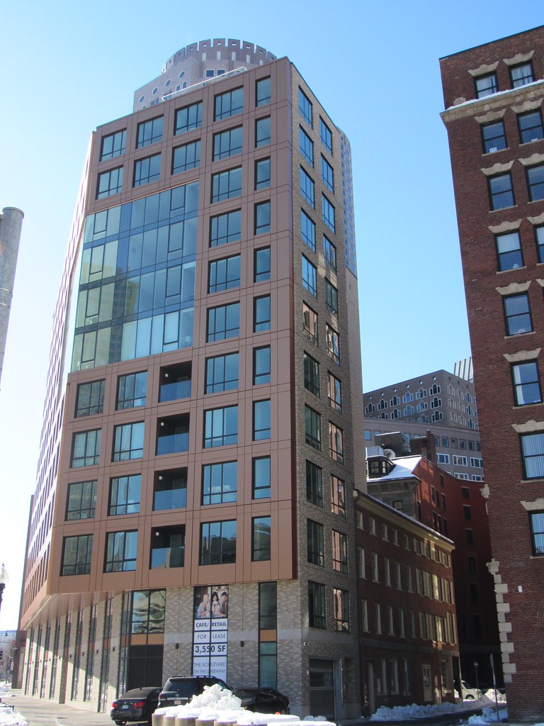
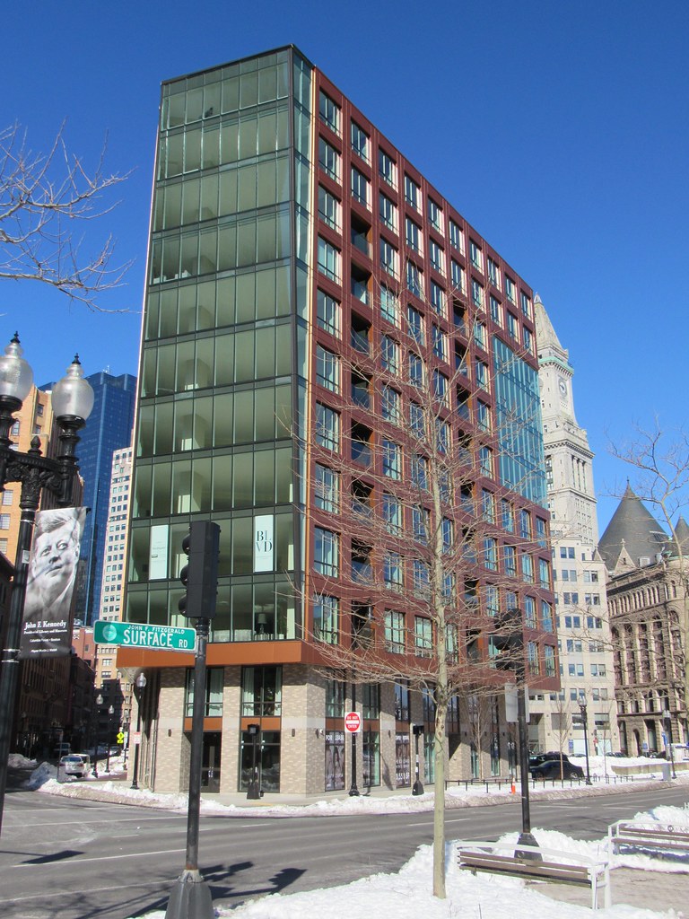
This is what it looks like in real life.
 https://flic.kr/p/SYFom7
 https://flic.kr/p/2dHZWeB
 https://flic.kr/p/2e1VAi9
 https://flic.kr/p/2dHZWuM
 https://flic.kr/p/2e1VANs
 https://flic.kr/p/SYFom7
 https://flic.kr/p/2dHZWeB
 https://flic.kr/p/2e1VAi9
 https://flic.kr/p/2dHZWuM
 https://flic.kr/p/2e1VANs
stick n move
Superstar
- Joined
- Oct 14, 2009
- Messages
- 13,361
- Reaction score
- 23,947
I like this a lot. Im not sure what the actual material is, but it looks copper-ish and looks high quality. Street level isnt the most popular, I think its fine though, and its added retail space thats going to add more to the greenway which is turning into a retail lined gem... which is its ultimate final form.
- Joined
- Jan 7, 2012
- Messages
- 14,172
- Reaction score
- 23,677
cca
Senior Member
- Joined
- Aug 19, 2008
- Messages
- 1,408
- Reaction score
- 12
I like this a lot. Im not sure what the actual material is, but it looks copper-ish and looks high quality. Street level isnt the most popular, I think its fine though, and its added retail space thats going to add more to the greenway which is turning into a retail lined gem... which is its ultimate final form.
Copper colored metalic paint with a resin coating. Same finish that your car gets just coppery.
cca
TheMagicMan
Banned
- Joined
- Jun 20, 2014
- Messages
- 138
- Reaction score
- 0
Great location a very bad design. This building is very ugly


