Boston02124
Senior Member
- Joined
- Sep 6, 2007
- Messages
- 6,936
- Reaction score
- 7,088
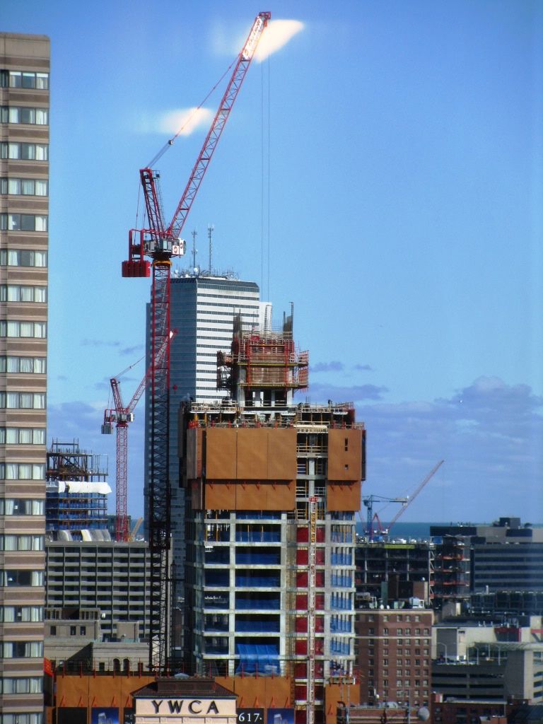
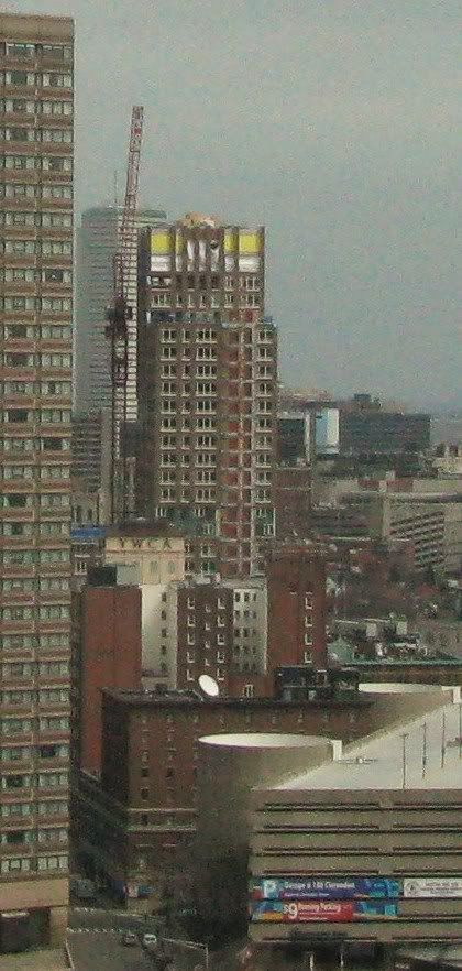
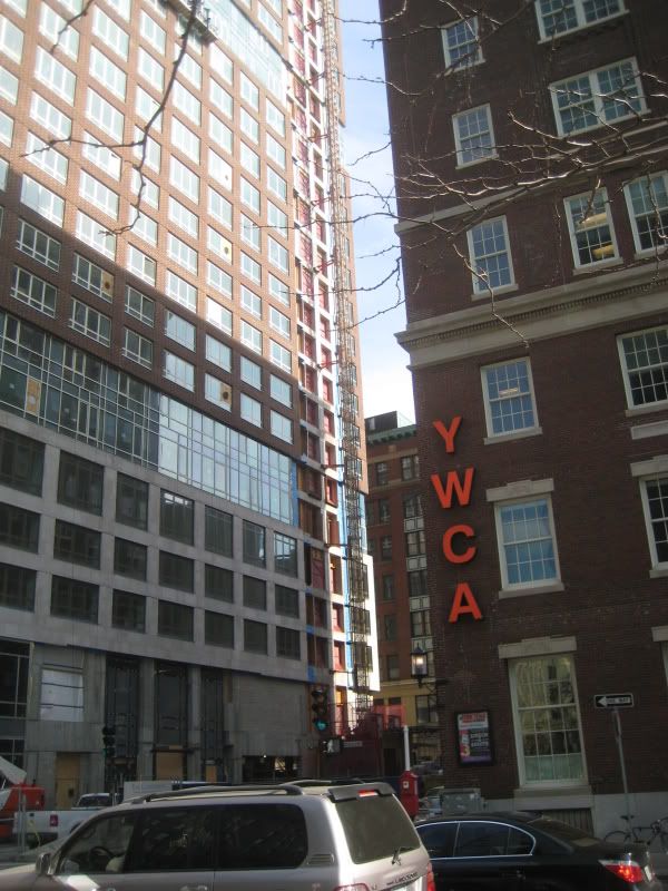
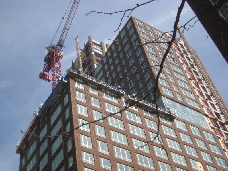
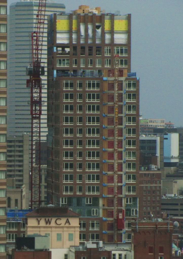
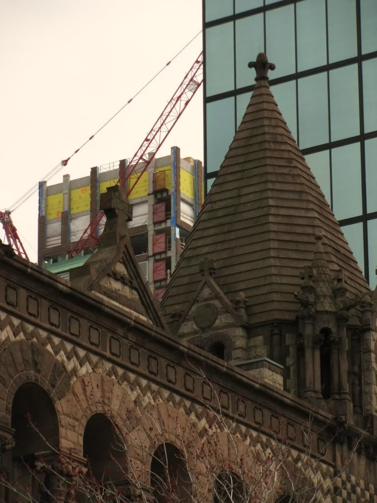
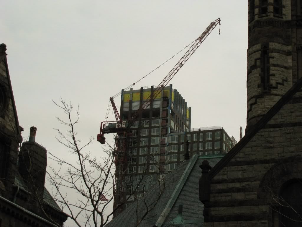
Today can't seam to get enough of this building I look forward to when the top is done and lit up at nite!
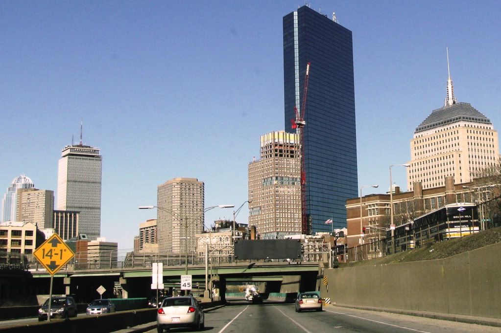
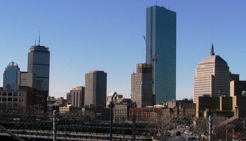
 from 93 south
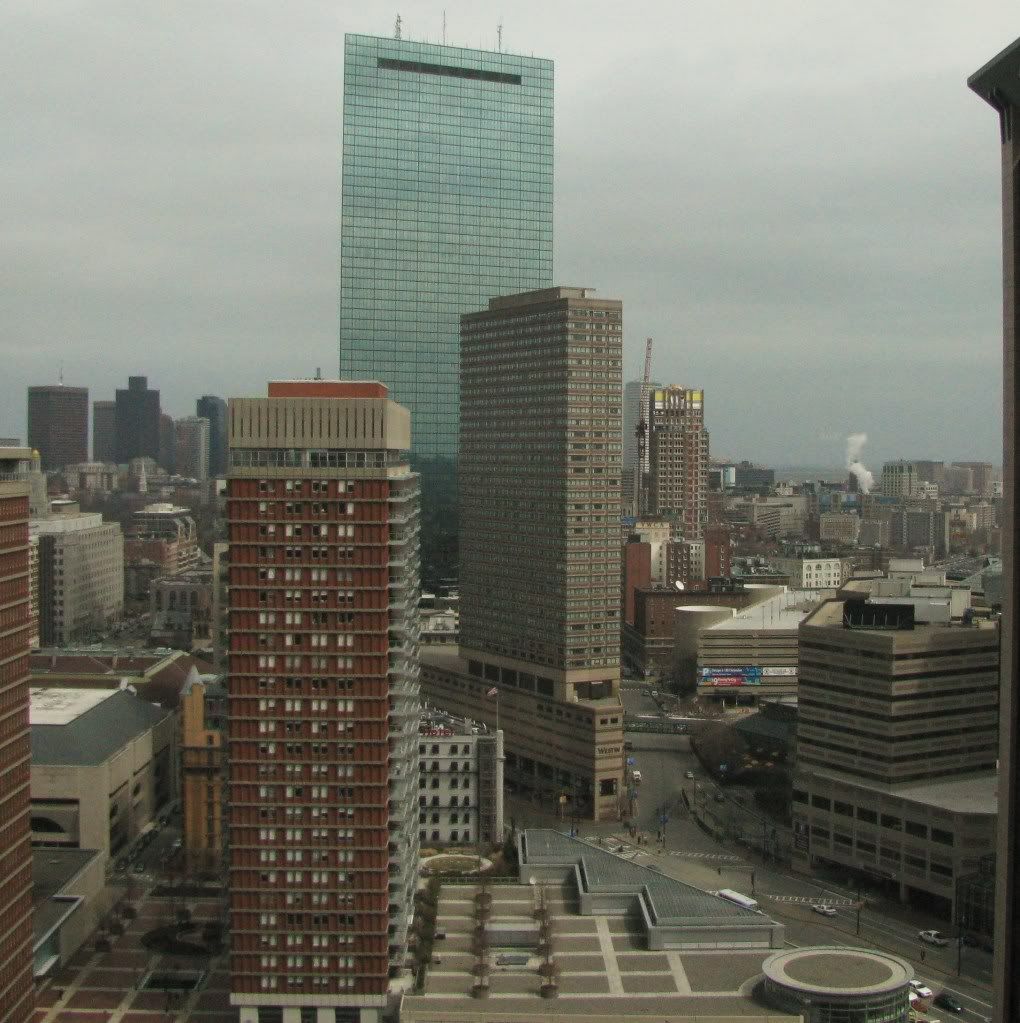
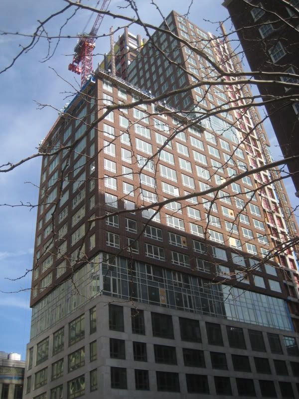
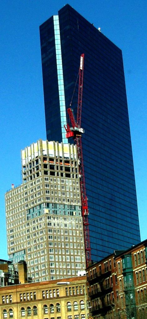
Thoughts:
1) I honestly don't think the building would look better with more height. I think the design works as it is.
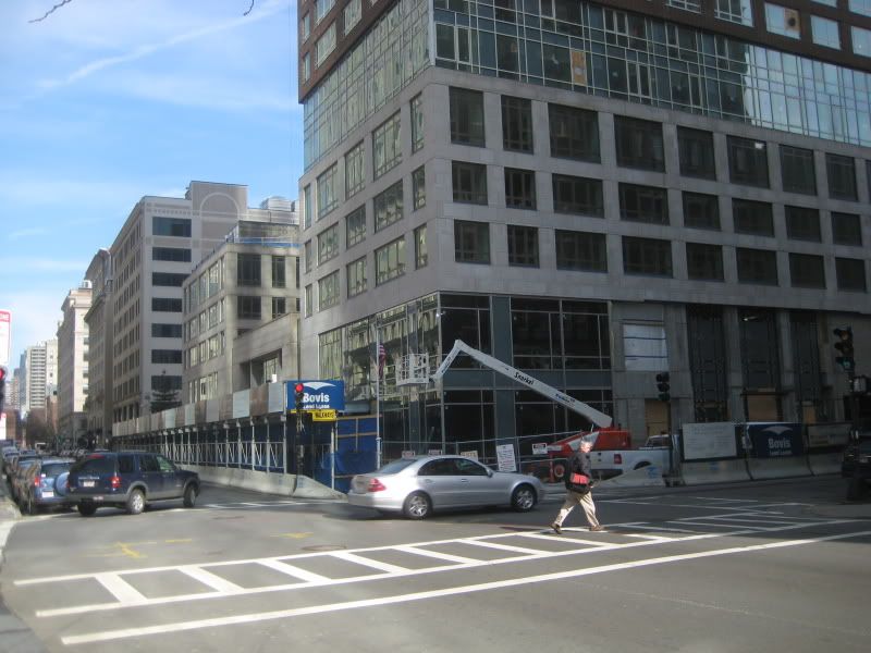
2) God damn the Westin is one piece of crap (not to mention Copley Place).
3) I've never given them much thought but I really like the apartment towers at the Pru. Classic modernism with good colors and massing.