The Clarendon

Status
Not open for further replies.
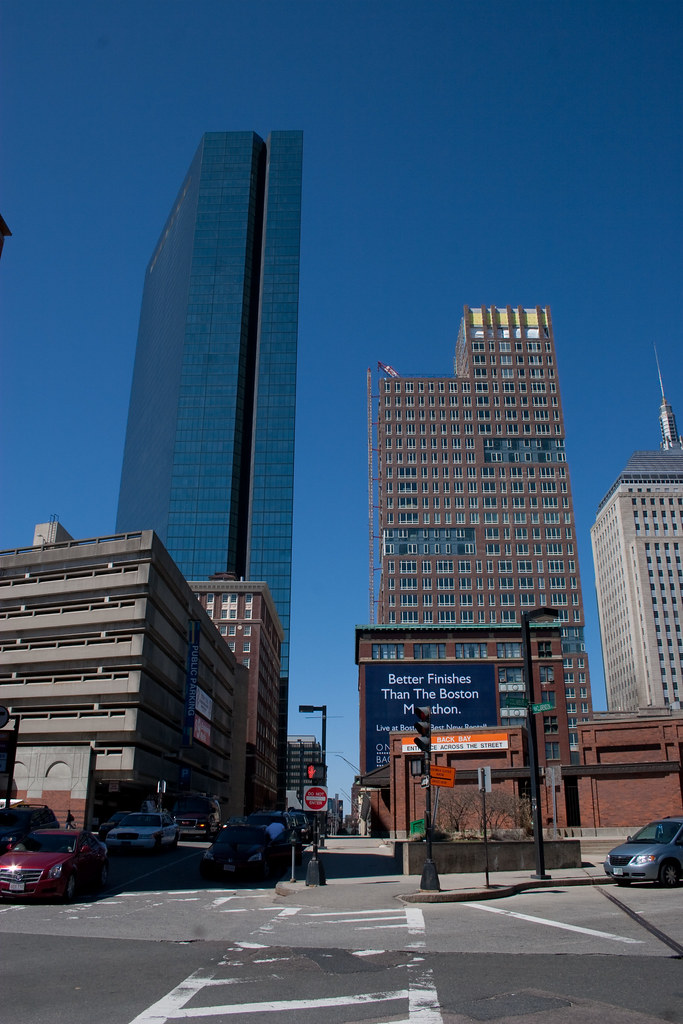
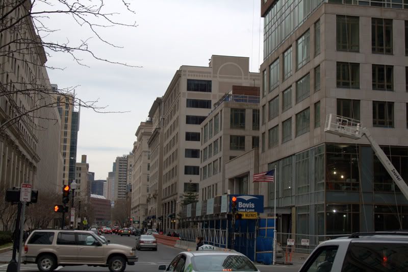
There are a lot of bad things to say about this building, IMO, but its worst crime is this:
clarendon_stuart_st.jpg


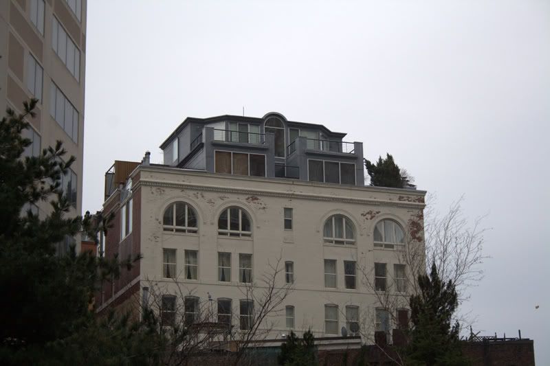
Look how it--permanently--disrupts Stuart St. The Jury, two buildings down, deliberately added-on to meet the height of the rest of Stuart St. The Clarendon renders its efforts pointless, and seems like it could care less. How do its designers justify this?

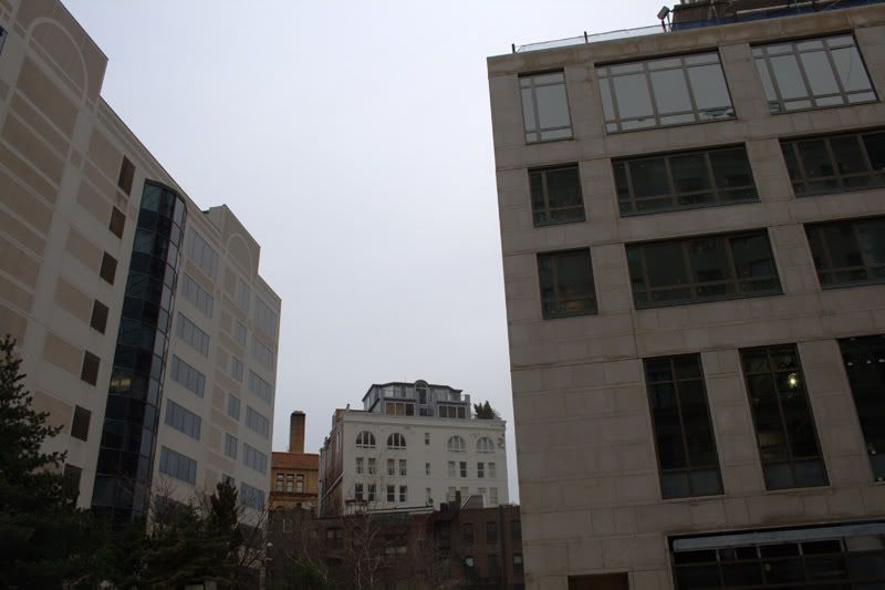
I can only speculate, but I think this little building's inhabitants may have something to do with it(and, perhaps, the Clarendon's mysterious reorientation from its earlier scheme):
clarendon_pope_building.jpg


pope_building.jpg
 
Aren't these the types of things the BRA should be catching?
 
I think Columbus Center will block that view

LOL! Columbus Center!

KentXie, I agree that at some angles this building looks really thin. A great angle is if you're on Stuart St, looking from the Pru.
 
In between the Clarendon and that white office building? It's a park/daycare playground.
 
Government regulation by a planning board with monopolistic powers doesn't work.
 
3477830450_372ea0f59e_b.jpg


3477024475_849364a181_b.jpg


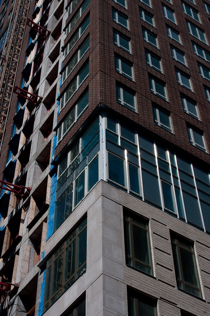
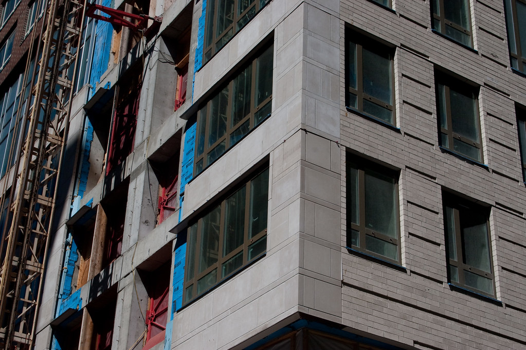
They switch from limestone to brick on the back side. I think it works, especially since you are never going to see that part unless you are up close.

3477834504_61506f2a46_b.jpg


3477028499_b434f1968f_b.jpg
 
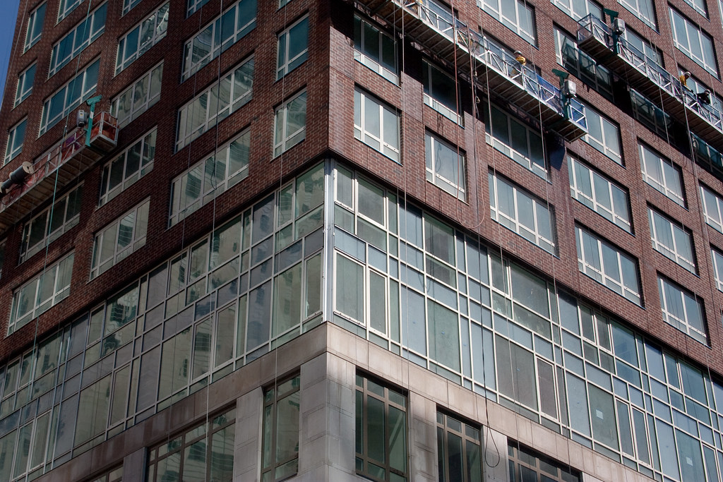
Why do the all-glass sections look so much nastier from further away?
 
You can see that parts are just glass veneer stretched over opaque walls.
 
But not here. Look at what the contrast between the veneer and the real windows looks like from a distance.
 
I like the "glass walls" design, the way it breaks the "square" look of the tower...
But I'm NOT so sure about the color of the brick....
The marked difference between the lower and the higher floors is REALLY good, but....
the choice of that shade.....
I don't know, I want to see the "product" FULLY finished!
And, OF COURSE, we DO HAVE the Hancock tower right across the street.... that makes everything new WAY more difficult to like!
 
Last night with the Hancock and Clarendon and the "fingernail" moon, it was beautiful.

Guess you'll have to take my word for it!
 
Why the new building wrap on the Hard Rock Building that says "One Back Bay - the finest finishes in Boston"???

Has the Clarendon been re-named? Has it gone rental? (Often condo projects that go rental re-brand to differentiate product) Or is One Back Bay the name of another building that Beal is advertising on its Mass Pike (and Ned) facing Hard Rock building?

I'm confused, and I need a former realtor turned politician to give me answers!!!
 
Status
Not open for further replies.

Back
Top