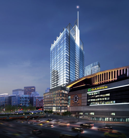
The Hub on Causeway (née TD Garden Towers) | 80 Causeway Street | West End

They want that tenant.

Tenant wants what fits them from the inside out; tall floors & not so good balconies, etc–which puts the tallest floor about 40 feet higher than before. So, a very nice 505' office tower has been crunched to 495' (not counting the bulkhead). But it just so happens – that given that the current design is so bad; there is but one simple solution;

go back to the last previous design: the wharf-shaped tower, and ask the BPDA for 40 more feet!

Nix the absurd ugly balconies, compress the mechanicals and get a hearing for a 30~35' height increase (still well within zoning), and build a 530 foot tower: the nice looking one.
 
That sucks though if Worcester would kill for garbage mediocrity because they have been neglected for so long. I used to live out there and Im not sure they would. For the base yea, but they dont really care about skyscraprs because they dont really matter. They dont have the same problems as Boston and skyscrapers arent going to fix the problems they do have- unless it means Amazon is moving there or some other big company. They want the problems fixed and businesses to move out there and fill in the streetscape before they worry about how their skyline looks.

Worcester brings up an interesting debate about whether it is better to separate your financial center from your capital city or not. Maybe if centrally located Worcester was the capital the people who ear mark money- who would live there, would want much more funding to make the city a better place to live for their families. That may have came with some governmental concrete high rises to hold employees. Maybe today it would have been at the point where the govt employees and their families would want to live in a glass condo building. Then maybe more companies would have wanted to locate there to tap into the college talent pool and govt official family member pool. Well never know, but Worcester and Springfield are completely forgotten about and neglected.

Worcester is pretty crappy by Boston standards but by "post-industrial New England medium city" standards it is doing OK. Better than Waterbury and Fall River at least. The public realm is very poorly maintained and there is a somewhat unfriendly vibe throughout (I'm sure due to the stresses of poverty and neglect). But there are a few renovations/new buildings and it is on a slow upswing. Downtown might develop a nice feel in a few years (the buildings are magnificent, but the street life is very lacking). Still not somewhere I'd stay long-term unless I prioritized saving on rent over everything (and even then, Fitchburg seems a bit cheaper and is on a better commuter rail line).

They need to fully revamp the public realm along major corridors (I know, there's budget constraints). They are going to do a complete streets makeover of part of Main Street and have made noise about improving bikeability. Especially along Highland Street would be good because there's already a lot of popular businesses there. It's just not pleasant to walk along these corridors with cracked sidewalks, lots of abandoned lots, but there's already the ingredients of students/graduates and popular businesses, just needs some more public realm maintenance and the street life will follow.

I actually worked on a full presentation and report on liveability (focusing on street trees) for the Elm Park neighborhood of Worcester, including Highland Street:

https://static1.squarespace.com/sta...18112568711/Elm+Park+Project+Presentation.pdf

https://static1.squarespace.com/sta...18112632950/StreetTreesinElmParkWorcester.pdf
 
Its the second biggest city in New England though you have to look at it in that context. For how big it is its pretty bad, its not in the same ballpark as Fall River. Providence is 100x nicer and even a few cities in CT. Anyways getting off topic so we can discuss in the Worcester thread if need be.
 
These were turds too.

the-hub-on-causeway-west-tower---multi-family-boston-ma-building-photo.jpg


the-hub-on-causeway-west-tower---multi-family-boston-ma-primary-photo.jpg


This design below was perfectly fine. Just like someone else said if they needed more room... make it taller. I also think in the corner you can see from the highway they should have extended the tower down to ground level so it would show its true height and the entire tower wouldnt all be above the podium. That would have looked good. It had a lit crown and dpire, we dont have that on the skyline so it would have added that too. The slant roofs are cool, but we need some spires as well.

The-Hub-on-Causeway-Mixed-Use-Development-Bulfinch-Triangle-Boston-TD-Garden-North-Station-Boston-Properties-Delaware-North-John-Moriarty-and-Associates-Construction.jpg
.

TheHubOnCauseway-Renderings-1_Page_02.png


TheHubOnCauseway-Renderings-1_Page_06.png


TheHubOnCauseway-Renderings-1_Page_03.png


HIRBN_Hub+on+Causeway+%285%29.jpg
 
Last edited:
Its the second biggest city in New England though you have to look at it in that context. For how big it is its pretty bad.... Anyways getting off topic so we can discuss in the Worcester thread if need be.

spent a couple of hours on Indian Lake yesterday.

couldn't believe they run power boats.

kinda felt like i was back in the '70s.
 
Its the second biggest city in New England though you have to look at it in that context. For how big it is its pretty bad, its not in the same ballpark as Fall River. Providence is 100x nicer and even a few cities in CT. Anyways getting off topic so we can discuss in the Worcester thread if need be.

Yeah, there's just a severe lack of any street life, so even though it is a historic city, there's nowhere in the area with that city vibe. Just a bunch of old triple-deckers scattered around filled with people who drive to their job and back home. The Worcester Art Museum is super nice though, you wouldn't expect it in Worcester. The Brutalist wing is very close to my architectural ideal for that style, just incredible:

https://www.google.com/maps/uv?hl=e...UKEwjo_amx_PLaAhUsTd8KHV1bC1wQoiowCnoFCAAQrgE

https://www.google.com/maps/uv?hl=e...UKEwjo_amx_PLaAhUsTd8KHV1bC1wQoiowCnoFCAAQrgE

https://www.google.com/maps/uv?hl=e...UKEwjo_amx_PLaAhUsTd8KHV1bC1wQoiowCnoFCAAQrgE
 
The approach from 93 looks atrocious.

wWkeRlg.jpg

I think I am starting to understand the design philosophy of the architect/client... 'just go ahead and make it look like 5 or 6 buildings all stuck together awkwardly'
 
"Just go ahead and make it look like something that fell out of a camel's ass, but even worse."
 
The only thing missing from the latest office tower rendering is the "shit box" sign illuminated on all 4 sides of the top.

+1

I think we'll be lucky if the Mayor doesn't give them another sign on the lower mass. The architect (Gensler) describes this at three buildings, podium, middle, and top. Three buildings, three tenants, three signs.
 
Is The Hub still office-heavy, or has it shifted a bit? The OP said 600k sq ft for office space, more square footage than for any other use, and which at just under 175 sq ft/job means 3,500 office workers. A hearty number for anywhere, I guess... but this is a hub, as the name implies. A heavy rail line, a light rail system, and the entire North Side railroad system funnel in here. Plus, residents will likely just complain about Garden event crowds and idling trains in the station. They should have gone big on the office space. The FAA cap is 800'+ here, so they could have negotiated with NIMBYs down to 600ft and it'd still be 1.5x taller than what we're getting.
 
They got itchy ass with this project. Cant pick something and stick with it. They should have stopped at the office tower with the spire and worked on the resi if anything. This site has changed like 50 times and all but 1 design were absolute garbage. This newest version is better than the black roof with the flat top with solar panels that was ass trash. Pretty much all of the glass ones before that were ungodly bad too. Then out of nowhere they got it right, but they still had itchy ass n couldnt sit still. Now its just a jumbled mess, but its not the worst one yet. Still very bad though.

Someone is crying out for a Proctologist.
 
If the developers are truly interested in incorporating an industrial aesthetic into the office tower (exposed I-beams and truss-work), look no further than Norman Foster. Here, the grand old man of High Tech returns to the language of his iconic Hongkong and Shanghai Bank from a generation ago.

Want to see how to do it in a way that looks like a jewel? Renzo Piano's NYTimes building is a shining example. That thing just gets better every time you walk by.

cca
 
Will the developer lose the tenant because they can't figure how to build a tower that is acceptable to themselves, their tenant and the community?

or will the Developer prevail and get this deed of horror built.
 
Want to see how to do it in a way that looks like a jewel? Renzo Piano's NYTimes building is a shining example. That thing just gets better every time you walk by.

cca

It's a very handsome building, an a great solution for the occupants. I'm curious about the durability of the horizontally-mounted enamel rods used as a brise soleil. A clever solution, but after 15 New York winters, how're they holding up?
 

Back
Top