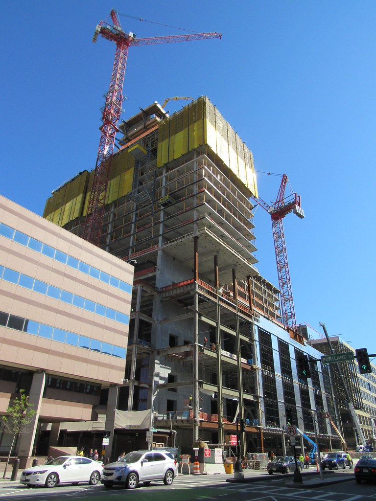
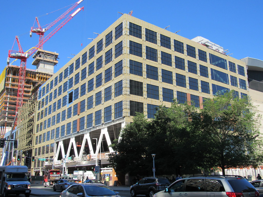
The Hub on Causeway (née TD Garden Towers) | 80 Causeway Street | West End

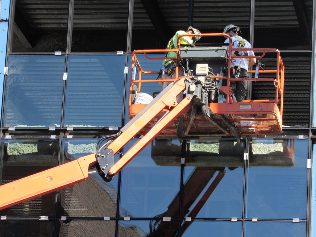
I work on Causeway Street and noticed them taking the panels down too. The first panels they had put up started to wash out/lose their color, so i wonder if the performance issues are the cause of the removal.
 
I work on Causeway Street and noticed them taking the panels down too. The first panels they had put up started to wash out/lose their color, so i wonder if the performance issues are the cause of the removal.

Maybe part of the deal for allowing the crappy design on the office portion is that they need to use better materials. The solid red panels just weren't good enough IMO.
 
Huh... BeeLine's pic from last week clearly shows the discoloring.


Reminds me of what a plastic kid's toy such as a Powerwheels would look like after being left out in the sun for a couple summers. And those panels first went up in early April. Under three months... from just morning sun exposure... yikes.
 
This may end up looking a lot better finished that it did in the renderings.
 
I actually have been thinking that both this and the office tower are going to look better than the renderings.
 
I pray it does because that office tower is ass.


What makes you think this though? They almost always look worse even if its only a liiiiiitle bit.
 
I'm thinking that, because several buildings highlighted on here in the last several years looked shitty in the renderings, but looked okay or better once they were built.

Part of that may be due to the way renderings are done today by computers. The renderings today look lifeless and flat, and lack the excitement and style of the hand drawn/painted ones of decades past. I remember in the 60's and 70's how inspiring the renderings of proposed buildings were.
 
Charlie’s on point. Interestingly, the prevailing rendering style on in the 60s enhanced the vertically of towers. Look at the the drawings of Edward Larabee Barnes, Gordon Bunschaft, and especially Paul Rudolph - tall buildings look decidedly tall.
 
I've never really understood the near universal and implicit hatred for this building. To me it looks uninspired at worst. The renderings make me hopeful that this building will hold together better than the Avalon project behind it, which from every angle but the front is an awkward mess. I think this will be decent enough.

I can only assume the negativity is largely a result of the high expectations for the site.
 
I think that's a big part of it - being a sort of gateway to the city. I also find the residential portion uninspired, but not the crime against humanity that others take it to be.
 
Everything above the podium could be a literal block of concrete and it would still be a huge plus for the urban fabric
 
The residential part seems pretty inoffensive to me but the office tower is an atrocity for reasons others and I have enumerated upthread.
 
I hate the office building because of the uninspiring design (stack of blocks with an identity crisis). I hate it because you can tell the architect tried so hard to make it unique that they ended up making it look like they didn't try at all. I hate it if it was built here, Downtown, Back Bay, New York City, Hong Kong, on the moon. A bad design is a bad design no matter where it is built.
 

Back
Top