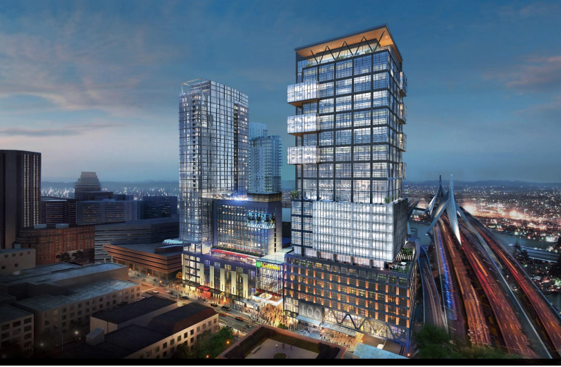
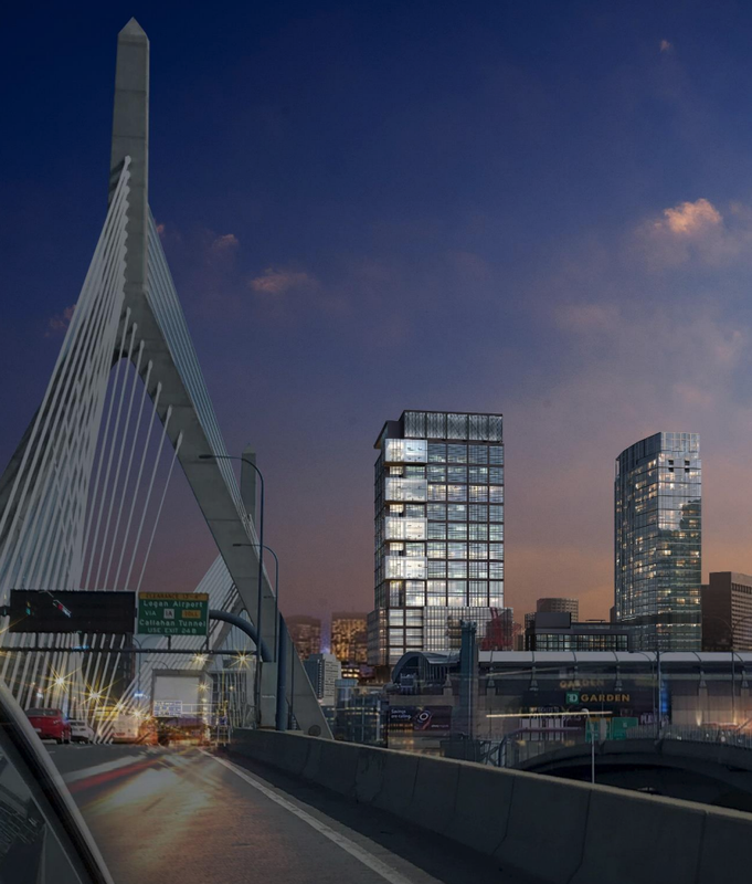
Fucking Christ, they really have to go with fake terra-cotta colored panels? Again? In Boston? I really liked those industrial windows before, but I am so fucking sick of these fucking PANELS!
I'm with you on this one. It strikes me as a lazy attempt to make new buildings fit in with all the surrounding brick buildings. The value of those older buildings are the materials theirselves, not the color of them. If you're going to use a cheaper, more modern material then just try to use it in a way that looks good in its own way, using its own colors rather than trying to make it blend. Boston is a living city, not a UNESCO world heritage site.
You guys are so cute when you are upset. Why do you think these choices are made? How do you think these choices are made? In another post yesterday (the MIT nano thread I think) I explained that in a project like this the price of the building has everything to do with the price of the exterior skin (because it is an empty box full of air is essence) and if you save $1/sf of facade on a project of this scope you can take $1M out of the pro forma. Imagine the pressure on the developers project managers to get that $1/sf or $30/sf out of the facade costs. Think of the bonus you would get at the end of the year when the choice to go from a facade that looks like something at Hudson Yards (which is the gold standard of tower design) to something that is "good enough to get past BCDC". So ... you get sad, flat, cheap, but just good enough to be acceptable in projects like this.
cca
This might be a non-starter but what if, instead of trying to (cheaply) mimic the brick look, they had gone in another direction with, say, Celtic green panels? It would have been neat if some part of this architecturally paid homage to the 2 teams that call the Garden their home.
Last edited:


