The Sudbury (Bulfinch Crossing Residential Tower) | 50 Sudbury St | GCG Phase I | Gov't Center

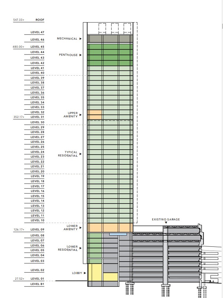
based on the above -- 120 ft from the contractor -- Sounds like something between 10 more floors [12 ft per floor] to 14 more floors [9 ft / floor] including the mechanical screen

I'm making the assumption, based on it being a concrete contractor, that they are talking about the last pour at 120' and not the official top of the building.
 
based on the above -- 120 ft from the contractor -- Sounds like something between 10 more floors [12 ft per floor] to 14 more floors [9 ft / floor] including the mechanical screen

Whoa, he's alive!
 
He appears to have returned with nary an acknowledgement of his long absence. Prison? Stranded on an island?

Not quite -- Just leave it at -- Doing something that kept me from being able to spend the time to do something like AB without interrupting other things
 
Anyone know why the 8/9th floor is double height?

Skylobby for the garage roofdeck.

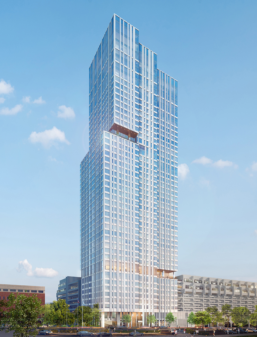
BulfinchCrossing.jpg


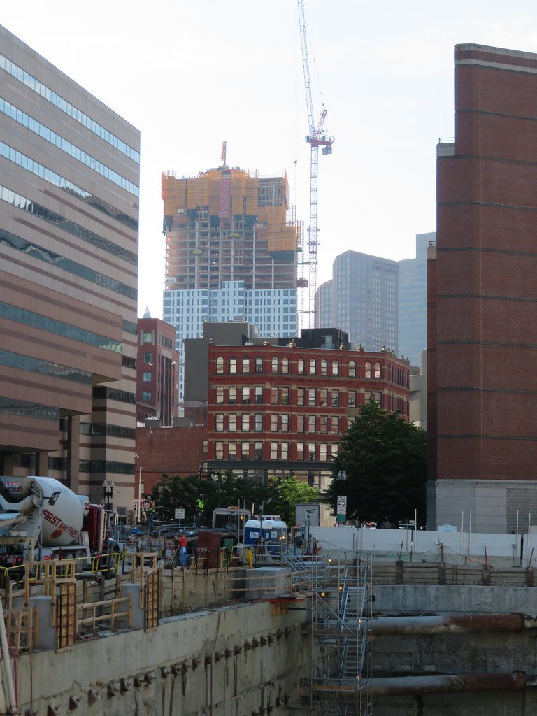
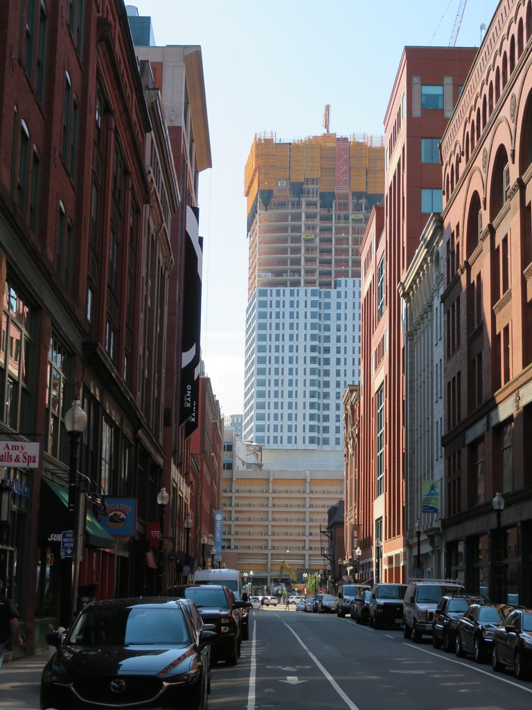
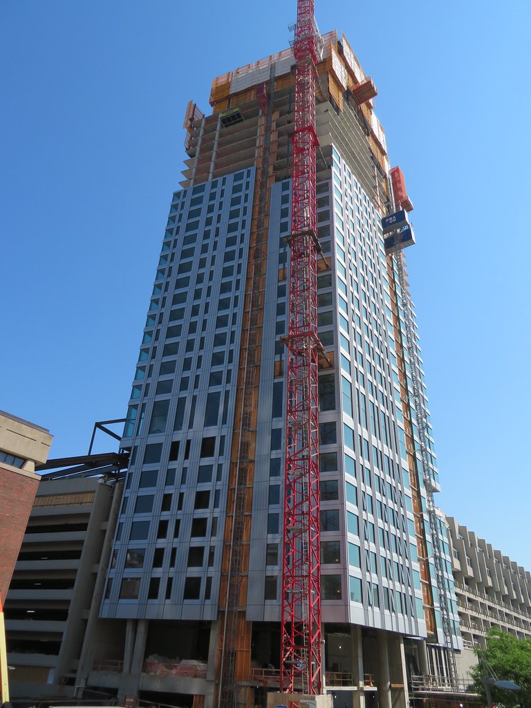
I really can't tell from the photos- is this top all one height once complete or is the height varied and split into 3 parts?

Also you can really tell where we are height wise on this based off the 60% height mark balcony now really showing.
 
This building is both fat and ugly. It's also very prominent on the skyline.

Yuck.
 
This building is both fat and ugly. It's also very prominent on the skyline.

Yuck.

I think it will look less fat and more varied in mass when it's done. It has cut-outs accented with different colors - it won't be a white box all the way up.

It will also have a taller and more distinguished neighbor.
 
Rob Lowe: Face it dad, we're just a ****ed up family, not just the home to some of the most horrendous architecture, but the US capital of buildings ranging from quite fat, to Orca fat, to 'you can't be serious' fat, to decks of cards laid out or their sides, to long stretched out monoliths that seemingly never end--and even a long, arcing horror called 1-2-3 center plaza...... but we saved Boston: there's no shadows.

This thing goes 725' like it should have--and it's a 110% fab, NYC apt tower.

It will also have a taller and more distinguished neighbor.

But, w/ one glaring feature: its skyline obscuring girth.
 
It has cut-outs accented with different colors - it won't be a white box all the way up.

I don't think this is true. I believe you might be referring to an older render. I'm pretty sure it will be the same color the whole way, which is really more silver than white but it also depends on the lighting. The top will definitely look glassier than the rest of the tower. It looks absolutely stunning up close, but the verdict is still out from further away.
 
From photo distance the depth of the facade flattens out so it looks cheaper than it is, with small punched openings. I want it to be a success but it's not looking great. You can't make the argument from these photos that this is of any more quality than the Avalon North Station tower.
 
This building is both fat and ugly. It's also very prominent on the skyline.

Yuck.

Lol its already that time? That time where every development gets to, where its close enough to where people start thinking they know what the finished building will look like, so they start proclaiming its a failure... but in reality its actually still far enough that the important parts that will tie everything together arent done or added yet, and without the full height or cladding it makes it actually look bad, so its premature. Some things really never change.

Yawn... happens every time. This just happened in the pier 4 res thread lol and was acknowledged how everybody jumped the gun. Of course it looks fat and bulky... it hasnt reached its full height yet...

The people talking about the top, yes the spacing starts to get more and more as the cladding goes up making the crown much more glassy than the rest of the tower.
 
You can't make the argument from these photos that this is of any more quality than the Avalon North Station tower.

Maybe not. But my biggest issue with Avalon is how incoherent the overall form is. The massing, the placement of the glass and lights, the angles and the cuts, it looks like it was thrown together by an amateur. From most angles it's just a mess. I don't think that will happen here. Not saying this is great architecture, just that consistency and repetition go a long way toward making a building palatable, especially when viewed from a distance.

I'm still optimistic on this one. It's in that awkward adolescent phase where nothing looks good. It's not even done growing.
 
It's in that awkward adolescent phase where nothing looks good. It's not even done growing.

Yup, how many times are we really gonna do this?


I know... 99.9% of the time. This has been happening as long as Ive been here and just happened with the pier 4 residential.
 
Lol its already that time? That time where every development gets to, where its close enough to where people start thinking they know what the finished building will look like, so they start proclaiming its a failure... but in reality its actually still far enough that the important parts that will tie everything together arent done or added yet, and without the full height or cladding it makes it actually look bad, so its premature. Some things really never change.

Yawn... happens every time. This just happened in the pier 4 res thread lol and was acknowledged how everybody jumped the gun. Of course it looks fat and bulky... it hasnt reached its full height yet...

The people talking about the top, yes the spacing starts to get more and more as the cladding goes up making the crown much more glassy than the rest of the tower.

Haha I was just about to post the same thing.

I guess we just need to wait another 6 months to come back to this thread for the "You know what? This actually came together pretty good!" and "Maybe we rushed to judgement on this one. Next time, I'm not going to close the book on a 50 story tower when it's on floor 20" comments. Then we can click on the Winthrop Square thread and see the same people saying the building sucks because it has dirty glass on the 15th floor.
 

Back
Top