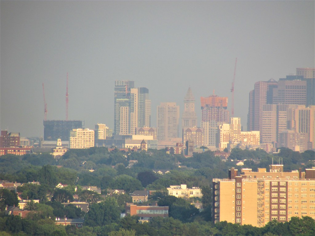
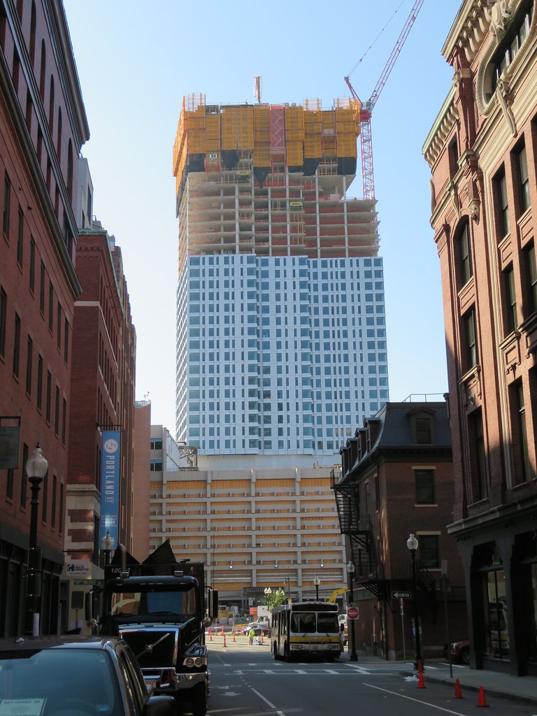
The Sudbury (Bulfinch Crossing Residential Tower) | 50 Sudbury St | GCG Phase I | Gov't Center

When did we turn sour on this building? A few pages ago, people were raving that it wasn't a glass box. Not many apartment buildings in the city above 40 floors, so this is a big win in my book.
 
Because it just hit that point that every building hits, where its the worst its ever gonna look, but far enough along to trick people into thinking that its an accurate representation of the final building. The point where a building looks its worst, is far enough along into its construction that it gives the false idea that this is it. These 2 points hit at the same time, so thats why it gets people over and over and over. From this point on though, it will look better by the day.

Its only far enough along to show a half ass cladded half ass massed building, that looks the fattest it will ever look. From this point on it will get skinnier by the day proportionally, the cladding will climb higher, and soon the crown will slowly add more and more glass to the top 1/3rd compared to the lower floors and it will look many times better than what it looks like now and it will take its place as a great addition to the skyline and people will say that this came out better than they thought, just as has been happening for years and years before.
 
Last edited:
Yup, how many times are we really gonna do this?
You must be new here.
Yup, how many times are we really gonna do this?
One of the very few parcels in the City left, and developed in the current cycle, capable of supporting 1 Dalton height, now gone. Squandered might be too harsh a word. But, when it has the width of a 700' NYC/ Chicago/ LA/ Miami/ SF/ Seattle apartment, but, is approved to deliver yet another squat a/r, fatty--given the amount of traveling people who frequent this site do, seeing everything going up around the way, you aren't going to get universal love for '90's Menino era quality and massing.

It looks to be a decent tower. But, stopping 200 feet under what could go up in present day Boston, at arguably it's most perfectly situated Downtown site. If you're going ~540', with absolutely no shadow concerns, why not build to match the real estate market? .....All that said, it might end up being the better of the 2 going up, imo.
 
Yep, that time again before we start saying "not that bad".
 
Happy to revisit this in a few months. Though I bet I won't be satisfied until the second tower starts growing to offset the solid feeling of this one.
 
Reminds me of a nice summary by Bos77 from when I joined. I think we are squarely at #9 right now:

http://www.archboston.org/community/showpost.php?p=174637&postcount=135


You haven't been on here that long... There is a cycle:

1) Post article from Globe, Herald, or BBJ
2) Excitement ensues for 3-10 posts.
3) Rendering released. 10-30 more posts, possibly from only 2-5 members about the architectural apocalypse being upon us.
4) Community meeting time... NIMBYs/BRA suck, this wouldn't happen in NYC, etc.
5) Revised proposal released. Floors cut, value engineering done, and discussion about alucobond.
6) More community meetings and bitching. Something keeps being posted about "lack of vision and the Krafts/seaport". Thread also derails into some ridiculous topic like this thread, independent movie houses now closed, or DTX BIDs.
7) Construction may or may not start. Surprise BRA or Mass Dep/DOT permitting issue.
If construction continues, some awesome folks will do their damnedest to document it all with a gallery of pics.
9) For every 1 pic there is a ration of 5-10 posts judging materials like precast and glazing. 50% chance of thread derailing again. And with construction not even at 10% complete people will declare the building to be the end of Boston.
10) Building complete, it turns out 'not as bad' as people thought or 'better than a parking lot'. Thread dies.
 
Reminds me of a nice summary by Bos77 from when I joined. I think we are squarely at #9 right now:

http://www.archboston.org/community/showpost.php?p=174637&postcount=135

Yeah that was funny.

But, seriously, I’ve soured on this and that’s cuz I see it a lot. It’s not BAD, but I’m so fucking sick of these 20-40 story boring and bland residential pieces of shit. Society hasn’t figured out how to do decently attractive towers without hem being either boring or totally over the top (and in those cases, only for the ultra rich). How would one design a tower for residential only that isn’t so what is the weather but it’s only for the super rich, but it’s also tasteful and not completely uninspiring? This is a serious question
 
Yeah that was funny.

.....It’s not BAD, but I’m so fucking sick of these 20-40 story boring and bland residential pieces of shit..

Great news! This one's going 45. It's going to extend the downtown plateau across Government Center and help visually connect the North Station area back to the rest of the city.

Also, from up close the cladding seems pretty unique to me, and the glass is sharp. The siding seems almost metallic, although the timing, weather, and viewing location certainly make a difference. It looks really good in the evenings when I usually get to see it.

If anything, I think the biggest problem nobody is mentioning is that the color seems to clash with the highrises around it, mainly JFK and Saltonstall. I'm still liking it so far, a lot. It's the year's most exciting addition!
 
Purely my subjective opinion, I've been biting my tongue on this one but some buildings just let you down out of the gate and others do not, this one is not so great... but it's rising from a parking garage so I can deal with it. If anything, I have a new found lukewarm appreciation of the neighboring JFK high rise. Even after 40 plus years, on the whole, its a comparatively more attractive high rise than this building rising today. In lay man's terms, this looks like a plastic modern version of the concrete high rises of the jfk era. That being said, on a positive note, it's a skyline filler and from city hall plaza and other areas it provides a visual sense of enclosure.
 
Last edited:
I never said its going to “definitely be the best tower ever”. All Im saying is:

1. It WILL look better than it does now

And

2. Just wait until its finished before making any final declarations of its failure because (see 1.)
 
Wrong thread-but from that photo- wow Hub on Causeway Tower 2 is so massively wide from that angle it's going to absolutely dominate the area.
 
Wrong thread-but from that photo- wow Hub on Causeway Tower 2 is so massively wide from that angle it's going to absolutely dominate the area.

That's one of the unique and often delightful things about "Boston" [and Cambridge the other built-up inner burgs]

Due to the lack of a uniform grid for aligning the development, seeing a render of a new building often does little to tell you what a building will actually look like in the context of the city or even a neighborhood

You just have to wander about a bit and see some of the new juxtapositions that are revealed as you round a corner
 
Snapped a few shots at a rooftop party last night; didn't come out well on my phone, but interesting perspective nonetheless!

8iJLsIe.jpg


6mmNUsW.jpg
 

Back
Top