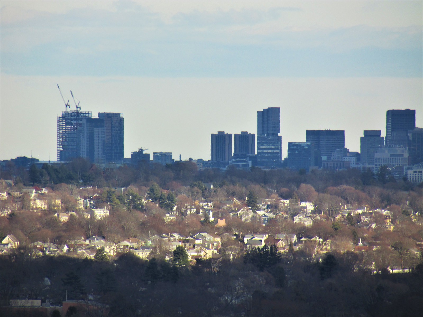
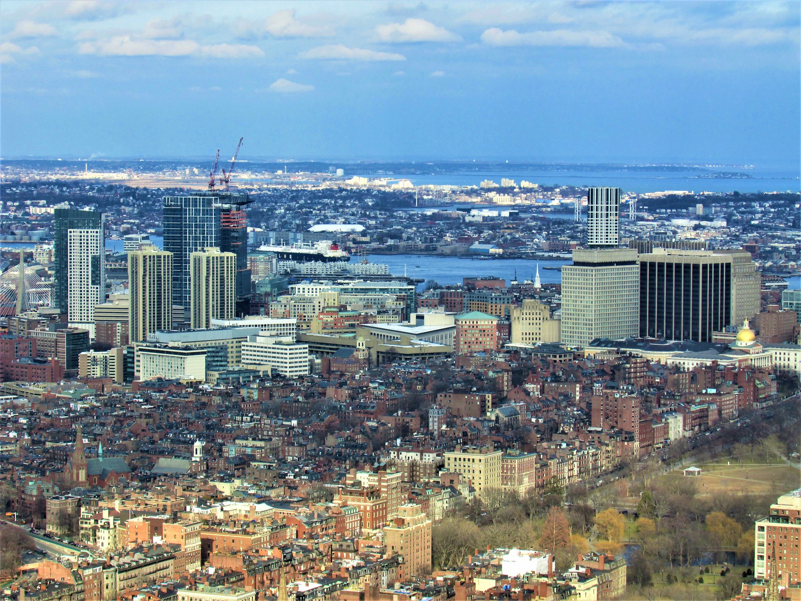
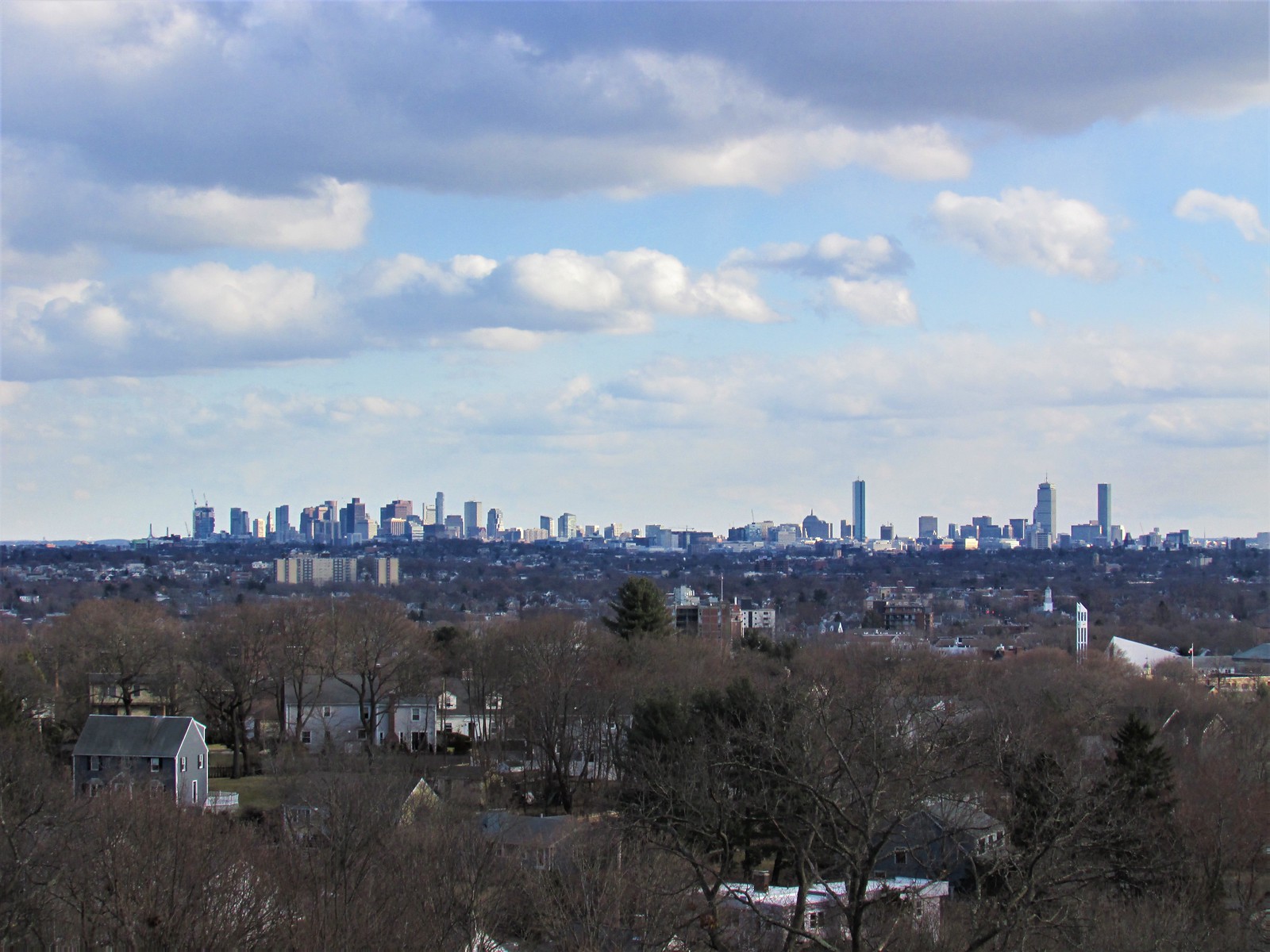
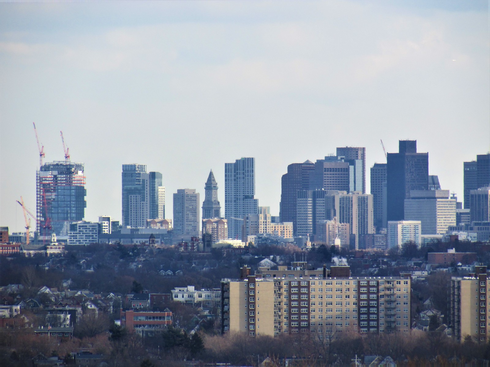
The Sudbury (Bulfinch Crossing Residential Tower) | 50 Sudbury St | GCG Phase I | Gov't Center

feels like the first real slender tower since custom house...

I think 1 Dalton fits that bill just a little bit better, particularly because it's the same width from every angle. When you can see it nearly top to bottom it appears very slender.

However, I definitely understand the sentiment here. It's funny to think how wide we all thought this looked in the renders, vs the reality of the nearly finished product! I am a very big fan of the way this building is turning out.
 
feels like the first real slender tower since custom house...
At first when it was a render next to the Curvaceous State Street Tower -- it just seemed like a boring box designed to hide some of what was left of the Brutally Ugly Government Center Parking Garage

BUT -- now that it has come into its own as real "steel and glass" aka Flesh and Blood -- its becoming a nice addition to the Boston skyline. This is especially true from west and north of the building.

Some of the recent DZH pix are very close to the cliche "Iconic" in how the tower sits amongst its surroundings -- shouldering them out of the way -- but in a civilized manner
 
I think 1 Dalton fits that bill just a little bit better, particularly because it's the same width from every angle. When you can see it nearly top to bottom it appears very slender.

However, I definitely understand the sentiment here. It's funny to think how wide we all thought this looked in the renders, vs the reality of the nearly finished product! I am a very big fan of the way this building is turning out.

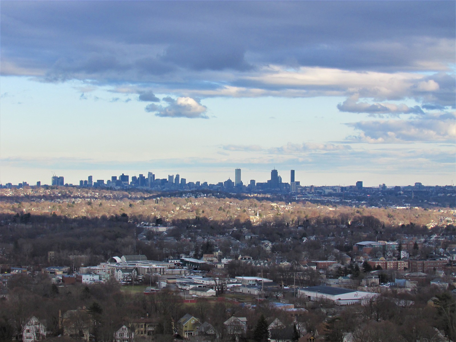
Yeah I was thinking that 1 Dalton would be mentioned, but something about it doesn't scream slender to me, even with its stripes. Its more of a perception than reality...but I think that's sometimes more important. The abrupt flat top and the curved edges I think help lessen its ability to appear slimming. Also standing so close to Pru isnt helping it either.

Sudbury is pretty standalone, and has set-backs at the parapet which accentuate its skinnty-ness.
 
^^^ I think this view shows just how much change the skyline has grown over the past five years the best. And it's only going to get more impressive over the next few more.
 
it's still way too early to give them grief about it, but im liking how there are a few windows up top that still have plywood. if both this and 1 dalton still have a handful of plywood windows in, say, five years that could be boston's new architectural "thing": permanently unfinished skyscrapers.
 
it's still way too early to give them grief about it, but im liking how there are a few windows up top that still have plywood. if both this and 1 dalton still have a handful of plywood windows in, say, five years that could be boston's new architectural "thing": permanently unfinished skyscrapers.
I'm betting this building gets it's plywood down before One Dalton, this things moving at quite a pace
 
it's still way too early to give them grief about it, but im liking how there are a few windows up top that still have plywood. if both this and 1 dalton still have a handful of plywood windows in, say, five years that could be boston's new architectural "thing": permanently unfinished skyscrapers.

In addition to Millenium's missing roof.
 
It's not "missing" in the sense that they forgot to put it up or are eventually going to put it up. It's deliberately designed that way whether you like it or not.
Some of the earlier renders of MT seem to imply a roof, with a slot for the window washing gear to rise up through.

My read is that it was VE'd out of the design.
 
Some of the earlier renders of MT seem to imply a roof, with a slot for the window washing gear to rise up through.

There was 100% a render with a roof. I actually think it was on one of the adjacent building's (maybe diagonally across down Franklin Street) front windows showing the whole render. However, I have been scouring the web and can't find it. It might have been a casualty of the photobucket debacle... Anybody have it who can repost it here?
 
that's exactly correct. the roof absolultely IS missing -- and that's not "whether i (or anyone else) likes it or not". there was an actual roof in the renders (final renders, at that) and they cheaped out, plain and simple.
 
The roof was on the renders posted on the marketing website for the tower which still exists and contains a video showing a covering over most of the top, but since this is marketing material it may have not been a totally accurate representation of the actual plans. http://millenniumtowerboston.com/#!/home
 
The roof was on the renders posted on the marketing website for the tower which still exists and contains a video showing a covering over most of the top, but since this is marketing material it may have not been a totally accurate representation of the actual plans. http://millenniumtowerboston.com/#!/home

Thanks for this, exactly what I was looking for! You can see the roof less than 10 seconds into the video.

It's not "missing" in the sense that they forgot to put it up or are eventually going to put it up. It's deliberately designed that way whether you like it or not.

It's missing and was originally designed to have the roof, whether you like it or not.
 
41146CEA-DAE9-4251-BD38-25517E16E3E9.jpeg
 
Last edited:

Back
Top