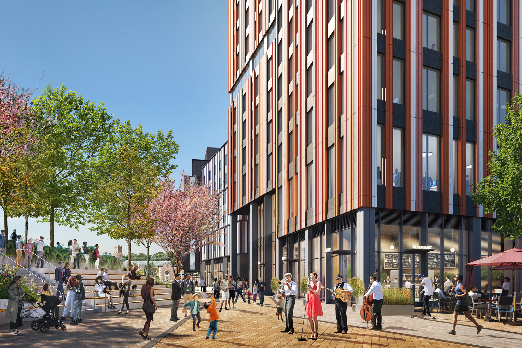
Union Square D2.1 | 10 Prospect Street | Somerville

It matches the renders exactly so idk what else ppl expected. It looks fine as a finished product.
50p_Tplaza.jpg

01_Brick_Aerial_LandscapeRoof__5___1_.jpg


It also fits in nicely with other buildings going up nearby like cambria
Cambria-Exterior-rendering-scaled-e1620931768120.jpeg
 
Maybe they should have leaned into the brick theme even more? Instead of two tones of red and two tones of white, go like three tones of red? A little simpler, a little more clearly brick-inspired, and a little less contrasty? Obviously you are kind of stuck with the blue/some dark color if you want your whole vertical lines thesis to show.

I'm more just brainstorming alternatives for fun than I am suggesting they should change it this late in the game. If you followed my suggestion you would break the relationship with the lowrise portion (red-with-white on the tall, white-with-red on the short) so that would need to change in response as well.

The pattern was derived from an oblique overhead shot of a Somerville neighborhood, IIRC. "Colors of the city" and such.
 
Yeah but... do we consider Somerville to have a desirable color pallet currently? There's a lot I love about my city, but the off-white of sun-bleached vinyl siding on a triple decker isn't one of them, and I feel like they're channeling that successfully with those whites there.

(I actually like the high contrast of the red-on-white, but for a different reason that I doubt was the architect's intent - that building looks like bacon.)

Nothing says 2022 Somerville more than a bacon-infused Bloody Mary at some insufferable hipster faux-dive, so... success?
 
There is some real depth to that facade. Should do some wonderfull things with shadows.

I agree with you about facade depth for both projects. The tower’s facades all taper in towards the center which should create nice variation of the colors as the light strikes at slightly different angles.
 
What is that development under construction across the street from this?
01_Brick_Aerial_LandscapeRoof__5___1_.jpeg
 
What is that development under construction across the street from this?

It's an electrical substation and not included in any of the redevelopment plans.

It matches the renders exactly so idk what else ppl expected. It looks fine as a finished product.

It also fits in nicely with other buildings going up nearby like cambria

Seems like orange-y brown is Somerville's new build color of the early 2020's:
- d2.1
- The new high school
- Hotel Cambria

Wonder what's going to be next?
 
Nothing says 2022 Somerville more than a bacon-infused Bloody Mary at some insufferable hipster faux-dive, so... success?
I was thinking about the same just as I scrolled by this, but replacing bloody Mary with a bathtub Mary (bacon-infusion optional). Though that's usually more of a sky blue.
 
Construction has now reached the intersection of Somerville and Prospect.

View attachment 21909View attachment 21910View attachment 21911
This is tangential - as this corner is forever changed: does anyone foresee the Dunkin Donuts selling its property here and maybe moving into the ground floor of a new development? It would probably be smart of them if offered. A Dunkins with a parking lot almost doesn't fit in in this area anymore - it definitely won't once D2.1 is done.
 

Back
Top