Union Square D2.1 | 10 Prospect Street | Somerville

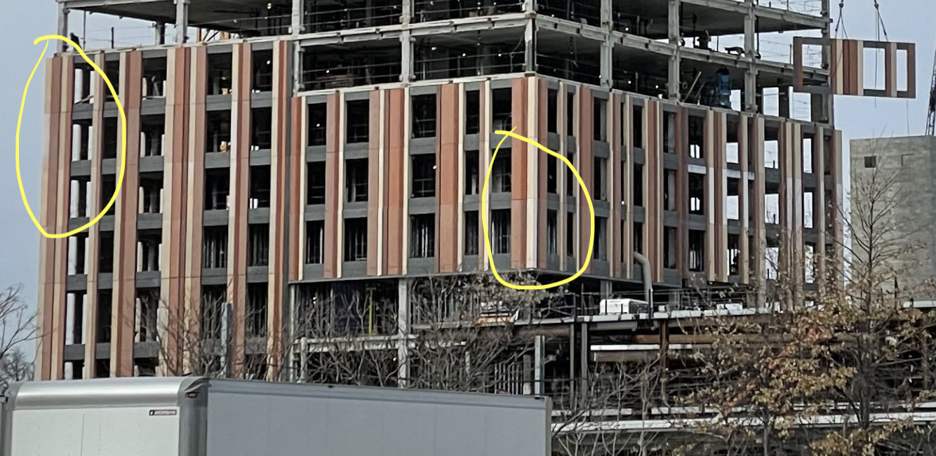
Is it just me, or is the color matching on the precast panels really inconsistent? I've circled a couple of the more egregious examples:
Screen Shot 2022-03-30 at 18.43.07.png


Is this from shadows due to the (temporarily) misaligned panels? Dirt on the panels? Or just inconsistent pigmentation of the concrete?
 
That may also be due to a 2x optical zoom on an iPhone, with associated Image Signal Processor magic.
 
It looks really bad in person too. Like someone jammed the wrong puzzle piece in until it fit.
 
And here I was thinking the salmon striping was looking iffy before these last few posts...
 
Theyre probably just dirty. Im not sure what the process is if they powerwash them or something but a lot of projects look sketchy mid construction with misaligned panels and seemingly the colors being off and then turn out fine once finished. The most recent example is canopy on the greenway, the black brick panels looked atrocious for most of construction and then all of a sudden they looked perfectly fine.

Anyways I hope that theres a trend back towards using different materials and colors because were starting to reach critical mass on blue glass towers once the rest of the approved/uc projects finish up. I do wish we could get a few black glass towers though.
 
Is it just me, or is the color matching on the precast panels really inconsistent? I've circled a couple of the more egregious examples:

View attachment 22830

Is this from shadows due to the (temporarily) misaligned panels? Dirt on the panels? Or just inconsistent pigmentation of the concrete?

Definitely some variation going on. As noted above it could very well just be dirty, although that would be some quite evenly distributed dirtiness if so. Variations seem more of tonal quality than some dirt stains here and there.

That al being said, I almost wouldn’t mind if it did have *subtle* variation so as not to look like painted surfaces. Sort of like how red bricks aren’t all the same red. And when you do paint them it’s terribly obvious.
1316764F-2C45-49A7-86EA-242E670FB5FA.jpeg
15ED42D5-E36C-4FA3-86F1-A4756C079DE0.jpeg
 
I really hope the glass makes the facade look less like a bad 1970s wallpaper. I grew up in a house with wallpaper reminiscent of that, and if you had a fever it would dance.

There is a phase in every project when the cladding is going up without windows and aB thinks it's ugly. You may remember such classics as "when they were cladding The Sudbury", "when they were cladding Eschelon", and "when they were cladding The Alcott."
 
There is a phase in every project when the cladding is going up without windows and aB thinks it's ugly. You may remember such classics as "when they were cladding The Sudbury", "when they were cladding Eschelon", and "when they were cladding The Alcott."
there's also a tendency for people on aB to try and downplay any aesthetic criticism mid construction.
I think everyone knows that it'll look different when finished but, given the sheer scale of the building in the location, it's perfectly reasonable to voice concerns. I know I have some.
 
You can see a break in the facade where the pattern is vertically disrupted. Wonder if that will be all glass there? I also just noticed that the grey horizontal element of the precast panel has change, from the ribbed profile to flat.

8ACCE7A2-02C2-4993-9C38-2131DD975C2D.jpeg

4DBE29A7-B4A3-4D1D-977E-BAB708BEC9B3.jpeg
 
Last edited:
Anyways I hope that theres a trend back towards using different materials and colors because were starting to reach critical mass on blue glass towers once the rest of the approved/uc projects finish up. I do wish we could get a few black glass towers though.

blue glass towers -- jht, exchange place, MT
reflective/untinted towers -- one congress/state street, winthrop
dark... grey(?) towers -- 1 dalton
 

Back
Top