A softer City Hall
Young architects offer visions for turning plaza into something a bit more welcoming
By Casey Ross
Globe Staff / April 4, 2010
(images at end of the post)
Imagine the brutish Boston City Hall with its three-story brick base replaced by glass walls, the lower levels seemingly part of one long open space stretching to Faneuil Hall. Or perhaps it could be paired with a new wing of glass-enclosed shops, or even a new building altogether, adding space and a rooftop garden to brighten its gray facade.
Those were the visions created by finalists in the Boston Society of Architect?s annual Rotch design competition, a sort of ?American Idol?? for young architects. The challenge for the six contestants happened to be a subject very much on the minds of Boston officials: Transforming City Hall and the desert of brick around it, while adding a particular component ? a museum focused on Massachusetts history ? to its lower floors.
Though ultimately a hypothetical exercise, the Rotch contest showed the potential for remaking the much-reviled City Hall and its sprawling empty plaza at a time when its fate is in limbo. Mayor Thomas M. Menino has suspended his plan to build a new city hall on the South Boston waterfront, and in the interim, architects, urban planners, and civic activists have hotly debated what to do with a building that seems to have few friends.
Indeed, the young architects? proposals were well-received within City Hall itself. Boston?s chief planner, Kairos Shen, who also served as a judge in the competition, said some of the changes could ? for fairly short money ? make the building much more inviting.
?Unlike previous efforts to remake City Hall and the plaza,?? Shen said, ?these kinds of interventions seem more doable. Some simple changes like this could be achievable in the near term.??
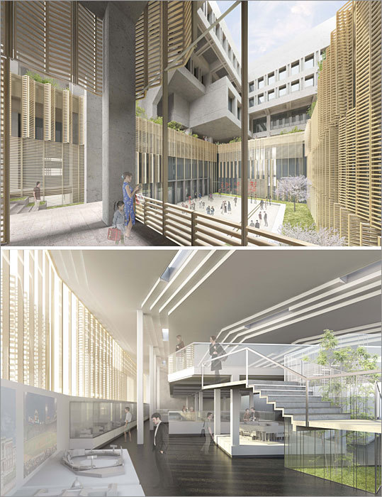
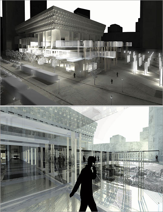
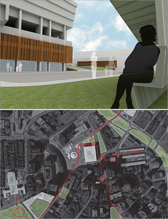
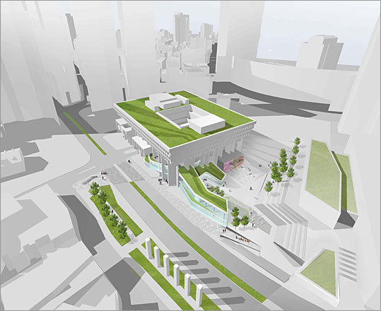
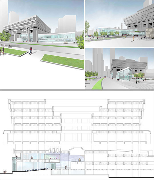
The Rotch contest winner was Christopher Shusta, who sought to soften the building?s imposing presence while also adding attractions to bring more visitors to the site. He would build the museum in a horizontal stretch along Congress Street, adding above it an outdoor terrace that faces the area of the plaza where concerts and other public events are currently held.
Then Shusta would extend City Hall?s interior courtyard, a dark, disused space, out through the side of the building, connecting to the terraced area. The interior glass walls would look onto a newly brightened courtyard, which would be draped with geometrically shaped wooden shutters in natural finish.
?The thought is to bring some human scale to the building that people see as missing now,?? said Shusta, a graduate of the Harvard Graduate School of Design who lives in Princeton, N.J. He received a $37,000 scholarship to travel the world studying architecture for a minimum of eight months.
Despite the building?s widespread unpopularity, City Hall officials have resisted calls for its renovation ? or demolition ? for years. The building, designed in the Brutalist style by the firm Kallman, McKinnell and Knowles, was built between 1961 and 1968. Its powerful concrete columns were meant to symbolize the organization of city government, with large open spaces for the public to gather.
In the 1990s, a group called the Trust for City Hall Plaza, led by developer Norman B. Leventhal, proposed building a hotel on the plaza to generate money for renovations. That effort failed, as did other initiatives to add a pavilion and other structures along Cambridge Street to infuse life into the plaza.
Now, a new source of activity has emerged at its opposite side, with the Rose Fitzgerald Kennedy Greenway opening up the landscape around that part of Boston, making City Hall more easily seen from locations near the North End and Boston Harbor. That can be either a good or a bad thing, as City Hall has both critics who say it is an ugly mistake from a misguided era in architecture and defenders who want it preserved as a monument to the period of urban renewal that reshaped downtown Boston.
The tension between those viewpoints prompted architect Tim Love, principal of Utile Inc., to suggest that the Boston Society of Architects make it the focal point of this year?s Rotch competition. Love said he wanted the young architects ? and city officials ? to consider a compromise between the two extreme views that would transform City Hall?s facade and add a history museum to attract visitors.
?There is a more nuanced middle ground that should be explored for many of these midcentury buildings,?? said Love, who also served as a judge. ?I also wanted to raise the question of whether the museum would help energize this part of downtown.??
A civic organization has been trying, unsuccessfully so far, to win the right to build a Massachusetts history museum on a sliver of land near the Greenway.
Frank Keefe, president of the Boston Museum group, plans to review the Rotch contestants? designs, but said the Greenway remains a more desirable location. ?Our economic advisers tell us it?s the best museum location in the world,?? he said.
The Rotch contestants focused heavily on drawing pedestrians, especially from the Greenway, largely by opening up City Hall?s Congress Street facade with galleries, shops, or parks. As for the museum, the young architects had provocative ways to use it to break up City Hall?s hard exterior and its barren plaza.
Andrew Steingiser of Malden proposed putting historical exhibits or other information in a series of pavilions along Congress Street. His design called for the removal of the large brick barrier around the base of City Hall, replacing it with a sweeping glass facade that would make the building more accessible.
Meanwhile, this year?s Rotch runner-up, Eric Weyant of Concord, would build a low-rise building next to City Hall for the museum galleries. The building would serve as a new entry point to the area for visitors and have large windows offering sweeping views, while adding a cafe and bookstore across from Faneuil Hall and Quincy Market.
Another design by Cynthia Dorta-Quinones of Allston has small parks in the current amphitheatre space and an outdoor cafe and new transit stop that would be aligned with Hanover Street where it crosses over from the North End.
?The scheme hopes to leave the user with a sense of openness and easy fluidity,?? she wrote in her submission. ?Its lightness and translucency are meant to contrast with the heavy structure of City Hall.??
----------------------------------
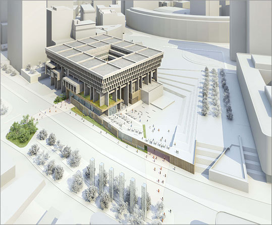
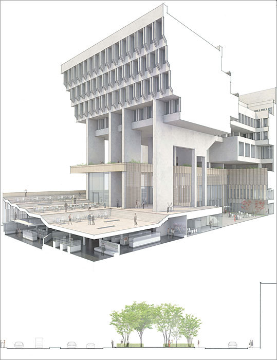
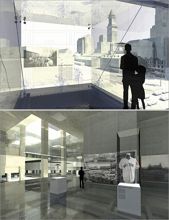
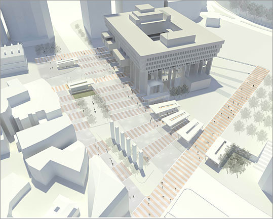
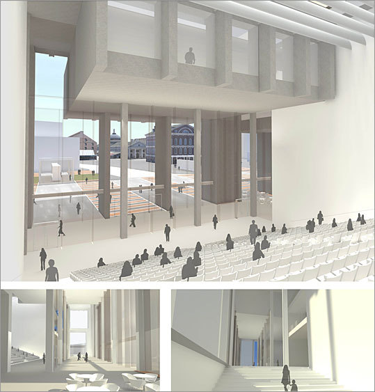
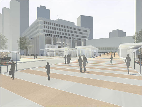
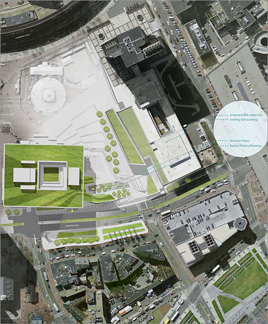
Design No. 1 - winner
By: Christopher Shusta of Princeton, N.J.
This project aims to restore the City Hall building's openness to the public by making the building more pedestrian-friendly at street level.
On the Congress Street side, the design aims to catch the interest of passing pedestrians with a "storefront glimpse" of historical exhibitions within.
At the northern edge of the site, the upper terraces create a pedestrian bridge and outdoor caf? space.
The area is not overly grand in scale, but is meant to offer "spectacular views" of the plaza stage and the Holocaust Memorial Park across Congress Street.
The existing building's interior courtyard is expanded and carved through to the lowest level, bringing in daylight and allowing museum events to spill outside during good weather.
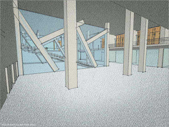
Design No. 2, by: Robert Alexander of San Pedro, Calif.
In this design, the new museum enclosure would be as light as possible to counter the enormous mass of the existing City Hall building.
Using the existing concrete columns as a conceptual starting point, columns made of steel angles would reflect an inverted version of the existing building's structure.
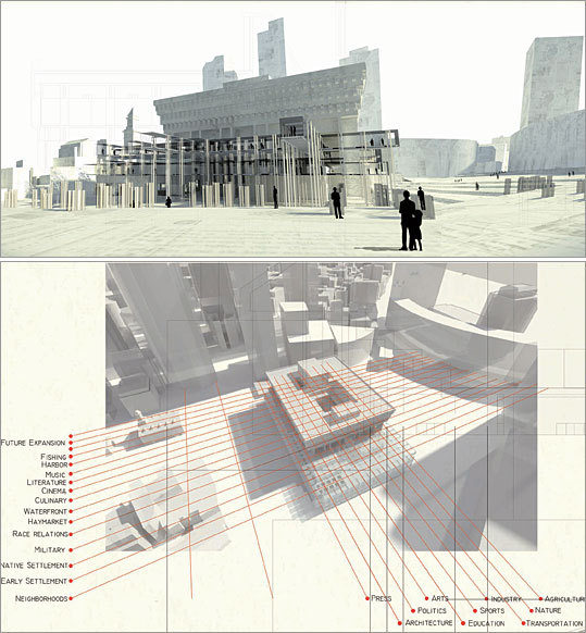
The idea behind this museum is to create a matrix of historical events, organized around themes rather than chronological order. This would the museum easily expand and change exhibits.
In this museum, galleries would extend into walkways "like fingers into the city." If possible, the contents of the museum images, text, and objects would be placed with views of locations relevant to the artifacts - the same strategy used in the Freedom Trail.
Design No. 3, by: Andrew Steingiser of Malden
This design aims to accomplish Italian architect Aldo Rossi's vision of urban architecture: Architecture that defines a particular place, with the potential to develop ?in both space and time?.
Its goal is a City Hall space that can evolve to accommodate multiple functions.
This design does away with the three-story brick mass in front of the building, opening up the space and making it more accessible.
The design extends a series of pavilions along and across Congress Street with pavilions to reinforce the existing plaza and street front.
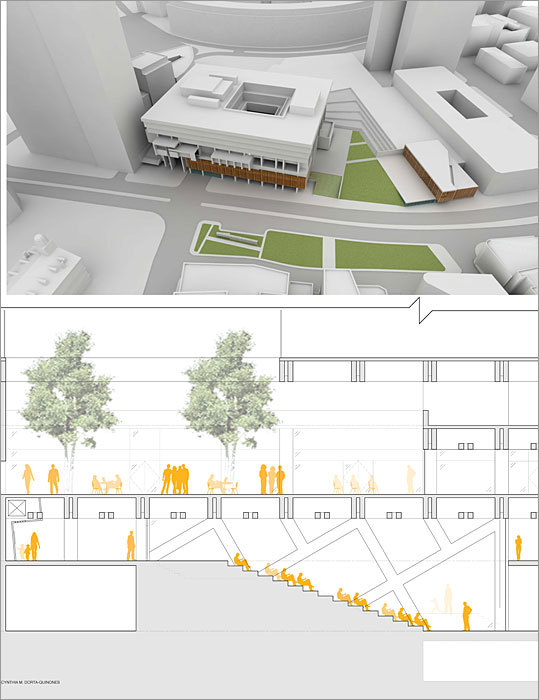
Design No. 4, by: Cynthia M. Dorta-Quinones of Allston
This design retools the City Hall facade to create a more active front that jibes with the activity of Haymarket and Faneuil Hall across Congress Street.
The Boston History Museum?s public zones, galleries, meeting rooms, auditorium and bookstore are all located along the fa?ade.
An outdoor cafe is aligned with Hanover Street to provide a sense of continuity .The cafe area and MBTA stop create a connection between the private functions and the public realm of City Hall.
The main hall or lobby, when approached from Congress Street, acts as an indoor public plaza, accessible at any time. It creates a backdrop that highlights City Hall?s unique structure, while also opening views to the floors above through a stepped auditorium and grand staircase.
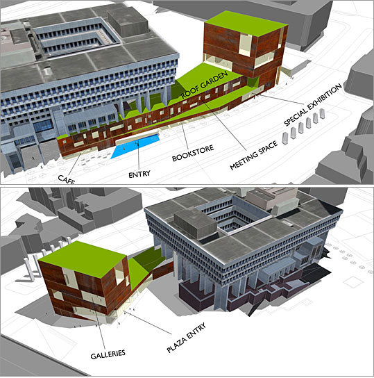
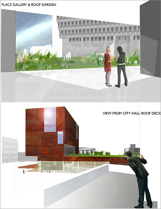
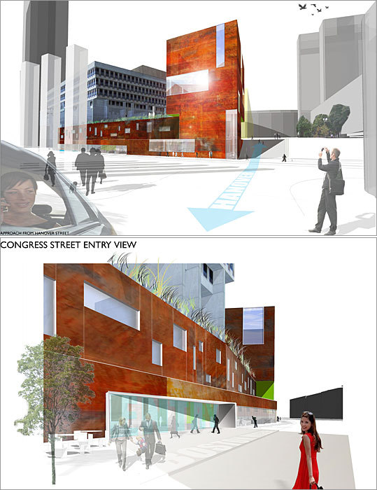
Design No. 5, by: Eric Weyant of Concord
This design adds a low-rise tower to the site along Congress Street.The museum's galleries occupy the floors of the tower, with the uppermost gallery spilling onto a roof garden.
The galleries in the tower have large shifting planes of glass allowing for unique perspectives from Faneuil Hall to Cambridge Street. The material of the museum is a play on the worn, chipped brick of the Freedom Trail.
The Congress Street edge is lined with public activities like a cafe and bookstore. Inside City Hall, a lecture hall and theater below support upper-level office and staff space.
Design No. 6, by: Karen Blanchard of Philadelphia
This design aims to bring social activity back to the currently businesslike City Hall plaza. The north end of the plaza becomes dedicated to the museum, which weaves itself into the existing City Hall.
A small entry plaza that feeds the museum entrance, a bookstore and a cafe.
The museum also has an entrance off Congress Street that is recognizable from nearby attractions of Faneuil Hall and Quincy Market.
The large number of steps off Congress Street are balanced out by a ramp that invites visitors to the museum plaza. The glassy museum advertises itself through transparency.
http://www.boston.com/business/gallery/cityhallrenderings/