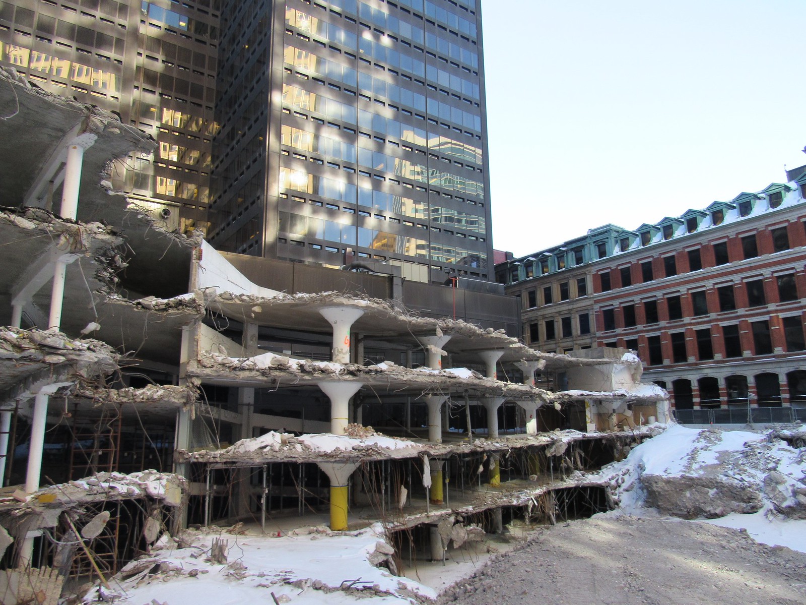
Good afternoon, Ms. Hines --
Having taken some time to review the renderings of Handel Architects' new scheme for Winthrop Square, I feel compelled to communicate my puzzled disappointment to the BPDA. Though I've never been impressed with Handel's anodyne work here in Boston, their initial proposal for this site showcased a set of architectural gestures that responded to the site's awkward shape and mitigated the tower's girth by enhancing its verticality.
The recently revised plan omits these gestures entirely, replacing them with an unfocused collection of elements assembled to spellbindingly cartoonish effect, as if a child with a bucket of Legos took the lead on the design team. Further, the seemingly opulent materials convey an aura of tastelessness worthy of a 70s pimpmobile. In short, I can't imagine this building looking attractive on any site on earth.
As a lifelong Boston resident with a deep interest in our built environment, I hope that you and your colleagues at the BPDA, working in conjunction with the BCDC, send Millennium Partners and their architects back to the drawing board. To clarify, my objections to this proposal are not a matter of height, scale, or density, but the absolutely repulsive articulation of the facade.
This site deserves better; I trust that you'll communicate this sentiment to the proponents.
 https://flic.kr/p/23eXgSW
  https://flic.kr/p/22cXfCo
 https://flic.kr/p/22cXezG
 https://flic.kr/p/21VoPEP
 https://flic.kr/p/23eXgSW
  https://flic.kr/p/22cXfCo
 https://flic.kr/p/22cXezG
 https://flic.kr/p/21VoPEP