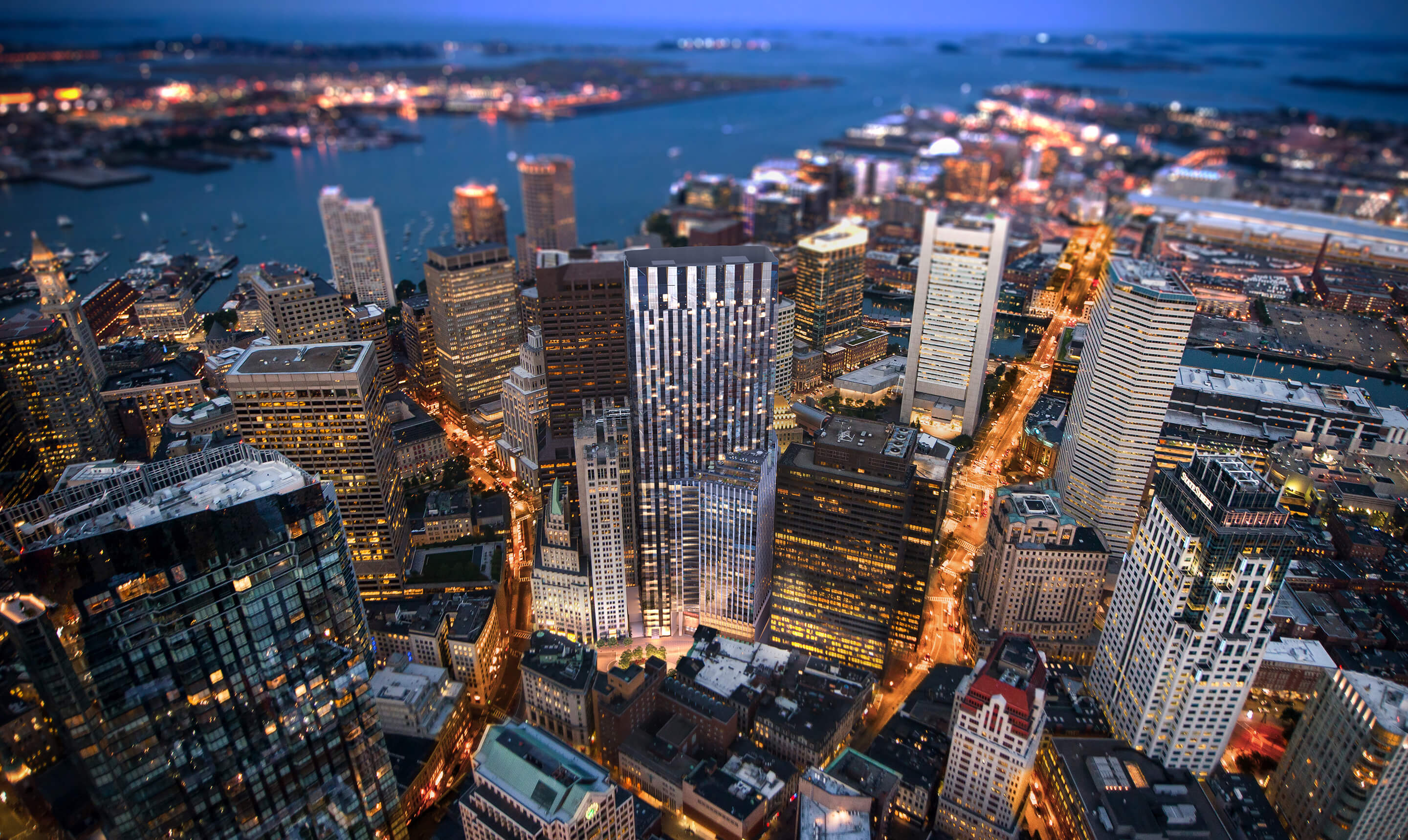
Winthrop Center | 115 Winthrop Square | Financial District

I’m going to miss that view of the United Shoe building.
I think it would be an okay building if it weren't so wide. My first time in Boston in 2013, it was one of my favorite buildings when looking up from South Station.
 

One Financial is in a four way tie blandest Boston box, along with One Fed, One Beacon, and One PO Square... With PO Square getting it's re-do, that potentially changes that to a three way tie. Certain angles, like DZ's pic, it is fat AF. On rainy or grey days, the dull lifeless façade gets even duller. I'll give it some points though: the new colored lighting at night is an attempt to do something.
 
Last edited:
One Financial is in a four way tie blandest Boston box, along with One Fed, One Beacon, and One PO Square... With PO Square getting it's re-do, that potentially changes that to a three way tie. Certain angles it is fat AF. On rainy or grey days, the dull lifeless façade gets even duller. I'll give it some points though, the new colored lighting at night is an attempt to do something.

Mostly this. It's big, bland, in a very high traffic area and the ground level sucks. It encompasses all the worst aspects of 80's office architecture in its design including abusive use of ribbon windows from top to bottom.

Hopefully when it comes up for a reclad we get something better. But gotta be another twenty years or so from that as it is not that old.

It is my least favorite skyscraper in Boston.
 
447A7749-B26D-452F-8D0D-85DB274E1B1D.jpeg
 
Mostly this. It's big, bland, in a very high traffic area and the ground level sucks. It encompasses all the worst aspects of 80's office architecture in its design including abusive use of ribbon windows from top to bottom.

Hopefully when it comes up for a reclad we get something better. But gotta be another twenty years or so from that as it is not that old.

It is my least favorite skyscraper in Boston.

Theres going to be a few prominent buildings coming up for a reclad in the medium term and I feel like the success of 1 po sq reclad is going to get the trend kick started. That being said I really hope they can start getting more creative with facade choices, because with all the blue glass towers going up now or recently finished I think that recladding the rest in blue glass as well will be too much. If they did the pru and one financial in blue glass our skyline would go from varied and interesting to bland monolith. Cant have that.
 
One Financial is in a four way tie blandest Boston box, along with One Fed, One Beacon, and One PO Square...

Yeah, except it's not a "box" at all -- it's a weird hexagon-ish type, angled thing. One Fed and One Beacon are absolutely dull and awful boxes, I fully agree, but One Financial is nothing like them. Does the ribbon fenestration date it as being "'80s"? Yeah, definitely. But it's arrogance to dismiss entire decades/movements/periods/whatever just because you, personally, don't dig 'em. We all know what happened when folks in positions of power who didn't see any particular merit in the architecture of Scollay Square and the West End were calling the shots. One Financial a cool, extremely "of its time" tower -- sort of Boston's Nakatomi Tower (Fox Plaza) -- by a respected architect and is absolutely valuable as such.
 
^^ Sorry but I ain't buying what you're selling. One Fin is as milquetoast as it gets, and if it didn't have the angled/chamfered corners then it'd be exactly the "blandest Boston box" that Bos77 is calling it. And it isn't anywhere near as memorable as Nakatomi Plaza.
 
The Waldorf Cafeteria, Garcia y Vega Cigar Store and Eric Fuchs were more interesting predecessors on the One Financial site. You felt like you were in some old time big city, not a loading dock/traffic sewer topped with some Hartford style cheapskate building. But alas, the pooch truly was screwed when the developer allowed Hizzonah Kevin White to select the facade design. Prison stripe was, in its own way, thematically appropriate.

This should have been much better than it was, and looking like it was designed by John Belushi, it is a stack of suck from B-2 to 46.
 
"It's arrogance to dismiss entire decades/movements/periods/whatever just because you, personally, don't dig 'em."

There are plenty of other boxes in Boston I quite like, pre or post One Financial, so it is hard to make that jump from "I don't like building X" to "arrogance and dismissal of entire decades of architecture". I don't think anyone went there. The façade is flat and dreary with zero dynamism, the treatment of Essex Street and Atlantic Avenue is a crime (even for pre Big Dig times) and as DZ's pic perfectly demonstrates that the hex shape, doesn't change a thing from afar. Up close, who cares if the angle is obtuse versus right to be a perfect box?

It's the purest background building ever, yet sitting prominently on the southeast corner of the skyline. It doesn't pretend to be anything else than it is; 46 stacked floor plates of Class A space, with dark, narrow, and barely reflective windows, sandwiched between weathering grey pre-cast. It is a product of its time, with clones scattered across downtowns all over America. So maybe that is some sort of faint praise of function?

I hope to <insert higher power here> it gets the PO Square treatment and I cannot wait for SST to bring a new visual focus to Dewey Square. Oh yeah, and Winthrop Square too... 🏗
 
Last edited:
Eric Fuch’s… now there is a name I haven’t heard in a very long time.
 
It's the purest background building ever, yet sitting prominently on the southeast corner of the skyline.

It also sits prominently at the effective end of the Greenway, where it and the Fed look like the most lovely of tombstones. Imagine a building with some pizzazz there and you almost have a postcard-worthy vista.

51162041157_c55daaba9d_b.jpg
 
It also sits prominently at the effective end of the Greenway, where it and the Fed look like the most lovely of tombstones.

This. Francisco Franco is still dead (and those idiot Spaniards giving a Fascist salute would be well-advised to take a DNA test to discover just how much Moorish ancestry is almost certainly intermingled with their allegedly "pure Spanish" heritage), but the horrors of the 1930s lingering on in grotesque zombie-like fashion, architecture-wise, in terms of what is effectively a fascist necropolis with those twin pinnacles.

Also, as noted above, 1 Financial's street-level presence is completely garbage.
Probably a pretty good share of Sephardic Converso DNA too, so take that Fascists!
Apropos of imperialism, Dewey Square was to be Boston’s monument to Empire, honoring as it does Commodore Dewey’s humiliation of the Spanish Empire at Manila. Sort of our Nelson and Trafalgar Square.
South Station held up its end of the bargain. If memory serves, the Square’s Imperial Eagle ended up as a souvenir out at B.C. The Greenway design missed a chance to revive the idea of a grand gesture. The twin tinfoil high rises on opposite corners do little to help.
 

Back
Top